𝐑𝐆𝐁 𝐯𝐬 𝐂𝐌𝐘𝐊 𝐂𝐨𝐥𝐨𝐫 𝐏𝐫𝐨𝐟𝐢𝐥𝐞 𝐂𝐨𝐦𝐩𝐚𝐫𝐢𝐬𝐨𝐧.
RGB and CMYK are the two foundational color profiles that define nearly every digital screen and print output in modern visual communication, and understanding how they differ requires exploring not just their color ranges, but the science behind how each system produces color and how these differences influence everything from digital design to professional printing and brand consistency. Both models are systems for representing color, yet they are built on opposite physical principles. RGB is an additive color model that begins with darkness and creates brightness by adding colored light, while CMYK is a subtractive color model that begins with white and produces color by subtracting portions of reflected light using ink. This opposing logic lies at the heart of every difference between the two systems and explains why they are not interchangeable. Designers, photographers, marketers and printers rely on an understanding of RGB and CMYK not only to create visually appealing work but to control how color appears across devices and printed materials. When the wrong profile is chosen, a vivid image can print dull, a bright logo can shift tones across media and brand identity can become inconsistent—all of which reinforce that color accuracy is not accidental but structurally tied to the color model used.
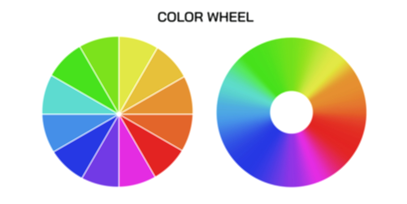
The RGB model is used for color production based on light emission, meaning it applies to screens and devices such as monitors, televisions, projectors, digital cameras and smartphones. The acronym RGB reflects its primary components: Red, Green and Blue. These three light colors mix in varying intensities to produce the visual color spectrum. When all three are combined at maximum intensity, the resulting color is white, while the absence of all three produces black. Additive blending allows RGB to achieve strong brightness and extremely vibrant hues, especially in areas such as neons, luminous pastels and intense saturated highlights. Screens are capable of reaching very high brightness levels and pixels emit light directly, so the RGB color space includes a broad gamut—meaning a wide range of reproducible colors. This large gamut is one reason digital images created for online platforms look intensely vivid. RGB excels in gradients, glowing highlights, luminous visual effects and any design intended for digital experience. It is a high-energy color model that depends on radiated light rather than pigment, and this physical trait gives it a dynamic visual punch that ink cannot reproduce with the same impact.
CMYK operates by a completely different physical mechanism. Instead of emitting light, CMYK colors absorb light. The acronym represents Cyan, Magenta, Yellow and Key (Black), and each ink reduces the amount of visible light reflected from white paper. When cyan ink is applied, wavelengths corresponding to cyan remain visible while other wavelengths are absorbed; the same happens with magenta and yellow, and black strengthens shadows while improving tonal depth. Rather than adding color to black, CMYK subtracts brightness from white, and the combined values determine the final printed output. Unlike screens, printed materials have no backlighting to intensify highlights, so the CMYK color gamut is inherently narrower than RGB. Deep violet, neon greens and intensely saturated blues that glow on a screen cannot be reproduced convincingly with inks because the subtractive mixing process relies on physical pigment absorption rather than light emission. The printed result can appear more matte, softer and sometimes slightly dull compared with the digital image, not because the print is inferior but because the color model uses a different physical pathway for color formation. CMYK prioritizes realism, tonal precision, shadow detail and color consistency across print batches rather than light-driven luminosity.
The relationship between RGB and CMYK becomes particularly important when a design transitions from screen to print. Images created in RGB often include colors outside the CMYK gamut, and when such images are printed without profile conversion, the printer must interpret and remap colors to the nearest printable value. This can lead to unintended changes: bright reds may darken, electric blues may shift toward purple, and neons may become completely muted. To prevent this, conversion from RGB to CMYK must be done intentionally before printing, allowing designers to adjust colors manually rather than relying on automatic compression. Many creative professionals monitor color in CMYK during the design stage for printed projects because it provides a realistic preview of how ink will behave rather than how backlit screens display radiant light. This highlights an essential truth: RGB is the language of light, and CMYK is the language of pigment. A design that looks perfect in one language may not translate perfectly into the other without thoughtful adaptation.
The deeper comparison between RGB and CMYK also reveals how technology and human perception intersect. Human eyes detect color through light stimulation of cone cells, making RGB a direct extension of visual physiology. CMYK, however, models how pigments interact with reflected light, meaning its function is influenced by printing surfaces, paper whiteness, ink density, coating, absorption and even ambient lighting that illuminates the print. This is why printed colors look different under different lighting conditions—a blue shade under warm indoor lighting may appear slightly different in daylight, while its digital equivalent in RGB remains consistent across screen environments as long as calibration is stable. Screens provide uniform, controlled light, while print must rely on environmental illumination for visibility. Color science must account for these differences to maintain consistency across branding, packaging, advertising and product imaging.
Advances in design workflows have introduced tools such as ICC profiles, Pantone matching and soft proofing to bridge RGB–CMYK differences. Soft proofing allows screens to simulate CMYK output so designers can preview how colors will change when printed. ICC profiles map device-specific color capabilities to ensure accurate reproduction. Pantone spot colors offer standardized blends that bypass CMYK mixtures when exact color precision is required, such as in corporate branding. Even these systems, though helpful, exist because of the core structural distinction between additive and subtractive color systems. They are not ways to merge RGB and CMYK into one model but mechanisms to translate between two fundamentally different approaches to color formation.
The strengths of each color model align with its intended medium rather than general superiority. RGB is ideal for digital delivery—websites, video, social media, digital illustrations, UI/UX design and motion graphics—because it takes advantage of the light-emission capabilities of screens. CMYK is the definitive system for printed materials—magazines, packaging, posters, labels, brochures and clothing prints—because ink-based reproduction relies on subtractive color mixing. The widest and most accurate communication strategy recognizes when each method should be used. A campaign that uses RGB effects on digital screens and CMYK-adapted art for print embraces the strengths of each environment. In branding, icons and color palettes are often developed first in CMYK to ensure precise printable results, then converted to the most compatible RGB values for digital assets. In photography, RAW files are processed in RGB to preserve the widest color gamut, then converted to CMYK only when preparing files for print output.
The comparison between RGB and CMYK ultimately demonstrates how deeply color science affects design, marketing and communication across physical and digital spaces. RGB offers greater vibrancy because light creates intensity; CMYK offers greater physical realism because pigment creates texture. RGB provides luminosity and saturation for glowing screens; CMYK provides tangibility and permanence for printed objects. They are not rivals, but complementary systems—each optimized to its medium. Understanding the distinction prevents color loss, tonal distortion and brand inconsistency. More importantly, it empowers creators to guide visual perception intentionally, ensuring the same design tells the same story everywhere it appears, whether glowing from a screen or printed on a page.