Color Wheel — Primary and Secondary Colors
The color wheel is one of the most foundational visual tools in art, design, physics, and human perception, serving as a map that organizes colors according to their relationships, interactions, and the ways they emerge from mixing and contrast. While it may seem simple at first glance—a circular arrangement of hues—the color wheel embodies centuries of artistic exploration, scientific investigation, perceptual psychology, and cultural evolution. Its structure is rooted in the logical progression of hues that the human eye interprets through interactions between light wavelengths and the biological mechanisms of vision. At the heart of the color wheel lie the primary and secondary colors, which form the essential building blocks of color theory. These colors interact in predictable patterns that inform everything from painting and photography to digital imaging, graphic design, interior decoration, textile manufacturing, branding, and environmental design. Understanding the color wheel and the roles of primary and secondary colors reveals not only how humans create and manipulate color but also why color influences mood, communication, aesthetics, and the emotional texture of lived experience.
The concept of primary colors emerges from the search for a minimal set of hues that cannot be produced by mixing other colors but that can themselves combine to form a wide spectrum. In traditional artistic practice, the primary colors are red, blue, and yellow. These three pigments form the basis of subtractive color mixing, a system in which colors result from the absorption and reflection of light by surfaces. When an artist blends two of these primary pigments, they produce secondary colors: red and yellow yield orange, yellow and blue yield green, and blue and red yield violet. These relationships are arranged around the color wheel to illustrate how hues transition smoothly from one to the next through intermediate mixtures. The continuity of this circular structure makes it possible to visualize complementary color pairs, analogous color groups, and harmonious color schemes, allowing artists to intentionally craft visual balance, contrast, intensity, and atmosphere.
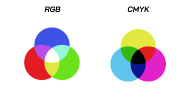
Even though the traditional red–blue–yellow model remains central in painting and design, modern color theory recognizes additional systems, each with its own set of primary colors depending on the medium and method of color production. In the world of light, the primary colors shift to red, green, and blue, forming the additive color system used in digital screens, stage lighting, and optical displays. When red and green light combine, they produce yellow; green and blue light yield cyan; blue and red light yield magenta. These secondary colors in additive mixing form their own wheel, showing how different wavelengths of light blend directly at the level of human perception. This modern understanding deepens the significance of primary and secondary colors, demonstrating that the color wheel is not merely a painter’s aid but a conceptual model that reflects the physics of light and the biology of the eye.
Despite the differences between subtractive and additive systems, the symbolic structure of the color wheel remains consistent: primary colors serve as the origins, secondary colors appear between them as the result of pairwise mixtures, and the full spectrum emerges from their transitional relationships. This geometry allows designers and artists to make intuitive choices about contrast and harmony. For instance, complementary colors—those positioned opposite each other on the wheel, such as blue and orange or red and green—produce strong visual contrast when paired. This contrast heightens vibrancy and draws attention, which is why complementary pairings are common in advertising, digital interfaces, sports team branding, and cinematic color grading. By contrast, analogous colors—those located next to each other on the wheel—produce soft, cohesive harmony, often used in paintings, interior design, and natural landscapes to evoke calmness or unity. These applications reveal that the wheel is not only a scientific tool but a deeply psychological one, mapping directly onto emotional and perceptual responses.
The arrangement of primary and secondary colors around the wheel also allows for understanding tertiary colors, which arise when a primary color mixes with a neighboring secondary color. Although tertiary hues extend the wheel into a more continuous gradient, the primary–secondary structure remains central because it anchors the relationships that govern all subsequent mixtures. These relationships are reflected in countless forms of visual practice. Painters rely on the wheel to avoid muddiness when mixing pigments, ensuring that harmonies remain bright and intentional. Photographers use color wheel principles when adjusting lighting conditions or post-processing images, balancing complementary tones to maintain natural skin appearance or to create dramatic emphasis. Cinematographers employ the wheel to structure color palettes in film, often using complementary pairs to heighten emotional contrast between characters or scenes.
In digital imaging, the color wheel is also encoded mathematically through color models such as RGB and HSL. The HSL model arranges hues around a circular path, directly mirroring the traditional color wheel but mapping them to numerical values that computer systems can interpret. This translation of visual relationships into digital frameworks shows how deeply the primary and secondary colors of the wheel inform modern technology. Web designers choose color schemes based on wheel-based principles, ensuring that user interfaces remain visually coherent, accessible, and emotionally expressive. Even virtual reality environments rely on these relationships, using color contrasts to guide attention, shape spatial perception, and maintain visual clarity.
The wheel’s importance extends far beyond aesthetics. In education, it offers a structured way for children and beginners to grasp the fundamentals of color mixing and visual relationships. In branding and marketing, companies use primary and secondary color relations to shape identity and influence consumer psychology. For example, pairing complementary colors creates energetic vibrancy, while analogous palettes are associated with refined subtlety. In interior design, the color wheel guides the creation of spaces that feel balanced, soothing, energizing, or dramatic depending on the desired effect. The ability to predict emotional impact through color choice demonstrates how primary and secondary colors shape human behavior and environment.
Even in scientific fields such as meteorology, geology, and medicine, color wheels appear as reference tools. Weather radar systems use color gradients that follow wheel-like structures to represent temperature or precipitation intensities. In geology, mineral samples exhibit natural color variations that can be mapped against wheel-based relationships. In medical imaging, color-coded outputs rely on systematic color relationships to communicate information clearly. These diverse connections show that the color wheel functions not merely as an artistic device but as a universal organizational structure for representing visual information.
Culturally, the significance of primary and secondary colors varies across traditions, yet the relationships embedded in the color wheel maintain consistent perceptual grounding. Many cultures assign symbolic meaning to specific colors, but the visual interactions—contrast, harmony, transition—remain grounded in the same universal perceptual principles. Whether applying color to textiles, architecture, ritual art, or digital media, creators across cultures draw unconsciously or deliberately from the wheel’s logic. The universality of these relationships arises from physiological constants: the human eye perceives color through cone cells tuned to specific wavelength ranges, and the brain interprets combinations of these signals as structured relationships. Thus, the primary and secondary colors are not simply arbitrary conventions but reflect the biological architecture of human vision.
The color wheel also illustrates how color mixing differs depending on materials. In pigment mixing, combining all primary colors eventually yields a muted or neutral shade because pigments absorb multiple wavelengths. In light mixing, however, combining all primary colors yields white because light waves add together rather than subtract. These differences reveal why artists must think differently from optical engineers, and why the wheel remains a flexible yet grounding tool across domains. Regardless of medium, the primary–secondary structure remains an anchor for predicting interactions.
Ultimately, the color wheel and its foundational primary and secondary colors represent a fusion of art, science, and perception. They form a language through which humans understand and shape visual experience, communicate emotion, and manipulate the environment around them. The wheel brings order to the complexity of color interactions, offering a framework that spans from classical painting techniques to modern digital displays. It captures the essence of how colors relate, contrast, blend, and harmonize, making it a timeless guide for both creative expression and scientific analysis. Through the structure of primary and secondary colors, the color wheel embodies the deep relationship between the human eye, the properties of light, and the aesthetic instincts that define human culture and creativity.