Inverse Square Law — Physics Concept Showing Intensity and Distance Relationship Explained Visually
The inverse square law is one of the most universal and illuminating principles in physics because it explains how the strength of many natural forces and intensities decreases as distance increases, not in a linear way, but by spreading out across an expanding area. The core idea is that when a physical quantity such as light, sound, gravity, electric field, or radiation travels outward from a point source, it does not remain concentrated but distributes itself across an ever-larger spherical surface. Because the surface area of a sphere increases with the square of the radius, the intensity experienced at any point decreases proportionally to the square of the distance from the source. This simple relationship — doubling the distance causing intensity to reduce to one-fourth, tripling the distance making it one-ninth, and so on — becomes visually clear when represented in a diagram. The point source sits at the center, and concentric spherical shells or circular wave fronts radiate outward; each new layer shows the same total energy spread over a larger surface area, making it immediately obvious that the farther a measurement point lies, the weaker the received effect will be. In this way, the inverse square law connects geometry with the behavior of physical reality, revealing that distance dilutes intensity because distribution enlarges the area across which the phenomenon must spread.
In a visual representation of the inverse square law, the strongest intensity is shown closest to the source, often using bold or saturated colors, wide arrows, or dense wave patterns. A light bulb shining in the dark appears extremely bright near its filament but the glow becomes softer as distance increases. In a diagrammatic grid, the wave fronts appear tightly spaced close to the source but widely separated farther out, reflecting how energy disperses rather than vanishes. If the total emitted energy remains constant, the amount reaching any one unit of area shrinks as expanding wave fronts grow larger. This is why someone standing one meter from a speaker hears music loudly, but at two meters the sound is not half as loud — it is only one-fourth as loud. A radiant heater warms hands strongly when close, but stepping farther away makes the warmth fade rapidly because the same heat is now distributed across a broad spherical region. The underlying mathematics need not be shown in a visual illustration for the concept to be understood; simply coloring the intensity zones and spacing the radiation rings conveys that distance weakens effects not gradually but steeply.
When the inverse square law is applied to light, the visual diagram commonly shows a lamp or star at the center with beams radiating outward. A grid overlay helps viewers see how twice the distance results in four times the illuminated area, causing brightness to drop to a quarter of the original. This visual is not merely conceptual — it describes astronomical reality. Stars appear faint not because they emit little energy, but because their light spreads across massive distances. Even the Sun would look like a dim star if it were moved only a few light-years away. Likewise, photography, astronomy, and stage lighting use the inverse square law to calculate proper exposure and illumination since brightness measured by a camera sensor or human eye depends heavily on distance. In educational illustrations, concentric rings around a point light source demonstrate how equal amounts of light remain constant overall but become less concentrated the farther one stands from the source. The viewer recognizes instantly that intensity is not lost; it is shared across space.
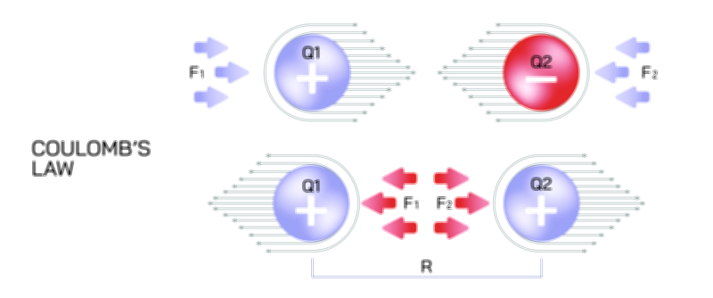
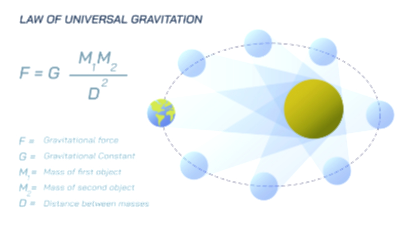
The same type of visualization applies to gravity and electric forces. A physical diagram showing the gravitational pull of a planet or the electric field around a charged particle uses field lines that start densely near the object and thin out with increasing radius. Inside the first circle, lines appear clustered; inside the second, they spread; inside the third, they become sparse, visually mirroring how force weakens with distance. This makes the inverse square law intuitive even without equations. A planet does not choose to weaken its gravitational pull; its gravitational influence simply spreads across an expanding spherical region, reducing the strength experienced at individual points farther away. Similarly, a positive charge has an electric field that fades rapidly because every additional meter increases the surface area of the imaginary sphere surrounding the charge and decreases the field felt at each point on that surface. Field diagrams communicate this without text: closeness equals strong effect, distance equals weak effect.
Sound intensity can be visualized using expanding circles radiating from a point source such as a speaker. Each circle represents a pulse of sound energy traveling outward. At one meter, the sound energy covers a relatively small circumference, but at two meters, the wave front circumference doubles and distributes the same total energy across a much larger surface, making the sound softer. Three meters makes the circle three times as wide and the intensity one-ninth as strong. A vector illustration depicting this pattern — with the central source, circular wave fronts, and labeled distances showing “1× farther = 1/1 intensity,” “2× farther = 1/4 intensity,” “3× farther = 1/9 intensity,” — allows learners to remember the principle visually rather than mathematically. The reliability of sound decreases with distance because the energy expands across space, not because the speaker emits less power. This visual metaphor helps understand real-world experiences such as why echoes become faint, why sirens become quieter as ambulances pass, and why sound insulation works by disrupting wave spread.
Radiation safety diagrams also rely heavily on inverse square visuals because they allow medical professionals and laboratory workers to calculate safe distances from X-ray machines, radioactive sources, and industrial radiation emitters. A small diagram with a source and distancing markers makes the law clear: standing twice as far cuts radiation exposure to a quarter, stepping three times farther cuts it to one-ninth, and stepping four times farther reduces it to one-sixteenth. In such diagrams, the exposure zones are color-coded — deep red near the source, fading to orange, then yellow, then light green — showing that distance alone dramatically reduces risk. This style of visualization helps individuals grasp that while shielding and exposure time matter, distance is one of the most powerful protective tools due to the geometric effect of spreading energy.
Even though the inverse square law applies across diverse scientific fields, the visual commonality remains the same: a central source and expanding regions that show decreasing intensity. Every illustration conveys the message that doubling distance has a stronger effect than intuition might predict. The human mind tends to assume that “twice as far means half as strong,” but the inverse square law proves otherwise, revealing that the world we live in is governed by geometric scaling rather than linear weakening. This is why learning through visual diagrams helps replace intuition with scientific reasoning. A simple sketch becomes an entry point to deeper understanding — that geometry influences physics decisively and predictably.
Ultimately, the inverse square law is a reminder that physical reality is shaped by spreading, sharing, and distance. Light, sound, force, and radiation do not dissolve as they move away; they extend into space and dilute because the universe gives them more room to occupy. A good visual illustration of the inverse square law captures this beautifully, showing concentric waves distributing the same energy over larger and larger areas. It communicates that intensity is not a mystery but a consequence of space, geometry, and distance working together. The diagram becomes a window into one of the most elegant principles of physics: the farther you are from a source, the more space the same energy must fill — and the weaker its effect becomes at any single point.