Line Types in UI/UX — Enhancing Layout, Hierarchy, and Visual Clarity
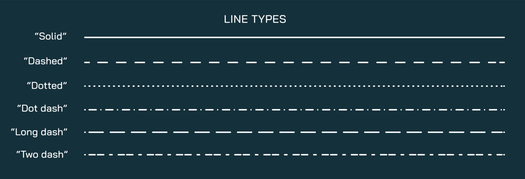
In UI/UX design, line types are essential visual elements used to structure layouts, separate content, indicate hierarchy, and enhance overall readability. Lines guide the user’s eye, define boundaries, and emphasize relationships between interface components. Common line types include solid, dashed, dotted, dot-dashed, long dash, and two dash, each serving a distinct purpose in digital design.
Solid lines are continuous and create clear separation between sections, buttons, or content blocks. They are the most commonly used lines in UI/UX for delineating borders, framing content, and providing structure without distracting from the overall interface. Solid lines are versatile and work well with both minimalistic and detailed designs.
Dashed lines consist of evenly spaced dashes and are often used to suggest optionality, draggable areas, or secondary content separation. They subtly indicate division without overwhelming the visual hierarchy, making them suitable for forms, cards, and guides.
Dotted lines use a sequence of small dots, creating a light, unobtrusive boundary. They are ideal for highlighting suggestions, tooltips, or auxiliary content, offering a gentle visual cue without drawing too much attention.
Dot-dashed lines, combining dots and dashes, are often applied to indicate alternating content or layered interactions. They can represent editable areas, workflow steps, or multiple states within a component, adding clarity while maintaining visual elegance.
Long dash lines are elongated dashes often used for timeline indicators, progress markers, or grouping related elements. Their length communicates distinction and separation clearly, enhancing the user’s understanding of sequences or categories.
Two dash lines consist of two consecutive dashes separated by a gap. These are particularly effective for highlighting boundaries between interactive and non-interactive elements or creating emphasis without the heaviness of solid lines.
Incorporating these line types into UI/UX design improves usability and visual hierarchy. Lines direct attention, reinforce alignment, and communicate subtle cues about interaction possibilities. For instance, a dashed border might suggest a clickable drop area, while a dotted line can indicate additional optional content. Proper use of line types reduces cognitive load, helps users understand relationships between components, and creates a polished, professional interface.
Visual illustrations of line types in UI/UX allow designers to see practical applications. They can be applied to menus, cards, panels, charts, forms, and navigation elements, demonstrating both functional and aesthetic purposes. Designers often combine line types with colors, shadows, and spacing to create layered and intuitive interfaces that are easy to navigate and visually appealing.
In conclusion, line types in UI/UX—solid, dashed, dotted, dot-dashed, long dash, and two dash—are versatile design tools that enhance layout, visual hierarchy, and usability. Educating designers about these line styles through illustrations and examples ensures thoughtful application in digital interfaces, improving clarity, interaction, and overall user experience. Mastery of line types contributes to a professional, intuitive, and aesthetically balanced interface design.