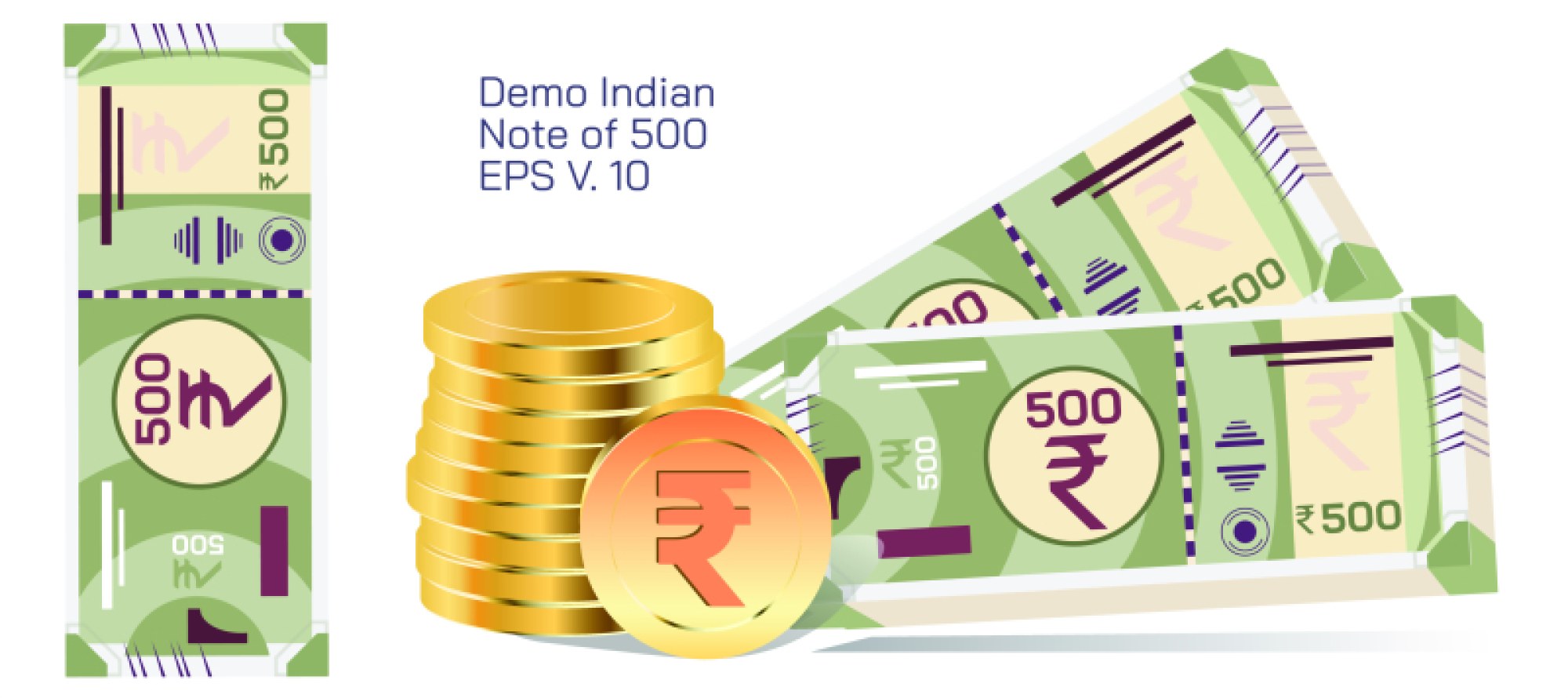
₹200 Indian Currency Note Demo Vector Illustration — Structure, Layout, and Visual Elements
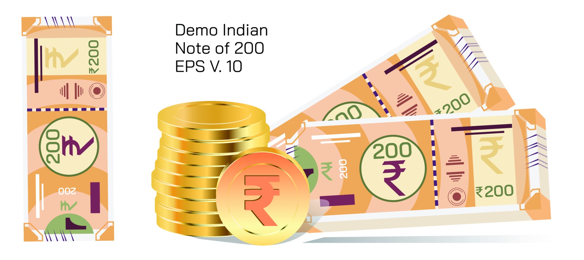
A vector illustration of the ₹200 Indian currency note serves as an excellent visual model for designers, educators, and learners who want to understand how banknote components are organized. Unlike photographic depictions, a vector version highlights clean edges, simplified shapes, and stylized features that clearly separate different design elements. This kind of illustration helps viewers appreciate the overall structure while avoiding the visual noise that appears in textured or shadowed photographs, making it ideal for demonstrations, presentations, and printed learning materials.
In a typical vector demo, the note is displayed in a flat, high-clarity format, often focusing on the essential parts such as the denomination markings, placement of major design elements, and overall proportion of the note. Vectors make it possible to enlarge the illustration without losing sharpness, which is particularly useful when explaining the note’s layout. This clarity helps emphasize components like the central number marking, specific design symbols, and decorative elements that give the note its distinct identity. Each shape, line, and pattern remains clean and precise, making it easy to analyze visually.
A demo illustration also highlights positional balance. It often places the denomination in bold regions to show how value recognition is enhanced in real notes. On the left or right side, depending on the version, the illustration may outline areas where key symbols typically appear. While such a demo never replicates sensitive or security elements, it provides a simplified representation that captures the note’s general composition. This makes the artwork suitable for educational purposes, classroom explanations, design studies, and infographic material.
Another advantage of a vector demo is its ability to break down sections for clarity. A designer might choose to display the placement of major components such as value text, background shapes, central emblem positions, and margin spacing. This shows how layouts maintain balance and readability. Because vectors rely on adjustable geometry rather than pixel grids, every element appears well-defined, allowing learners to clearly observe spacing, proportions, and alignment across the note.
These illustrations often serve as safe, non-sensitive practice material for graphic designers exploring how financial artwork is structured. They do not replicate any security features or authentic currency details, making them appropriate for educational or creative reference. A vector demo focuses on general placement, symmetry, and theme rather than functional authenticity. This helps learners differentiate between layout principles and the restricted elements used in real banknote production.
A ₹200 note demo vector also works well for creating teaching resources. Educators can use it to explain concepts such as proportion, symmetry, typography placement, color blocking, and visual balance. Students examining design concepts can benefit from seeing a structured, simplified representation that highlights composition. Because vectors can be recolored or adjusted without distortion, they allow flexibility for demonstrations across different educational settings.
In summary, a ₹200 Indian currency note demo vector illustration offers a clean, simplified, and well-organized representation of note layout. It helps designers study composition, educators explain visual structure, and learners understand how currency elements are arranged. By removing complex textures and sensitive elements, the vector form becomes a safe, versatile, and highly useful learning tool.