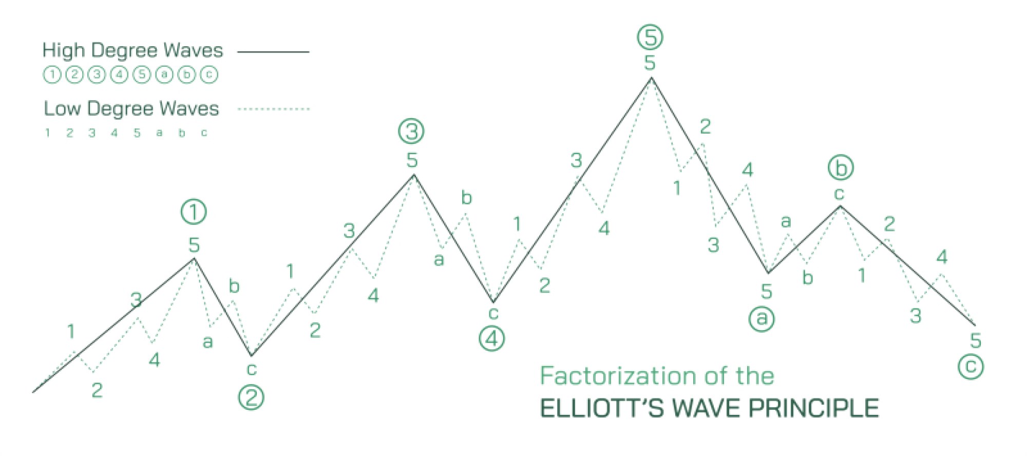
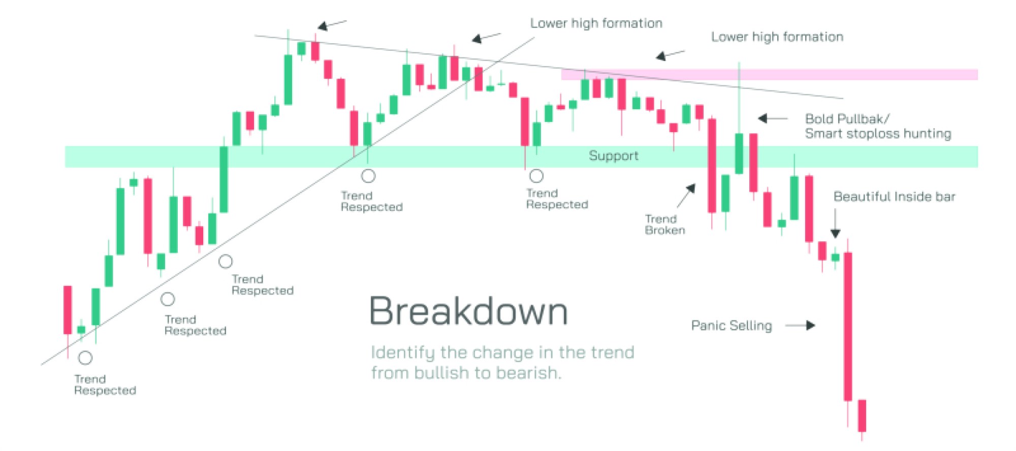
Demand Zone and Supply Zone Showing Price Action, Support–Resistance, and Market Trading Concept
In financial markets, the movement of price is not random — it reflects the collective decisions of buyers and sellers. Among the most important visual tools used by traders to understand price behavior are demand zones and supply zones, regions on a chart where market participants historically showed strong interest in buying or selling. These zones become psychological and structural reference points, influencing future price movements and forming the basis of many trading strategies. A vector illustration showing demand and supply zones usually depicts candlestick or price bars interacting with horizontal shaded regions, demonstrating how price reacts repeatedly when it enters those areas. Although the graphics appear simple, the underlying meaning reveals how the market measures value, liquidity, fear, and opportunity.
A demand zone represents an area on the chart where buying pressure has previously exceeded selling pressure, causing the price to rise sharply from that level. In visual terms, it appears below the current price and is usually drawn as a shaded or boxed region stretching horizontally across past candles. The logic behind a demand zone is straightforward: when the price previously entered this area, institutional or large traders stepped in aggressively to buy. Market participants remember this — consciously or algorithmically — and when the price returns, buyers often react once again. The zone acts as a support region, signaling that the market sees value there. For traders, the presence of a demand zone suggests a potential buying opportunity, as price may bounce and surge upward if demand comes back into the market. The strength of a demand zone is often judged by how quickly the price left it in the past and how little time it spent trading inside it, indicators of overwhelming buying interest.
A supply zone represents the mirror image of demand — an area where sellers previously overwhelmed buyers and caused price to fall decisively. It appears above the current price and is also drawn as a shaded horizontal region capturing the candlesticks where supply surged. When price last visited this region, institutions or large sellers entered the market with enough force to push price downward. As a result, traders expect selling pressure to reappear if price climbs back into this zone. The supply zone functions as a resistance area, where rallies often stall, reverse, or consolidate before deciding whether to break through. The sharpness of the previous decline from the zone helps measure its strength; the more violent and immediate the sell-off was, the more likely sellers will defend that level in the future.
These two kinds of zones sit at the heart of price action trading, a methodology that analyzes raw candlestick movement without relying on heavy indicators. Price action acknowledges that what drives the market is not the indicator itself but the intentions and positions of traders. Every time price enters a demand zone, buyers ask themselves whether price is cheap enough to re-enter the market. Every time price enters a supply zone, sellers evaluate whether the price has become expensive enough to justify taking profits or initiating new shorts. Because these evaluations are repeated across thousands of participants, demand and supply zones become self-reinforcing patterns. The crowd reacts the same way not by coincidence but because mass psychology recognizes the same value points on the chart.
Demand and supply zones reshape how traders interpret support and resistance. Traditional support and resistance lines focus on single price levels, while zones capture a range of prices, reflecting the reality that institutional orders do not execute at one exact number. Large market participants need liquidity — enough volume to fill massive orders — so they scale trades across clusters of prices rather than a single tick. Therefore, a zone is more accurate than a rigid line. In trading illustrations, this is shown using thick horizontal bands around past consolidation areas or around the base and top of sharp impulses.
When price interacts with these zones, the market typically displays one of several behaviors:
Price bounces from the zone
– At a demand zone, price rallies because buyers regain control.
– At a supply zone, price falls because sellers regain control.
Price consolidates inside the zone
– Market participants temporarily balance out, neither side dominating.
Price breaks through the zone
– A break of a demand zone converts it into future supply.
– A break of a supply zone converts it into future demand.
This conversion reflects a psychology reversal: buyers trapped below a broken demand zone often become sellers when price returns, and sellers trapped above a broken supply zone may become buyers when price retests the zone from the other side. Price action traders look for these break-and-retest structures because they often precede trending movements.
Illustrations also show that demand and supply zones are not all equally important. Zones formed by strong impulsive price movement — characterized by long candlestick bodies and minimal wicks — indicate powerful participation from large players and therefore have a greater chance of producing future reactions. Weak zones, created by slow or noisy movement, often fail to hold.
Liquidity and trader psychology provide the deeper explanation behind these patterns. When price drops into a demand zone, liquidity pools form as buyers place orders to re-enter the market at discounted levels. When price rallies into a supply zone, liquidity forms for sellers looking to exit positions at premium levels. These zones allow institutional traders to fill large orders without causing slippage. Retail traders unknowingly follow the footprints left by this institutional activity, and price action charts make it possible to see those footprints visually before entering the market.
A complete vector illustration of demand and supply zones typically contains:
• A price chart with candlesticks
• A demand zone highlighted below current price with upward arrows indicating buying pressure
• A supply zone highlighted above current price with downward arrows showing selling pressure
• Price movement bouncing or reversing within each zone
• Optional labels showing “support” near demand and “resistance” near supply
Without any numerical values or complex indicators, the illustration communicates a clear message: price gravitates between regions where demand overpowers supply and regions where supply overpowers demand. The constant interaction between these zones forms the rhythm of market structure, creating swings, trends, pullbacks, and breakouts.
Understanding demand and supply zones provides a powerful lens for interpreting financial charts. Instead of reacting emotionally to price movement, traders learn to think in terms of zones where professional buyers and sellers are likely to take action. The market becomes less mysterious and more structured once these zones are identified and respected. Whether the price bounces, consolidates, or breaks through a zone, every reaction becomes a piece of information — a signal of which side controls the market at that moment.
Through the simple combination of shaded regions and price movement, the vector illustration of demand and supply zones reveals the core engine of market dynamics: value perception, mass behavior, and the ongoing battle between buyers and sellers.