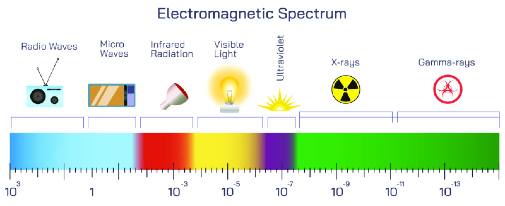
Electromagnetic Frequency Vector Illustration Showing Spectrum Range from Radio Waves to Gamma Rays with Wavelength and Energy Differences
The electromagnetic spectrum represents the full range of electromagnetic waves, characterized by frequency, wavelength, and photon energy. These waves span from long-wavelength, low-energy radio waves to short-wavelength, high-energy gamma rays, encompassing visible light, microwaves, infrared, ultraviolet, and X-rays. A vector illustration of the electromagnetic frequency spectrum typically integrates a continuous linear or logarithmic scale, showing the relationship between wavelength, frequency, and energy, providing a clear, educational visual for physics, engineering, and technology learners. By combining color-coded bands, labeled frequency ranges, and arrows indicating wavelength-energy relationships, the diagram conveys complex wave properties in an intuitive and visually engaging manner.
At the center of the illustration is a linear or logarithmic representation of the electromagnetic spectrum, spanning from radio waves on the low-frequency, long-wavelength end to gamma rays on the high-frequency, short-wavelength end. The horizontal axis often represents wavelength in meters, centimeters, or nanometers, while a secondary vertical axis may indicate frequency in hertz (Hz) or photon energy in electronvolts (eV). Arrows connecting wavelength and frequency demonstrate the inverse relationship between the two, as described by the wave equation, emphasizing that shorter wavelengths correspond to higher frequencies and greater energy.
Radio waves are positioned at the far left, characterized by very long wavelengths (up to kilometers) and low frequency (kHz to MHz). Vector diagrams may include practical examples, such as radio and television signals, communication satellites, or radar waves. Labels indicate typical wavelength ranges and frequency bands, and arrows may point toward energy levels, illustrating that radio waves carry minimal photon energy compared to other spectrum regions.
Microwaves, slightly shorter in wavelength than radio waves, are depicted next. Wavelengths range from centimeters to millimeters, with corresponding frequencies from GHz to tens of GHz. Vector illustrations often highlight their use in microwave ovens, communication systems, and radar applications, providing tangible context. Arrows indicate the slightly higher energy carried by microwaves, showing progression along the spectrum.
Infrared waves occupy the next segment, with wavelengths from about 700 nm to 1 mm and frequencies in the terahertz (THz) range. Vector diagrams may depict thermal imaging, remote controls, and heat emission, highlighting the interaction of infrared with matter. Shading or color gradients may show how infrared lies just beyond visible red light, linking the spectrum visually to human perception. Arrows may indicate photon energy increase compared to microwaves.
The visible light spectrum is illustrated as a rainbow gradient within the wavelength range of approximately 400–700 nm, with corresponding frequencies in the hundreds of THz. The vector illustration often shows color progression from violet (shortest wavelength, highest energy) to red (longest wavelength, lowest energy). Labels indicate individual color bands (violet, blue, green, yellow, orange, red), while arrows highlight photon energy differences, connecting visual perception to underlying physics.
Ultraviolet (UV) light follows, with wavelengths from 10 nm to 400 nm. Vector diagrams typically label UV-A, UV-B, and UV-C subdivisions, showing increasing energy and decreasing wavelength. Examples may include sun exposure, sterilization, and fluorescence applications. Arrows indicate the higher photon energy relative to visible light, emphasizing biological and technological effects such as DNA damage and germicidal activity.
X-rays are depicted with even shorter wavelengths (approximately 0.01 nm to 10 nm) and frequencies in the exahertz (EHz) range. Vector illustrations often include medical imaging or industrial inspection examples, highlighting the high-energy photons capable of penetrating tissue or materials. Arrows and color gradients illustrate the sharp increase in energy compared to UV light.
At the extreme right of the spectrum are gamma rays, with wavelengths less than 0.01 nm and the highest frequencies and photon energies in the electromagnetic spectrum. Vector diagrams may include examples such as nuclear decay, cosmic rays, or gamma-ray bursts, showing the immense energy carried by these waves. Labels indicate that gamma rays possess penetrating power far exceeding X-rays, emphasizing the importance of protective measures in radiation handling.
Vector illustrations often integrate a color-coded energy gradient or arrow scale above or below the spectrum to depict the direct correlation between decreasing wavelength and increasing energy. Dashed lines or labels may indicate specific frequency ranges, such as radio bands (AM, FM), infrared (near, mid, far), or UV subtypes. Magnified insets may show waveform diagrams, illustrating differences in oscillation frequency and amplitude across spectrum regions.
The diagram may also include comparative annotations for applications and biological interactions. For example, visible light is shown as perceivable by the human eye, infrared as heat, UV causing sunburn, X-rays for imaging, and gamma rays for ionizing radiation. Arrows or shaded overlays can indicate interaction intensity with matter, providing functional context to the physical properties.
By combining wavelength, frequency, energy, visual coloring, practical examples, and directional arrows, a vector illustration of the electromagnetic spectrum provides a comprehensive, visually intuitive understanding of wave behavior. Color gradients, labeled bands, and arrows reinforce the inverse relationship between wavelength and energy, while connecting abstract physical principles to real-world applications in communication, imaging, medicine, and astrophysics.
Ultimately, a vector illustration of electromagnetic frequency demonstrates the continuum from low-energy radio waves to high-energy gamma rays, showing how wavelength and frequency dictate energy levels and interaction with matter. Through labeled spectrum bands, color-coded gradients, directional arrows, and example applications, the diagram transforms abstract electromagnetic theory into an accessible, educational, and visually engaging framework for learners and professionals.