Say No to Plastic – Awareness Campaign Design, Visual Messaging Strategies, Symbolism, Emotional Appeal, Behavioral Change Goals, and Public Engagement for Environmental Protection
A “Say No to Plastic” awareness campaign design is built on one powerful idea: changing the way society views plastic from something convenient and harmless to something urgent, damaging, and preventable. The goal of the campaign is not only to inform people about the destructive environmental effects of plastic pollution but also to emotionally motivate them to take action in everyday life. Designing such a campaign requires a thoughtful combination of visual symbolism, meaningful messages, compelling storytelling, and accessible call-to-action elements that transform awareness into long-lasting behavioral change. The design must create an immediate emotional connection, a sense of responsibility, and a feeling of empowerment — encouraging children, youth, adults, businesses, and institutions to rethink their consumption habits and adopt sustainable alternatives. The campaign therefore becomes a bridge between environmental knowledge and real-world choices that protect oceans, soil, wildlife, climate, and future generations.
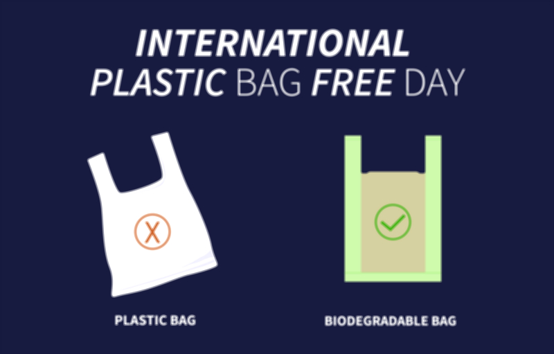
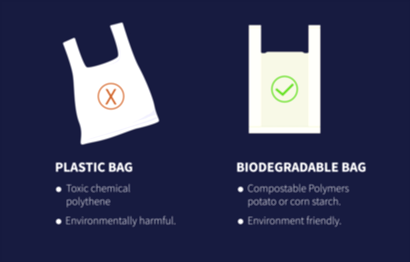
The heart of a successful “Say No to Plastic” design lies in its visual symbolism, which allows viewers to instantly understand that plastic pollution is harming the planet. Designers commonly use imagery that contrasts natural beauty with the damage caused by plastic waste — for example, a majestic ocean filled not with waves, but with floating bottles and bags; marine animals trapped in nets or mistaking plastic for food; soil suffocated under layers of plastic garbage; or a globe wrapped in plastic packaging representing Earth struggling to breathe. Another recurring symbol is the plastic shopping bag, which is instantly recognizable and emotionally charged because it represents the most common form of daily plastic use. Designers often change the visual role of the bag — turning it into the shape of a dead fish, a choking turtle, or a dripping toxic tear — to evoke empathy and shock. The central purpose of these visuals is not to cause fear, but to awaken awareness by revealing the silent tragedy happening in nature because of human negligence.
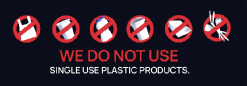
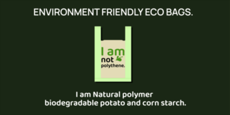
Graphic elements such as the banned symbol (a red circle with a diagonal strike) amplify the message of refusal by visually declaring that single-use plastic is unacceptable. This symbol, when combined with bags, cups, straws, bottles, cutlery, wrappers, and packaging icons, communicates instantly that the goal is total avoidance rather than partial reduction. At the same time, positive environmental symbols — leaves, oceans, trees, earth, recycling arrows, and reusable alternatives — help balance the message with hope and solutions. This duality of negative awareness and positive transformation allows the audience to emotionally process the problem while understanding that better choices are available. Vibrant campaign logos featuring phrases like “Say No to Plastic,” “Choose Reusable,” “Choose Planet Over Plastic,” “Protect Nature,” or “Plastic Free Future” reinforce the identity of the movement, making it memorable and easily shareable in print and digital media.
Color psychology plays a crucial role in intensifying the message. Green dominates sustainability campaigns because it represents life, nature, renewal, and environmental health. Blue symbolizes the oceans, clean air, and global well-being, reminding viewers that plastic threatens not only land but also water ecosystems. Brown and earth tones highlight soil conservation by contrasting the organic world with toxic synthetic waste. Red is often used strategically to express danger, urgency, and prohibition — especially in signs discouraging plastic use. A well-designed campaign balances these colors to reflect both environmental damage and environmental hope. When viewers see the poster, they should feel both the seriousness of the plastic crisis and the possibility of healing through sustainable action.
The emotional engagement of the campaign depends largely on the story it tells. A poster or banner becomes powerful when it makes people feel connected to the issue. Visual narratives showing marine life suffering because of plastic waste, birds feeding plastic to their chicks, or beaches buried in plastic shock the audience into awareness. Conversely, narrative visuals showing reusable bags, metal bottles, bamboo straws, compostable packaging, community cleanup activities, and smiling families emphasize the positive outcome of saying no to plastic. In many campaign designs, children are shown holding the Earth in their hands, symbolizing future generations inheriting the consequences or benefits of today’s choices. The more personal the message feels, the more likely people are to remember and act on it.
Typography supports the emotional tone of the design. Clear and bold fonts represent urgency and strength, while friendly rounded fonts communicate care and empathy. Short, direct phrases are the most effective, such as “Stop Plastic Pollution,” “Be the Change,” “Bring Your Own Bag,” “Refuse Single Use,” “Save the Oceans,” or “Your Choice Matters.” The wording should be simple enough for everyone — including school children — to understand instantly. In mobile-first and social-media-driven campaigns, the message must remain readable even on small screens, which is why large, high-contrast typography and limited text are preferred. If longer messages are needed, they are often placed under the main slogan in gentle supporting lines such as “One bag can take 500 years to decompose,” “Every bottle thrown today harms life tomorrow,” or “Small choices today protect the planet forever.”
A well-structured “Say No to Plastic” campaign design also guides the audience toward specific actions they can take. This is where visual icons and step-based cues become important — showing reusable shopping bags replacing plastic bags, refillable metal bottles replacing disposable water bottles, bamboo cutlery replacing plastic spoons, mesh bags replacing produce packaging, and compostable materials replacing synthetic wrappers. When people visually see the alternatives, they feel empowered and capable of contributing. The campaign becomes not just an alarm, but a toolkit that helps individuals make sustainable choices. Many successful designs also include QR codes directing people to educational resources, recycling centers, plastic-free stores, or community cleanup groups. In schools, awareness posters can be paired with pledge banners where students sign commitments such as “I refuse plastic bags,” “I bring my own bottle,” or “I reduce waste every day.”
The campaign design must be flexible enough to appear across multiple formats — posters, banners, classroom charts, murals, T-shirts, flyers, digital screens, social media posts, website headers, event backdrops, eco-bags, and rally placards. Each adaptation retains the core message but tailors the layout to the medium. For example, event banners may show inspiring imagery and slogans, while social media posts may focus on shocking statistics paired with strong visuals. School materials may use more colorful and cartoon-style graphics to connect with children, while corporate sustainability campaigns may use minimalist professional designs for brand alignment. Regardless of format, the visual identity must make it instantly clear that the campaign is against plastic and in favor of Earth-friendly living.
More than anything, the “Say No to Plastic” campaign design seeks to change daily habits — encouraging people to rethink their consumption patterns and recognize that sustainability is not only the responsibility of governments or environmental agencies, but of every individual. When people see an awareness poster repeatedly, whether on public walls, at school entrances, near markets, in community halls, or online, the message gradually becomes part of their mindset. Eventually, bringing a reusable bag becomes automatic, or refusing a plastic straw becomes instinctive. The design of the campaign therefore supports behavioral reinforcement, making the act of saying no to plastic feel normal, socially accepted, and morally responsible.
Ultimately, a “Say No to Plastic” campaign design is a visual movement for environmental protection. It brings together symbolic imagery, emotional storytelling, effective typography, color psychology, and action-oriented guidance to inspire sustainable change. Its message is simple yet profound: plastic pollution is not an unavoidable reality — it is a preventable one. Every individual has the power to protect the environment by choosing responsibility over convenience. Through collective awareness and thoughtful design communication, the campaign becomes a voice for oceans, soil, wildlife, and future generations. When people see the logo, poster, or banner, they are reminded that protecting the Earth begins with everyday decisions — and saying no to plastic is one of the most meaningful decisions we can make for the planet and for life itself.