Push and Pull Door Sign Designs for Clear Directional Guidance in Public and Commercial Spaces
Push and pull door signs play a far more crucial role in public and commercial environments than their simplicity might suggest, because every shared space depends on smooth and intuitive pedestrian flow to ensure safety, accessibility, and convenience. Whether it is a corporate office, retail showroom, airport terminal, hospital corridor, educational institution, restaurant, or government building, the entrance and exit pathways determine the rhythm of human movement and the first impression of the environment. When visitors approach a doorway, their ability to understand instantly whether they should push or pull affects not only comfort but also the overall operational efficiency of the facility. A poorly marked door can create confusion, hesitation, and bottlenecks, sometimes even resulting in accidents when crowded spaces force individuals into unplanned contact. In contrast, well-designed push and pull signs eliminate uncertainty in a fraction of a second by translating visual indicators into immediate action. For this reason, organizations increasingly recognize that door signage is not merely decorative but a functional communication tool that shapes both safety and user experience.
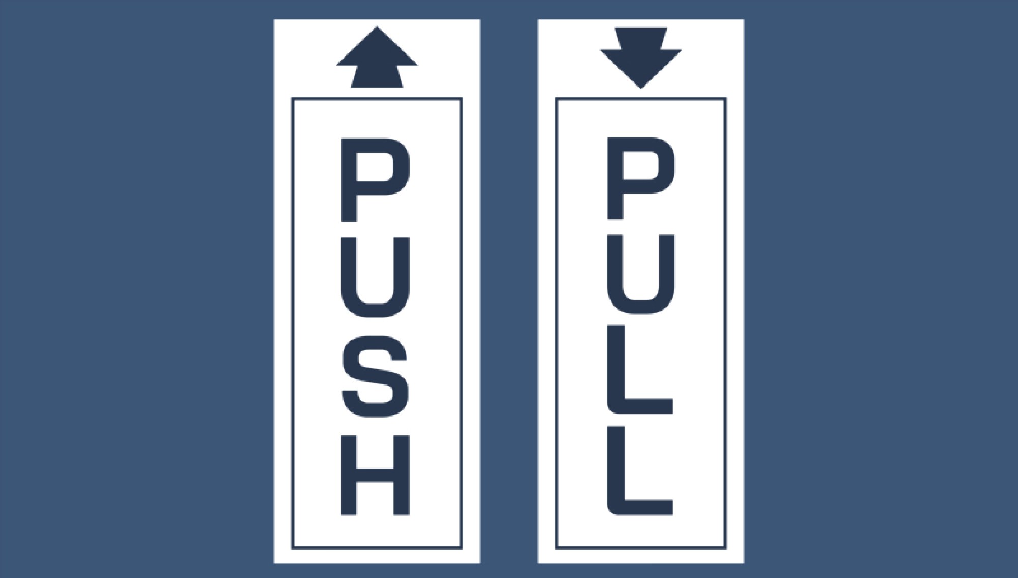
The effectiveness of push and pull signage begins with visual clarity, because the human brain processes direction-related messages fastest through clean typography, strong contrast, and consistent iconography. A high-impact typeface in bold characters reduces the cognitive load needed to interpret the message, helping individuals of all ages and literacy levels understand what to do without pausing. For example, a contrasting white “PUSH” label on a dark background or vice versa communicates information in a split second because the eye is drawn instinctively to the strongest color difference. Similarly, pairing text with universally recognizable symbols—such as an outward-pointing arrow for push and an inward-curved arrow or hand graphic for pull—supports non-native language speakers and those with limited reading proficiency. This becomes essential in international transit hubs, multicultural commercial centers, and public buildings where signage must transcend linguistic boundaries. Besides readability, placement height and viewing angle also influence comprehension. Signs positioned at natural eye-level and centered horizontally on the door panel ensure that the instruction becomes visible immediately upon approach rather than forcing users to search for guidance. When every dimension of visibility is considered, the sign becomes an intuitive piece of environmental communication rather than a decorative afterthought.
The design philosophy of push and pull door signage also emphasizes consistency across an entire facility. When different doors display mismatched fonts, symbols, sizes, or colors, visitors are forced to decode new visual systems every time they move through the building. This disrupts flow and increases the likelihood of hesitation, especially in areas with heavy traffic such as shopping malls, hospitals, and corporate offices. A consistent signage family, however, allows users to recognize the door system at a glance and make fast, confident decisions. Color-coding helps accomplish this, with many facilities selecting one uniform color theme for “push” and another for “pull” across all entrances and interior sections. This visual language becomes learned almost automatically after the first interaction, strengthening intuitive navigation throughout the environment. Consistency also extends to material and finishing choices. For instance, facilities employing brushed aluminum, glass engravings, acrylic plaques, or vinyl decals benefit from retaining the same material for every sign, reinforcing professionalism and brand cohesion. The uniformity creates a smooth psychological transition across spaces, reducing friction in movement and enhancing the perception of an organized, user-friendly environment.
Beyond aesthetics and clarity, ergonomics and safety remain essential considerations in push and pull sign design, particularly in environments that accommodate children, elderly individuals, or people with disabilities. Signs must be positioned high enough to avoid accidental peeling or damage yet low enough for wheelchair users to view comfortably. Clear fonts with ample spacing help individuals with visual impairments, while tactile surfaces or braille lettering are recommended in inclusive public facilities to support visually impaired users. In emergency situations, the ability to exit a building quickly and confidently may depend on how easily individuals can understand whether a doorway requires pushing outward or pulling inward. Thus, fire exit doors, emergency stairwell access points, and evacuation routes often require larger, bolder signage than regular interior doorways. The purpose is not merely regulatory compliance but creating a secure environment where directional confusion never worsens urgency or panic. The push and pull indications serve as immediate, muscle-memory prompts that guide safe physical action even when adrenaline heightens and mental calculation becomes harder.
Another dimension of successful push and pull signage involves the integration of design with brand identity. Commercial establishments in particular recognize the importance of turning every visual element—including door signs—into an extension of their brand tone and style. For instance, luxury hotels may choose elegantly engraved brass plaques paired with serif typography, while tech companies may favor sleek modern acrylic designs with minimalist lettering that align with contemporary interiors. Casual cafés and boutiques may find handwritten-style fonts or playful icons better suited to their personality. While the fundamental purpose of the sign remains functional, the visual execution reinforces the ambiance of the location and contributes to the emotional connection between visitor and space. Many designers achieve this balance by maintaining core signage principles—clarity, contrast, and instant readability—while adjusting secondary elements such as texture, shapes, colors, or icon creativity to align with the facility’s brand character. Thus, door signage becomes both a communication tool and a design asset.
Environmental durability further influences sign selection because push and pull indicators must withstand constant interaction, friction, cleaning materials, and sometimes outdoor weather conditions. In high-traffic areas like airports, schools, and retail outlets, decals may peel over time, necessitating more durable brushed metal or acrylic plates with UV-sealed paint. Outdoor entrances facing humidity or sunlight often require resin-coated finishes or corrosion-resistant steel to prevent fading or rust. In sectors such as healthcare and food service, where regular sanitization is mandatory, surface finishes must resist alcohol and disinfectant chemicals without smudging or abrasion. The ultimate goal is longevity, ensuring that signage continues to communicate effectively without requiring constant replacement or adding visual clutter due to wear and tear. When durability is designed intentionally, the signage remains clear, safe, and visually pleasing for years, contributing to long-term cost-efficiency.
Modern technology has also introduced digital and interactive variations of push and pull guidance, particularly in smart commercial buildings. Motion-sensor lighting can illuminate door signage as a user approaches, helping with nighttime visibility and energy conservation. In automated environments, digital screens installed on or beside glass panels can change instructions depending on the locked or unlocked state of the door. For example, a standard entrance might display “PUSH” during business hours but switch to “PULL” or “USE OTHER DOOR” when security access changes. While these advanced systems are not essential for most facilities, they demonstrate how signage continues to evolve in parallel with automation and user-centric design trends. Even in digital formats, however, the same rule applies: the design must deliver clear directional guidance instantly, without requiring thought or interpretation.
By analyzing push and pull door signs from every functional and environmental angle, it becomes clear that directional signage is one of the most valuable components of architectural navigation. The simple distinction between pushing and pulling can influence not only the flow of movement but also user comfort, accessibility, emergency performance, brand identity, and overall safety within a shared space. When signage is designed with clarity, consistency, inclusivity, and durability in mind, it transforms doorways from ambiguous points of decision into effortless, intuitive transitions between spaces. Well-executed push and pull signs therefore contribute quietly but powerfully to the harmony, efficiency, and professionalism of public and commercial environments, shaping the experience of every individual who passes through a doorway without needing to pause, wonder, or hesitate.