Modern Veg and Non Veg Symbol Vector Illustration for Clear Dietary Identification
The veg and non veg symbol system plays an essential role in food communication across restaurants, packaged goods and digital menu platforms. A vector illustration set built around these symbols must not only represent dietary categories accurately but also achieve clarity, cultural relevance and universal recognizability. In many regions, particularly in India, the veg and non veg symbols form an integral part of everyday food choices, helping consumers quickly understand what they are about to eat. When these symbols are designed as clean vector graphics, they achieve a level of precision and versatility that works effortlessly across print, packaging and digital environments.
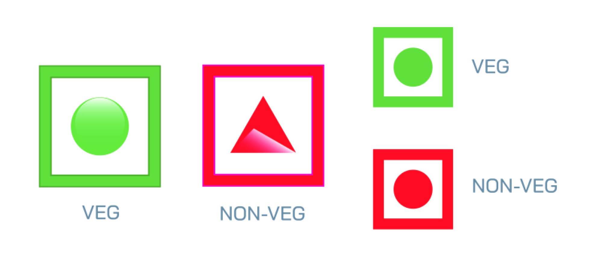
The veggie symbol traditionally uses a green square with a green circle placed inside it. This color represents freshness, plant-based nutrition and natural ingredients. In vector form, the symbol appears crisp, scalable and easy to integrate in menus, labels, signage or app interfaces. The simplicity of its geometric form assures immediate recognition regardless of size. Whether it appears on a tiny food packet corner or printed large on cafeteria boards, the symbol communicates its message without distortion or visual noise. Designers often refine the green tone, soften the edges or adjust stroke widths to meet brand aesthetics while preserving the essential meaning.
The non veg symbol follows the same structure but uses red instead of green, signaling that the food contains ingredients derived from animals. Red carries an instinctive attention-drawing quality, making the non veg marker stand out clearly even in crowded layouts. In vector style, the red square and circle maintain strong contrast, ensuring users instantly differentiate between veg and non veg options. This clarity is particularly important in environments where customers must make quick dietary decisions, such as online food apps, restaurant menus, grocery shelves and airline meal selection cards.
Creating a vector set of these symbols involves balancing form, proportion and visual harmony. The shapes must maintain consistent geometry and spacing, helping designers apply them to different platforms without worrying about mismatched aesthetics. The set may include variations such as outlined versions, filled versions, minimal thin-line styles or bold graphic styles. These adaptations allow businesses to align the dietary markers with their own brand identity while keeping the symbols universally understandable.
When these symbols are adapted for modern design contexts, they also integrate seamlessly with icons, typography and decorative elements that form part of menu layouts or product packaging. Their vector nature allows them to be recolored, scaled or layered while retaining sharpness. This flexibility is essential for magazine layouts, restaurant branding kits, instructional posters, mobile apps and grocery catalogues. The vector quality ensures that the symbols look equally clean on low-resolution screens and high-resolution print formats.
The importance of these symbols extends beyond aesthetics. They support ethical transparency and respect personal, cultural or religious dietary choices. Many people rely on these indicators to maintain dietary habits rooted in health, belief systems or personal preference. A well-designed set of veg and non veg symbols enhances trust between producers and consumers, showing commitment to clear and responsible communication. When customers see tidy, clear and aesthetically pleasing icons, it also contributes to a more professional experience.
In modern vector illustration, designers often experiment with subtle enhancements that do not interfere with official meaning. Improved contrast, gentle gradients, refined edges or elegant minimalism can make the symbols look contemporary while remaining fully recognizable. These enhancements help them fit naturally into elegant menus, premium packaging and visually rich interfaces without losing their core purpose.
A cohesive veg and non veg symbol vector set therefore stands at the intersection of function, clarity and design professionalism. It embodies the simplicity required for universal communication while offering designers enough flexibility to create polished visual systems across different media. Whether applied to magazines, restaurant menus, product labels or digital apps, these symbols continue to play a central role in guiding informed food choices, supporting transparency and elevating the overall visual quality of every platform where they appear.