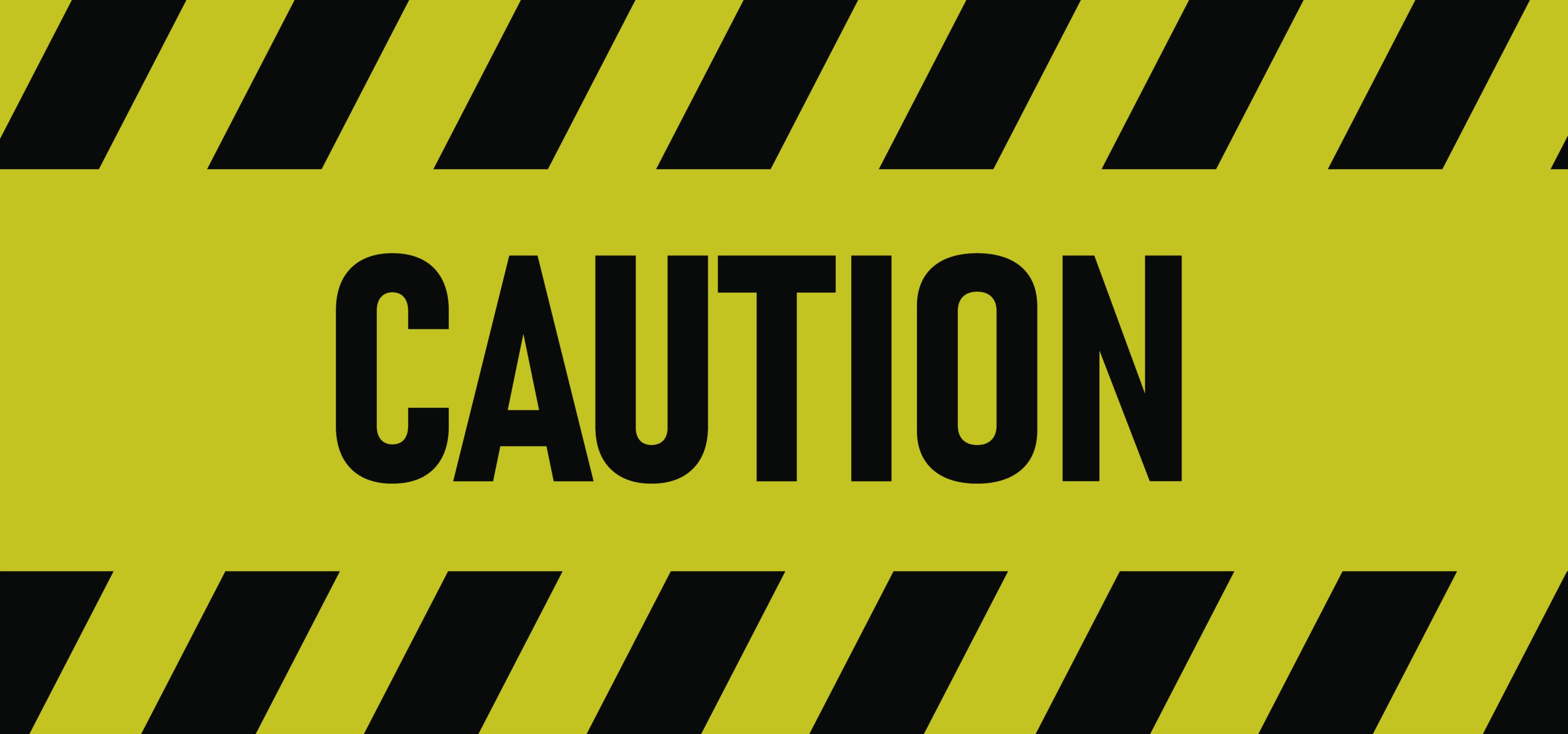
Caution Sign Vector Illustration — Yellow Safety Warning Board
A Caution sign, especially when illustrated as a clean and sharply defined vector graphic featuring a bold yellow background, strong black typography, and highly recognizable warning iconography, stands as one of the most universally significant tools of preventive safety communication found in workplaces, public areas, transportation networks, industrial environments, construction zones, laboratories, educational facilities, and countless other settings where human awareness must remain heightened. Although the word Caution may appear simple at first glance, its meaning carries far greater depth because it alerts every viewer that the space, equipment, or situation they are approaching is not inherently dangerous if handled correctly, but has the potential to become dangerous if ignored, misused, or approached carelessly. Unlike a sign that demands an absolute prohibition, the Caution sign does not forbid presence, entry, or activity; it instead warns that extra awareness, attentiveness, and self-control are required. It represents a psychological shift from routine behavior to mindful behavior — a moment where the brain transitions from autopilot into focused engagement because the surroundings are not typical and safety depends on informed action rather than assumption.
The sign gains much of its power from how the human mind interprets color and shape. Yellow has been universally adopted in safety communication because it strikes a balance between urgency and permission. It does not convey panic like red, nor neutrality like white or blue. Instead, it triggers the instinctive cognitive response that something ahead requires careful evaluation. Our brains associate yellow with alertness due to its prominence in nature, emergency visual signals, and hazard markings. Paired with black typography and borders, the contrast becomes immediately noticeable even from the corner of the eye, ensuring that the viewer sees the sign before engaging with the surrounding environment. The vector format intensifies this effect, because the crisp lines and sharp edges maintain flawless legibility at any size — from a tiny equipment label to a large outdoor warning panel — ensuring that no detail is lost regardless of scaling, lighting, or viewing distance.
The need for a Caution sign becomes clear when we observe how people behave in familiar or repetitive environments. The more comfortable individuals become with a space, the more likely they are to operate habitually rather than consciously. Routine can make people overlook elements that have changed — a wet floor that is normally dry, a piece of machinery that is usually idle, a hallway normally free of obstacles, or a surface that is unexpectedly slippery or fragile. Many minor injuries occur not because people deliberately act recklessly but because they assume that the space is unchanged from yesterday. A Caution sign disrupts that assumption by signaling that something here requires you to slow down, look carefully, and think before continuing. It transforms a space from predictable to alert-mode, encouraging the viewer to observe rather than assume.
The most direct purpose of the sign lies in injury and accident prevention. It alerts individuals to conditions that could cause harm if not respected — wet floors that could lead to slipping, uneven walkways that could cause tripping, low overhead beams that could cause head impact, fragile surfaces that could collapse under weight, electrical equipment that could shock if handled improperly, heated surfaces that could burn skin on contact, or areas where chemical, mechanical, or biological risks will remain dormant unless the wrong action is taken. These hazards do not always appear extreme or visible to the unconcerned eye. A clean-looking floor might still be slippery from a cleaning product. A polished metal surface might mask high temperature. A ladder might seem secure until someone climbs without checking weight limits. The Caution sign helps stop accidents not by removing the hazard, but by preparing the person to interact with it safely.
The sign also plays a profound role in workplace responsibility and industrial efficiency. In manufacturing plants, logistics hubs, laboratories, and heavy-equipment facilities, the Caution sign maintains productivity by preventing workers from making small mistakes that have large consequences. A worker who ignores a caution near automated machinery could interrupt delicate synchronization sequences or damage equipment worth millions. A forklift operator who ignores a caution zone might collide with fragile or high-value cargo. In hospitals, school science labs, or pharmaceutical facilities, the sign stops people from engaging with substances or devices that require trained handling. It allows specialized operations to continue smoothly without needing constant verbal warnings, oversight, or physical barriers. Instead of supervisors needing to watch every moment, the environment itself communicates where attention is necessary, which helps protect workflow along with safety.
Another critical dimension of the Caution sign is its role in legal compliance and organizational accountability. Safety regulations across the world require hazard communication to be visible anywhere a foreseeable risk exists. If an injury occurs and no proper signage was posted, the organization responsible for the space may be held liable for insufficient warning. However, when a Caution sign is clearly displayed, responsibility becomes shared — the environment provided a warning, and anyone entering is informed of their duty to act carefully. In courts, insurance investigations, and safety audits, the sign serves as documented evidence that the hazard was disclosed. This reduces legal uncertainty, protects ethical transparency, and ensures that the duty of care is demonstrated openly rather than assumed.
The Caution sign has important psychological and emotional effects as well. Without clear warnings, individuals often struggle with internal doubt when they sense a possible risk — Is this surface safe? Can I touch this equipment? Should I walk here or not? That uncertainty creates stress or hesitation. When a Caution sign is present, it removes ambiguity by clearly stating that a hazard exists and that the viewer should proceed carefully. People respond more calmly to risk when they know what to expect than when they are left guessing. The sign also reduces interpersonal conflict: instead of workers or staff needing to confront someone verbally about unsafe behavior, the environment itself asks for caution, reducing awkward or emotionally charged interactions.
The vector format of the sign reinforces reliability in environments where clarity is absolutely essential. A jagged or pixelated icon could become difficult to interpret quickly during motion or distraction, but a vector version maintains absolute edge definition regardless of scaling. This ensures that the triangular warning shape — one of the most instantly recognized shapes in safety signaling — triggers cognition almost automatically. The triangular form provides familiarity across cultures, languages, and literacy levels. Even individuals who cannot read the text will experience a reflexive caution response upon seeing the symbol alone, making the sign accessible to children, tourists, international workers, and persons with low literacy. It communicates without requiring language, ensuring safety through visual instinct rather than verbal comprehension.
On a deeper level, the Caution sign represents a universal human principle: awareness protects us. Much of modern safety does not rely on eliminating hazards entirely, because danger often exists naturally in workplaces and everyday life. Instead, safety depends on informed, attentive behavior. The Caution sign therefore is a partnership between the environment and the individual — it acknowledges that risk exists and empowers people with knowledge so they can protect themselves rather than walk blindly into harm. It does not accuse, restrict, or prohibit; it teaches and reminds. It brings responsibility into consciousness and allows people to avoid injury through awareness rather than through trial and error.
Ultimately, the Caution Sign Vector Illustration — Yellow Safety Warning Board stands as a preventative rather than reactive safety solution. It stops accidents before they happen, not by force but by knowledge. It allows workflow, freedom of movement, and human activity to continue without shutting down spaces, yet still ensures that individuals act with appropriate care. It protects physical wellbeing, operational continuity, legal fairness, emotional comfort, and social respect simultaneously. Every time someone slows down near a spill, watches their footing on a construction site, avoids touching hot machinery, moves cautiously near electrical equipment, or simply pauses to evaluate surroundings, the Caution sign has fulfilled its purpose. Through a short but powerful message amplified by unmistakable design, it transforms everyday environments into spaces where safety and awareness coexist naturally — allowing people to remain productive, confident, and protected through the simple human act of paying attention.