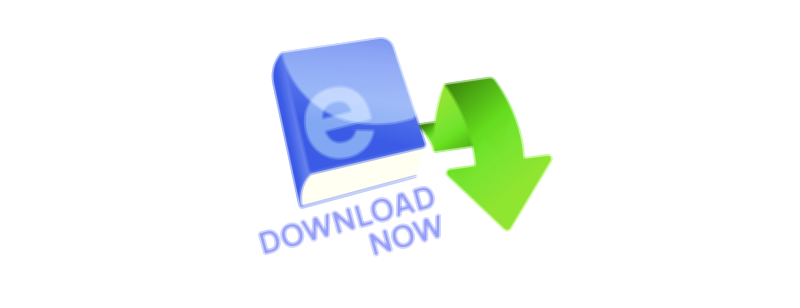
Stylish E-Book Download Now UI Button – Vector Illustration for Digital Reading Apps
A stylish E-book Download Now UI button designed as a vector illustration for digital reading apps represents more than a simple call-to-action — it captures the modern identity of reading in a digital age where learning, imagination, and entertainment travel directly through a screen into the hands of the user. The “Download Now” button is no longer just a technical trigger; it is the gateway to personal growth, curiosity, comfort reading, and self-driven education. When styled creatively, it becomes an iconic visual element of the reading experience, encouraging users not just to tap, but to feel excited about accessing a new story, a new lesson, or a new opportunity.
The stylish aspect transforms the button from a plain rectangle into a piece of digital design that communicates mood, emotion, and brand identity. Instead of flat lifeless shapes, the illustration embraces modern UI aesthetics — rounded floating shapes, smooth gradients, subtle shadows, glow effects, glass-panel transparency, or neon accents depending on the app’s personality. A stylish button tells the user: reading digital books isn’t just convenient… it’s enjoyable, elegant, and satisfying. When a user sees this button, they don’t feel pressure — they feel encouraged and intrigued.
Visually, the design often pairs meaningful symbols with the text to eliminate ambiguity and increase instant recognition. A downward arrow merging with a book silhouette, a cloud download icon layered above a digital page, or a stylized bookmark tag becoming part of the button’s structure reinforces the message: tap here, and you get a book immediately. These icons sit within the button not as decoration but as informational cues that enhance usability and cut decision time. In fast digital interfaces, where users skim rather than analyze, this combined visual signal becomes essential to smooth UX.
A stylish e-book button might softly glow against a dark reading interface or sit floating above a bright educational space. The goal is always to feel deliberate — the button should look like an invite, not an interruption.
Typography is another key ingredient. The message “Download Now” must be instantly readable but also pleasant and welcoming. Rounded sans-serif fonts are popular because they feel friendly and modern. Some apps make the word Download larger than Now to emphasize the action; others enlarge the entire phrase to position the button as the visual anchor of the screen. In stylish UI, text weight and spacing balance clarity with elegance. Even when shrunk to smaller mobile layouts, the button keeps its message unmistakable.
Because this button is a vector illustration, it gains adaptability that raster graphics cannot match. It remains sharp and crisp whether displayed:
• as a thumbnail layered on top of book covers
• as a large CTA in onboarding screens
• inside dashboards and learning progress sections
• in promotional cards inside the reading app
• in external marketing banners or social media posts
• in email newsletters encouraging downloads
• in desktop or tablet e-library platforms
No pixelation, no quality loss — the button can grow, shrink, recolor, or restyle while staying perfectly clean. Editable layers allow marketing teams and designers to re-theme the artwork to match seasonal promotions, dark mode/light mode preferences, or UI redesigns without rebuilding it from scratch.
Beyond visuals and technical adaptability, the deepest purpose of the stylish E-book Download Now UI button is emotional motivation. Apps succeed when users move from curiosity to action, and reading — despite being rewarding — often requires a psychological first step. A clean, attractive button lowers hesitation and transforms interest into momentum. Tapping it feels good because the UI aesthetic tells the user that learning or reading is not a chore, but a delightful personal investment. The button is not pushing — it is welcoming.
In digital reading and online learning, that micro-moment — the moment when someone chooses to download a new book — matters more than most other touchpoints. It is the spark that turns a reader into a learner, a learner into a regular user, and a regular user into someone who builds a personal digital library. A stylish, inviting call-to-action makes that spark more frequent and more satisfying.
Ultimately, a stylish E-book Download Now UI button vector illustration for digital reading apps is more than a UI component. It is the symbolic doorway into all the growth, imagination, knowledge, relaxation, and inspiration that the digital library holds. It tells every reader:
A book is waiting for you.
You can have it right now.
All you have to do is tap.
And in that gentle invitation, the journey of learning — page by page, book by book — begins.