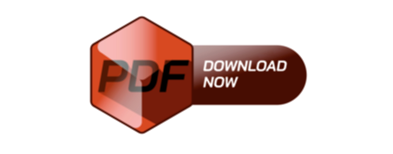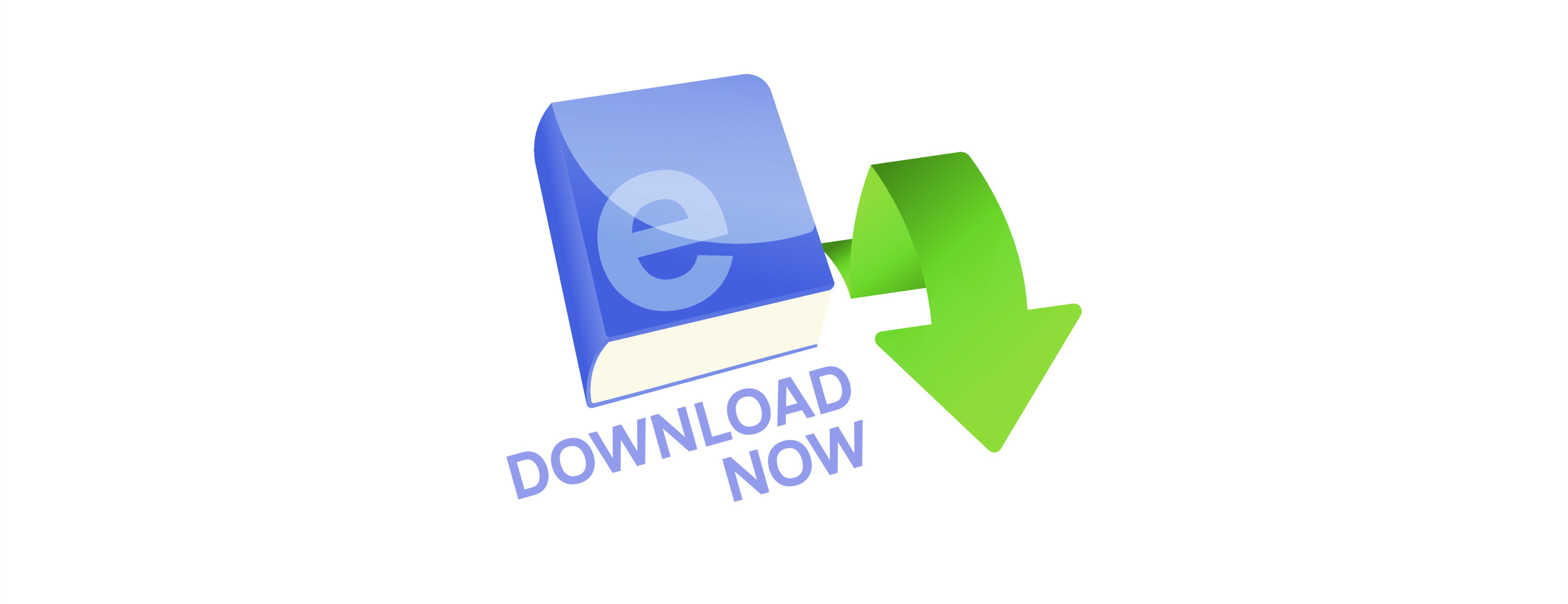
Download Now E-Book UI Button — Vector Illustration Concept for Digital Reading Apps, Visual Design Logic, and User-Centered Interaction Flow
A “Download Now” e-book UI button in a digital reading app is much more than a basic graphic element; it is a pivotal point in the user journey where interest transforms into action and where the platform demonstrates its reliability, convenience, and polish. In mobile and desktop reading environments, users browse vast libraries of books, summaries, reviews, and recommendations, so the instant they decide to obtain a title must feel both simple and rewarding. A thoughtfully designed button that visually communicates clarity, trust, and immediacy plays a major role in whether users continue exploring the app, return to it later, and ultimately treat it as their primary library. A vector illustration developed for this button provides an ideal medium to teach and demonstrate these ideas because scalable vector artwork captures precision, good UI structure, and the layered principles of digital design in a format that translates smoothly into real user interfaces.
The visual identity of a “Download Now” e-book button begins with color choice because color influences both recognition and emotion within the app. A primary accent color that contrasts well with background elements ensures the button stands out immediately among book covers, text blocks, and menus. For premium reading apps promoting calmness and immersion, the palette might include cool blues or soft purples with subtle gradients that hint at depth without being aggressive. Entertainment-driven apps might use brighter tones such as amber or teal to match an energetic, youth-oriented theme. What matters most is that users recognize the button instantly regardless of screen size, lighting conditions, or genre aesthetics. Color consistency across the interface becomes a visual habit that allows users, even subconsciously, to learn that this button is a central control point in the system — the place where they secure the book they want.
Typography plays an equally important role in shaping visual clarity. Because the phrase “Download Now” communicates an immediate reward, its placement inside the button must be both highly readable and friendly. A clean sans-serif typeface in a medium or semibold weight usually works well, maintaining legibility across small phone screens and high-resolution tablet displays. Generous padding around the text ensures that the label is not squeezed into a rigid space, which would make the button feel cramped and hard to tap. In multilingual reading apps, the typeface selection must also support global character sets so that users can view the button in their preferred language without losing style consistency. When a vector illustration of this UI element emphasizes these typographic choices — clear lettering, comfortable padding, crisp alignment — it teaches viewers how user trust is built from small but intentional visual decisions.
Iconography reinforces comprehension, especially in reading apps where fast interpretation enhances convenience. A downward arrow, a cloud icon, or a stylized book symbol next to the text subtly reassures users that tapping the button will transfer a file to their personal library or offline storage. The icon should complement rather than dominate the label; the text remains the primary anchor because users rely on explicit language when making transactional decisions. Smooth corner rounding, soft shadows, and polished surface lighting effects add the sense of an inviting tactile surface without overwhelming the layout. Vector illustrations excel in communicating these details because they show how curves, highlights, icon placement, and visual weight balance together to produce a refined action element.
The interaction sequence associated with this button is just as important as the visual presentation. When users tap the “Download Now” button, the UI must respond instantly. A pressed state might slightly darken the surface or show a ripple effect, visually confirming that the action was received. A loading state — for example swapping the text with a spinner and a message such as “Downloading…” — reduces uncertainty and prevents users from repeatedly pressing the button. When the download is complete, the button can morph into “Open Book”, “Read Now”, or “Continue” to communicate that the next stage of the reading journey is ready. Each of these transitions communicates safety, progress, and responsiveness. A static design cannot show these moment-to-moment changes, but a well-structured vector illustration can represent multiple button states side-by-side to teach developers and designers how the experience evolves from tap to completion.
Placement also shapes how users engage with the call to download. On a book detail page, the button is usually positioned near the pricing area or just below book metadata and synopsis — a location users naturally focus on when deciding whether to commit. In search lists or category grids, smaller icons or micro-buttons may appear that expand to a full “Download Now” button when users tap into a specific title. In a library page, the button might appear only if the book is not yet stored offline; otherwise, “Read” takes priority. This conditional rendering helps keep the interface clean and supports user expectations. A vector illustration meant for scientific or educational study can show this contextual variation by presenting multiple layouts: large actionable buttons for detail screens, compact variants for listing screens, and completed states for downloaded content.
Accessibility must be central to the conceptualization of this button. Good contrast ensures visibility against both light and dark backgrounds. Adequate size and spacing make tapping comfortable even for users with motor limitations or small screens. For screen reader users, descriptive labels such as “Download this e-book now — [Book Title]” provide clarity and ensure that visually hidden roles match the visible purpose of the element. Animation effects must remain subtle to prevent motion sensitivity issues. When a vector illustration includes contrast overlays, spacing guides, and text size annotations, it becomes a powerful instructional tool showing how inclusive design elevates an interface from attractive to truly user-centered.
Brand personality should shine through gently but clearly in this UI element. A cozy book-focused platform might choose soft lighting and gentle gradients that evoke the warmth of a personal bookshelf, whereas a cutting-edge academic platform might emphasize precise grids, sharp edges, and minimal color to represent professionalism. The stylishness of the button lies in how well its visual language aligns with the values of the app: elegance for literature lovers, vibrance for comics platforms, serenity for meditation-reading apps, futurism for sci-fi specialty platforms, and so on. The “Download Now” button becomes a micro-ambassador of the app’s aesthetic philosophy, reinforcing emotional identity every time it appears on the screen.
When illustrating this UI component in vector form for design education or UI development guides, creators typically showcase several snapshots: the default button state with full text and icon, the hover or pressed state with color-shift feedback, the loading state with progress indicator, and the finished state where the label changes to “Open” or “Read Now”. Each version teaches how users transition through stages and how the design encourages clarity at every point. Vector art also demonstrates modularity — consistent corner radii, cohesive typography, proportional spacing, and adaptable size variants for mobile, tablet, and desktop breakpoints.
In a digital reading environment, downloading a book marks a meaningful emotional moment: curiosity turning into ownership and anticipation turning into reading. A “Download Now” UI button that looks polished, behaves smoothly, and expresses the personality of the platform supports that moment beautifully. It reduces hesitation, builds trust, and contributes silently to the long-term habit of using the app regularly. When people click this button again and again over time, it becomes part of their reading ritual — an elegantly designed gateway to discovery, learning, comfort, and imagination.
A stylish vector illustration of the “Download Now” e-book button therefore captures not only an interaction but the philosophy behind digital reading design. It conveys to developers, UI designers, and students of interface design that the smallest components — when crafted thoughtfully — can shape how people experience technology, value content, and enjoy the simple delight of opening a new book.