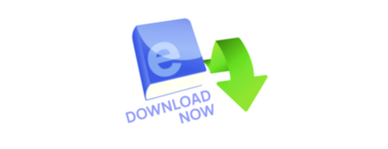
E-Book Download Now UI Button – Vector Illustration for Digital Reading Apps
A vector illustration built around an E-book Download Now UI button for digital reading apps carries a powerful symbolic role in the modern learning ecosystem because it turns the act of reading into something immediate, lightweight, and delightfully accessible. While physical books evoke imagery of shelves, pages, and time set aside, the digital e-book makes reading mobile, flexible, and available in whatever moment curiosity surfaces. The UI button becomes the interactive doorway to that promise. Its simple instruction, “Download Now,” represents not just a technical action but an emotional guarantee: the knowledge or story the user seeks is available instantly, without delay, without barriers, and without dependence on physical space or materials. When rendered as a polished vector illustration, the button becomes more than a clickable element — it becomes an invitation into learning, imagination, skill development, and self-improvement.
The main visual focus of this type of button illustration is not the complexity of detail but the clarity of meaning. It is designed so that the user understands its purpose within the first glance, even before reading the text inside it. Modern UI design relies on recognition rather than interpretation. A rounded button shape, a digital device frame, a cloud icon, a downward arrow, or the silhouette of an e-book symbol communicate that something will be retrieved, stored, or accessed immediately. These shapes create a visual rhythm that suggests flow: the book travels from the digital library to the reader’s device. The vector style keeps the shapes crisp and adaptable, ensuring that the button retains instant clarity at any size — whether shown as a tiny icon overlay on a book thumbnail or as a full promotional banner encouraging users to build their personal digital library.
Color is another essential aspect of the emotional narrative. Digital reading apps often choose colors that evoke calmness, focus, and enjoyment, because reading is fundamentally a cognitive and emotional journey. Blues create a sense of trust and concentration; greens represent personal growth and learning; purples connect the experience to creativity and imagination; oranges and yellows add energy, enthusiasm, and warmth; teals and aquas communicate modern intelligence. These palettes make the act of downloading a book feel positive rather than transactional. A button shaded in smooth gradients, framed by gentle glow, or highlighted with subtle depth shadows reinforces the sense of value — this download brings something beneficial and fulfilling.
Typography inside the button must match this emotional tone. Rounded and human-friendly fonts often work best because they feel welcoming rather than academic or rigid. The words “Download Now” are direct and confident but not aggressive, echoing a balance between call-to-action and respect for the reader’s pace. In some designs, the type may be paired with a tiny open-book icon or a digital page-flip symbol to make the meaning unmistakable. The UI button becomes a quick, effortless signpost that tells the user: the reading experience is just a click away. Instead of overwhelming the interface with promotional text, the button encapsulates the invitation with clean simplicity — the text and graphics together form a unified mental shortcut rather than a sentence that must be processed.
What makes this vector illustration especially meaningful for digital reading apps is how it contributes to the flow of the user journey. In the world of digital learning and reading platforms, momentum matters. A reader who sees a preview or a sample chapter develops instant curiosity. A learner who discovers a relevant book during study needs access without delay to maintain focus. A new reader exploring an app for the first time feels more engaged when the next step requires only a tap rather than effort. The “E-book Download Now” button serves this psychological momentum by eliminating hesitation and reducing friction. It tells the user that their interest is valid and that learning, enjoyment, or discovery can begin immediately.
The vector format makes this UI button illustration even more valuable because of its adaptiveness across environments and devices. It can appear on mobile screens, tablet dashboards, desktop reading platforms, smartwatch widgets, and even promotional graphics outside the app — social media banners, email newsletters, onboarding screens, e-library announcements, or course modules. No matter the display, the button remains sharp and readable because it is composed of resizable vector paths rather than fixed pixels. Designers can recolor the entire button to match brand identity, adapt it to light mode or dark mode, resize it for tiny floating overlays or giant landing page call-to-action blocks, or animate its layers for micro-interaction effects without sacrificing crispness. This makes the button both a graphical symbol and a structural asset in the interface.
Yet the deeper purpose of the button is not purely technical or visual. It represents a philosophical change in the way learning and reading are perceived. Older models of education often positioned books as something earned, restricted, or rationed based on time, place, or institutional privilege. The digital book turns learning into something democratized — anyone with a mobile device can hold a library in their hands. Clicking a button may seem like a small gesture, but the emotional meaning behind it is much bigger: it is the moment when the learner decides to explore, to grow, to be curious. The button becomes the threshold between intention and action, between curiosity and knowledge.
The illustration also communicates security and ownership. When a reader presses “Download Now,” they are not just accessing information — they are acquiring it for themselves. The book becomes theirs, stored on their device rather than only streamed from afar. This sense of ownership increases motivation and emotional connection to the reading process. It encourages users to build personal digital libraries the same way earlier generations built physical ones. The vector button communicates that with each click, the reader is adding to something meaningful — their learning bank, their imagination space, their reference archive, their personal journey.
Modern UI trends emphasize designing call-to-action buttons that spark emotional satisfaction rather than urgency. Today’s digital learning platforms rely on subtle animations, soft glow rings, hover lift effects, or ripple feedback responses to make the user feel rewarded for tapping. The vector illustration is foundational to these experiences, because clean shapes and layered structure make it possible to animate depth, light, and movement. The button doesn't simply say “Download Now”; it invites the click and celebrates the decision.
Ultimately, an E-book Download Now UI button vector illustration for digital reading apps symbolizes far more than a download. It represents the moment where curiosity turns into commitment, where interest becomes learning, and where knowledge becomes personal. It stands for the ease and empowerment of accessing information without limitation — anytime, anywhere, at any pace. It reminds every reader, student, educator, and lifelong learner that the barrier between wanting to know and beginning to know has never been smaller. And in that simple doorway — that single button — exists a world of stories, skills, subjects, ideas, and growth waiting to unfold the moment the user decides to begin.