Stylish E-Book Download Now UI Button for Digital Reading Apps — Visual Design Strategy, Interaction Flow, and User Engagement
A stylish “E-book Download Now” UI button on a digital reading application is far more than a simple rectangle that triggers file retrieval; it is a micro–experience that reflects the identity of the reading platform, supports the habits and expectations of digital book lovers, and communicates a smooth and delightful transition from browsing to ownership. In the world of mobile and web reading apps, users interact with a marketplace of books that spans thousands of genres, languages, and formats, so the button that invites them to download a title becomes a focal point in their journey. Its design affects how confidently users choose a book, how quickly they understand what will happen when they tap, and how friction-free the reading experience feels. When an interface presents a polished, appealing “E-book Download Now” component, it reassures the user that the digital library is well-organized, reliable, and pleasurable to use. This is why even a single button deserves deep design thinking and careful visual execution if the app aims to deliver an exceptional user experience.
The look and feel of this UI component begins with color psychology and brand consistency. A digital reading platform tends to evoke emotions such as calmness, focus, and discovery, so the “E-book Download Now” button should visually support these sentiments. For apps targeting a minimalist professional audience, a muted palette such as subtle blues, warm grays, or desaturated greens suggests clarity and stability. For apps focusing on entertainment or youth-oriented genres, vibrant gradients, bold hues, or glowing accents add energy and excitement to the action. In all cases, the button must stand out without breaking the visual rhythm of the page; it should be instantly noticeable on a product page yet harmoniously integrated into the app’s typography and layout. Because digital reading platforms frequently feature large book covers, text summaries, and recommendation carousels, the size and placement of the download button must cut through visual noise in a way that is elegant but assertive. If the button is too large, it risks overwhelming surrounding content; if too understated, users may scroll past it. Designers achieve balance by using directional layout flow — for example, placing the button directly below book metadata or close to the pricing block so that the eye naturally arrives at the call-to-action.
Typography also plays a crucial role in how compelling the button feels. A phrase like “E-book Download Now” expresses an action that is both immediate and rewarding, so the typeface should communicate confidence through clarity rather than decoration. A clean sans-serif font in a medium or semibold weight usually conveys precision and readability across devices, while generous letter spacing and a slight roundness in the curves provide a friendly, approachable tone. Text size must remain large enough to be comfortably readable on mobile screens, while padding around the label ensures the button feels spacious and touch-friendly rather than cramped. If a digital reading app supports multilingual content, typeface selection must also consider glyph compatibility so that the call-to-action remains visually consistent in English, Arabic, Hindi, Chinese, Spanish, or any supported language. Effective typography reminds the user that the platform respects clarity and ease of use — qualities closely associated with a pleasurable reading experience.
Many modern reading apps enhance their download button with subtle graphic elements that make the action visually intuitive. A downward arrow icon, a book spine symbol, or a cloud-with-arrow graphic reinforces that a file is about to be saved for offline reading. However, iconography must remain secondary to text because users rely primarily on the label for comprehension; icons should support recognition and not compete for attention. Rounded corners on the button give an inviting feel, while shadows or soft glows can add depth without appearing flashy. A concave inner shadow may hint tactile feedback, almost as if the button is a physical surface users can press. These small details influence the emotional tone of the interface — whether the app feels elegant, playful, serious, or futuristic becomes visible in every curve and glow of the button.
Interactivity elevates the button from a static UI piece to a sensory and functional experience. On touch devices, the instant the user presses “E-book Download Now,” the button should visually respond to confirm that the input was registered. This might involve a slight darkening of the background, a shift in elevation, or a short ripple animation. Such feedback builds trust and reduces anxiety, especially in digital marketplaces where users want reassurance that their action is being processed. After the tap, the next UI state should appear quickly — perhaps a loading spinner embedded into the button label, followed by a status like “Downloading…” and then “Added to Library.” This live progression prevents confusion about whether the action succeeded and supports a seamless mental flow from store to personal collection. If the button instantly transforms into a secondary action like “Read Now” or “Open Book,” the app communicates that the download is complete and the next step is available. Over time, users associate this reliability with a satisfying reading ecosystem, and their loyalty deepens.
The placement of the “E-book Download Now” button across different screens has notable influence on user satisfaction. On a dedicated book detail page, it is typically featured prominently near the top half of the layout so users do not need to scroll extensively just to begin downloading. On a list or search results view, the action is often discovered through an icon or a smaller button that appears only when tapping into the item, preventing overcrowding of the screen. Within a user’s personal library, the button may appear for newly added books that have not yet been downloaded for offline access. This variation in context-sensitive presentation ensures that the button remains helpful rather than intrusive. Good UI design avoids repetitive persuasion; if a book is already downloaded, the interface should display “Open,” “Continue Reading,” or “Resume” instead of showing a redundant download option. These intelligent micro-interactions contribute to a polished experience that respects user intent.
A stylish UI button must also address accessibility, especially because reading platforms attract users across a wide range of ages and visual abilities. High contrast between the button’s text and background ensures readability for people with impaired vision or those using the app in bright outdoor lighting. The button should be large enough to support comfortable tapping and placed far enough from other controls to prevent accidental touches. For screen reader users, the button label should be programmatically clear, such as “Download this e-book now — Book Title,” so that navigation technology communicates the exact purpose of the control. Animated transitions should be gentle, respecting users with motion sensitivity. Each of these considerations reinforces that a beautiful UI is inclusive and welcoming — and for a digital reading app, that is especially important because its purpose is to broaden access to literature and learning.
Brand identity strengthens emotional connection with the app and plays an important role in button aesthetics. A platform focused on classic literature may choose elegant muted tones, serif fonts, and a subtle book motif. A lifestyle-focused e-reading service might lean into gradient-rich color schemes, polished surfaces, and soft glowing strokes that imply modernity and comfort. An academic reading tool might take on a clean professional appearance with minimal distraction, neutral colors, and ultra-precise spacing to emphasize efficiency. Whatever direction the brand chooses, a stylish “E-book Download Now” button should feel unmistakably like part of that world. Every interaction with it — from the first glance to the moment the book begins downloading — reinforces the platform’s promise: convenience, accessibility, discovery, and joy in reading.
The psychological effect of this button is linked to the user’s journey. Downloading an e-book is an anticipatory moment, where curiosity about content turns into ownership. When the UI guides this moment gracefully, the user experiences satisfaction even before reading the first page. After several repeat interactions, the user begins to trust the app not just as a tool but as a personal library — a place where books wait safely and instant access is guaranteed. The “E-book Download Now” component becomes a ritual that invites users deeper into the reading habit, encouraging them to explore more titles, build personal collections, and eventually see the app as an integral part of their learning and entertainment lifestyle.
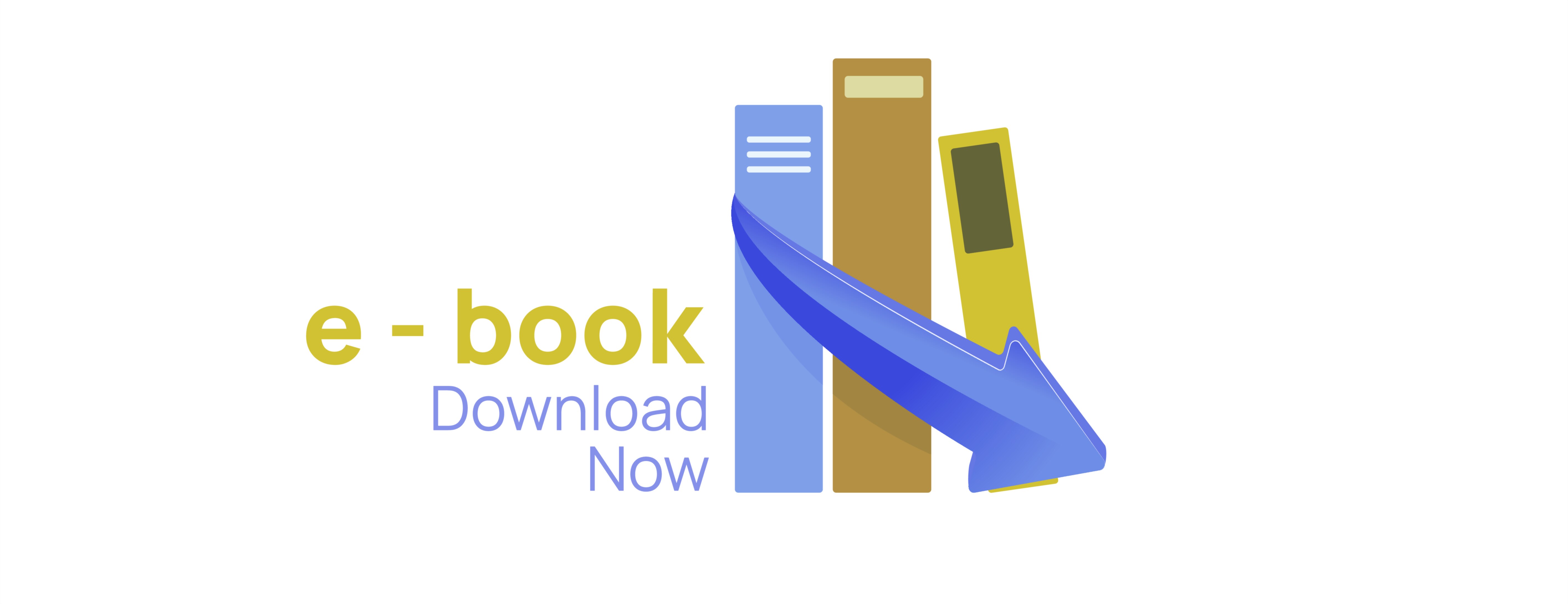
A vector illustration representing this stylish UI button can communicate all of these qualities visually. It can highlight rounded edges, modern typography, light reflections, soft gradients, icon integration, and a clearly labeled action area. It can depict button states such as default, pressed, loading, and completed to show the full micro-interaction cycle. It might also present multiple color variations — a primary version for high conversion contexts and secondary versions for softer contexts such as reading recommendations or curated collections. Such an illustration becomes a resource for interface designers and developers to implement not just the appearance but the behavior of a polished call-to-action.
Ultimately, a stylish “E-book Download Now” button succeeds when form and function reinforce one another. It should look beautiful, feel intuitive, perform quickly, and align with the emotional landscape of digital reading. When it achieves that combination, users are not only persuaded to click — they feel good doing so. Over time, such thoughtful UI details shape the identity of an app, make reading more enjoyable, and build a relationship of trust in which each downloaded book represents not only content acquired but an experience enhanced.