Order Now, Limited Offer, and Shop Now — Designing High-Impact E-commerce UI Assets
In e-commerce design, phrases like “Order Now”, “Limited Offer”, and “Shop Now” do much more than decorate a button; they are the core triggers that turn browsing into buying. These small pieces of text, along with their surrounding visual assets, carry a surprising amount of psychological, strategic, and aesthetic weight. When you think about UI assets for an online store, you are really thinking about how to guide a user’s attention, reduce hesitation, communicate urgency or value, and help them feel confident about taking the next step. A well-designed call-to-action button or banner looks simple, but behind that simplicity lies a careful balance of wording, color, size, contrast, spacing, and placement. Understanding how “Order Now”, “Limited Offer”, and “Shop Now” differ in meaning and usage, and how to visually support those messages, is essential for crafting UI assets that convert visitors into customers without feeling aggressive or confusing.
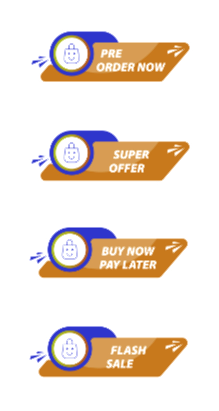
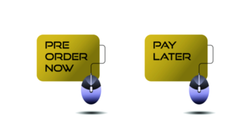
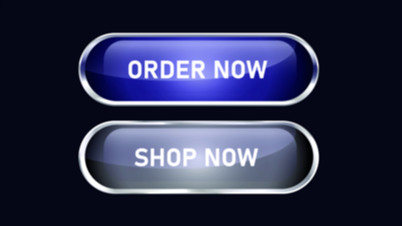
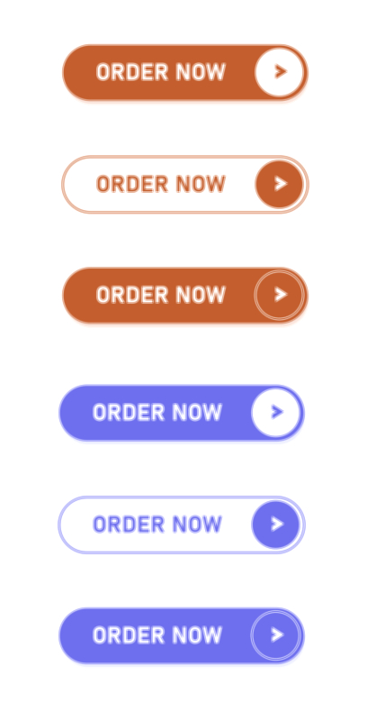
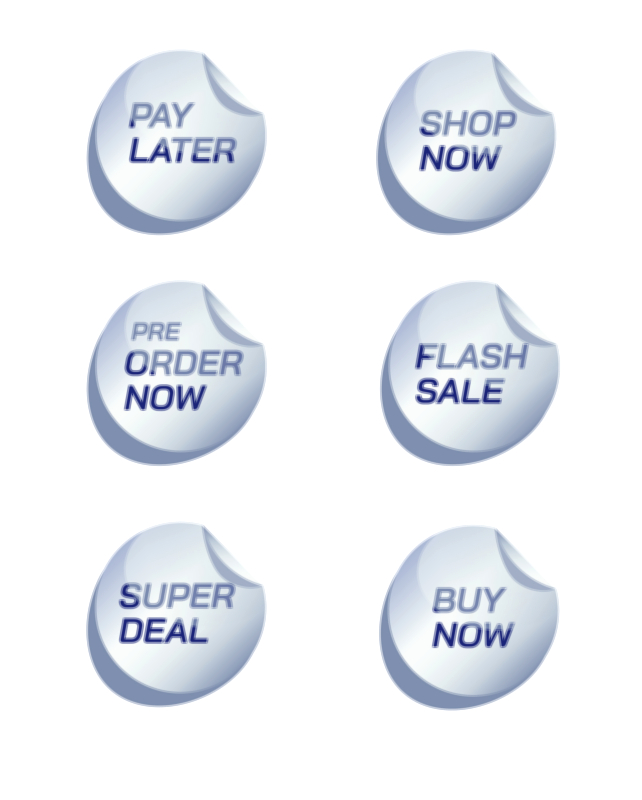
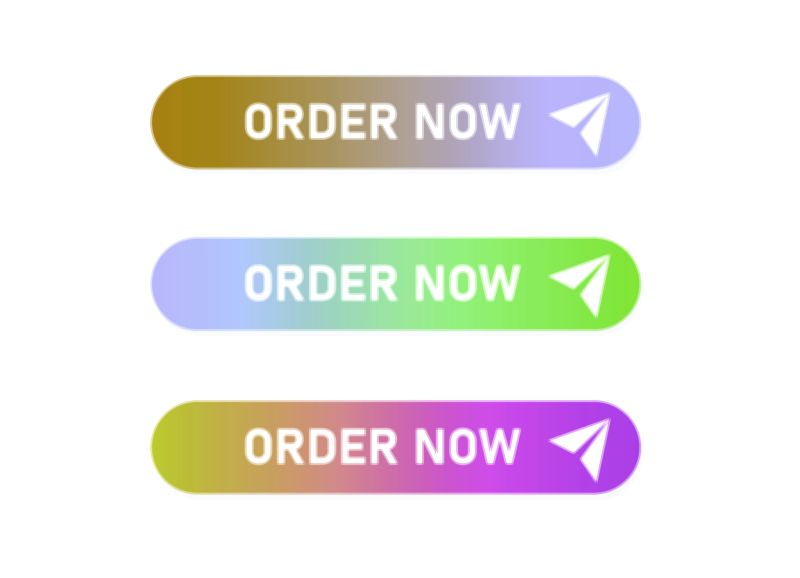
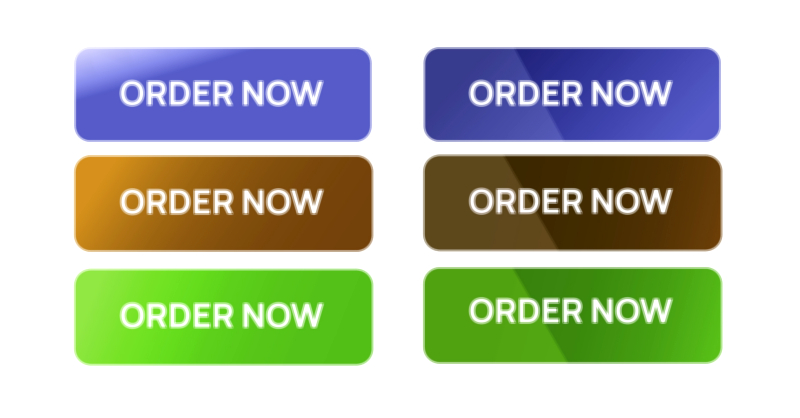
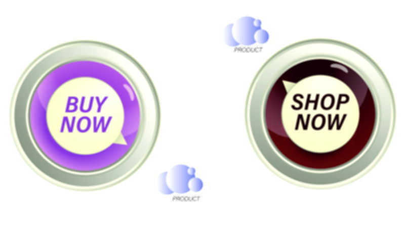
“Order Now” tends to signal a direct, decisive action. It is most effective when the user is at a point of high intent and is either ready to purchase or very close to it. In an e-commerce interface, this phrase often appears on product detail pages near the price, under the main product image, or alongside configuration options like size, color, or quantity. The tone of “Order Now” is stronger and more transactional than “Shop Now”, which makes it particularly suitable for individual items, bundles, or offers where the path from the button to checkout is short and clear. Visually, assets that carry “Order Now” should avoid ambiguity in their hierarchy: the button or badge must stand out from surrounding elements while still matching the brand’s design system. A clear background color with strong contrast, legible typography, and enough padding to feel tappable on mobile devices all contribute to a sense of reliability. When the UI frames “Order Now” with supportive microcopy such as delivery information or return policy hints, users are more likely to feel safe and motivated to commit.
“Shop Now” occupies a slightly different position in the customer journey. Where “Order Now” is about finalizing a choice, “Shop Now” is about exploration and entry into a catalog or category. It is commonly seen on hero banners, promotional cards, campaign sections on the homepage, or category tiles. The phrase invites users to discover, browse, and see more, rather than immediately pushing them to payment. Because the emotional tone is lighter and more open-ended, UI assets with “Shop Now” can lean a bit more into visual storytelling. A hero image with lifestyle photography, subtle gradients, or dynamic illustrations can be paired with a “Shop Now” button that serves as a focal point, pulling the user into a collection or theme. This is especially effective in seasonal campaigns, new arrivals sections, or curated collections like “Back to School”, “Festive Favorites”, or “Summer Essentials”. In these contexts, “Shop Now” functions as a friendly door, and the UI assets surrounding it, such as background images, icons, or highlight badges, should support the narrative of what the user will gain by clicking.
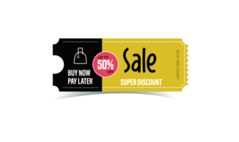
“Limited Offer” introduces a different psychological lever: urgency and scarcity. It is not a direct action phrase like “Shop Now” or “Order Now”; instead, it describes the condition of the deal and frames the time sensitivity or exclusivity. This copy works best when paired with another action, such as “Limited Offer — Shop Now” on a banner or “Limited Offer — Order Now” on a specific product. Used correctly, it nudges users to act sooner rather than later by suggesting that the window of opportunity is closing. In UI design, “Limited Offer” is often supported by visual signals associated with time and scarcity: countdown timers, subtle animated badges, labels like “Ends Today”, or small tags near the price. However, it is important that these assets are not overwhelming or misleading. If everything on the page is labeled “Limited Offer”, the user quickly becomes desensitized and may start to doubt the brand’s honesty. The visual hierarchy must be clear: “Limited Offer” elements should be special, strategically placed, and visually distinct, but they must also respect the overall cleanliness of the layout.
When designing a set of cohesive UI assets around these phrases, consistency becomes one of the most important rules. Each button, badge, and banner should feel like part of the same visual language. That means using consistent corner radius, shadow style, color palette, and typography across “Order Now”, “Shop Now”, and “Limited Offer” elements. At the same time, you can differentiate them through details: for instance, primary action buttons like “Order Now” may use a brand’s main accent color, while secondary actions like “Shop Now” might use an outlined style or a softer color variant. “Limited Offer” tags could use a more attention-grabbing hue such as a warm accent that signals urgency, but still harmonizes with the primary palette. This layered system allows users to learn the meaning of different visual signals unconsciously: they start to recognize which buttons are decisive, which ones invite exploration, and which labels indicate special conditions or time-bound deals.
Typography has a major influence on how these phrases feel. Short, punchy calls-to-action rely on clarity instead of decoration, so the typeface must be easily readable across screen sizes and resolutions. Many e-commerce interfaces use bold or semibold weights for button text to improve legibility and give the action a sense of importance. Choosing a type size that is comfortable for both desktop and mobile ensures that users do not have to strain their eyes or zoom in. Capitalization style also alters tone: “ORDER NOW” in all caps feels more urgent and commanding, while “Order now” or “Order Now” feels more conversational. For “Limited offer”, a slightly smaller size or lighter weight might be used when it appears as a badge near the price, so it supports rather than fights the primary price and action text. Managing line spacing and letter spacing becomes especially important when text appears inside small badges or overlaid on images; crowded letters can damage clarity and reduce the professional feel of the interface.
Color and contrast govern whether these assets actually catch the user’s attention. Buttons and badges must stand out sufficiently from the background and surrounding elements to be immediately identifiable as interactive. This is not just a matter of marketing; it is also a matter of accessibility and usability. For users with visual impairments or for those browsing on a screen in bright light, low contrast text or overly subtle buttons can make the interface feel frustrating. Designers often test their “Order Now” and “Shop Now” components against recognized contrast guidelines to make sure the text remains readable over their chosen colors. In addition, interactive states such as hover, pressed, and disabled should be clearly visible. A hover effect on desktop might slightly darken the button or add a gentle shadow, reinforcing that it can be clicked. On mobile, pressed states might slightly shrink or darken the button to provide tactile feedback. For “Limited Offer” labels, color must be chosen carefully so that the text remains readable even when placed over product photos or colorful banners.
The placement of these UI assets within the layout is another crucial dimension. “Shop Now” is typically placed in prominent hero sections where new visitors land, or near the top of collection pages where users can branch into more specific areas of the catalog. “Order Now” is most effective closer to the decision point, typically near “Add to Cart” or as the main call-to-action on a product page and in the cart summary. In some interfaces, “Order Now” is used on one-click purchase buttons or on final checkout steps to convey that the user is about to complete payment. “Limited Offer” badges can be placed near the price, near the product title, or at the corners of promotional cards. The common thread is that users should not have to search for these elements; they should naturally fall within the primary reading pattern of the page. Good layout design respects how people scan screens, often moving from top to bottom and left to right, and uses alignment, spacing, and grouping to make these calls-to-action feel like obvious next steps rather than hidden options.
Microcopy around these primary phrases significantly influences how users interpret them. While the button itself might say “Order Now”, a small line of text near it can clarify what happens next, for example noting shipping timeframes or return policies. This reduces anxiety at the moment of decision and makes the act of clicking feel less risky. Near “Shop Now”, microcopy might highlight a key value proposition such as “New arrivals just dropped” or “Discover curated picks”, helping users understand what type of experience they are about to enter. For “Limited Offer”, microcopy could clarify the constraint, such as “Valid until midnight” or “Only 3 left in stock”, making the urgency grounded and specific instead of vague. These small additions are part of the UI assets as much as the buttons and badges are, and they play a powerful role in building trust.
Interactivity and animation can add another layer of effectiveness when used tastefully. Subtle motion, such as a gentle pulse on a “Limited Offer” tag when it first appears, can attract the eye without feeling like a distraction. A slight slide-in motion for a “Shop Now” button in a hero banner can make the layout feel more dynamic and modern. However, motion must be controlled carefully; continuous flashing or aggressive movement can annoy users, increase cognitive load, and even cause discomfort for people sensitive to motion. Thoughtful animation should have a purpose, such as drawing initial attention or signaling state change, and it should stop once that purpose is fulfilled. When designing these animated assets, it is useful to consider performance as well; overly heavy animations can slow down page load, especially on mobile devices with weaker hardware or slower connections, which in turn undermines conversion.
Accessibility considerations should be woven into the design of “Order Now”, “Shop Now”, and “Limited Offer” assets from the beginning. Color contrast is one piece, but ensuring that buttons are large enough to tap comfortably on touchscreens is just as important. Adequate spacing between touch targets reduces accidental taps and frustration. For keyboard users, focus states must be clearly visible so that moving through interactive elements is easy and predictable. Screen readers should be able to announce buttons with descriptive labels; sometimes that means adding more context for assistive technologies, such as labeling a button “Order Now — Red Sneakers, Size 9” instead of simply “Order Now” in the underlying code. Although this layer is not visible in the visual illustration, it is part of the overall design thinking behind UI assets meant for real-world use.
From a branding perspective, these UI components are not generic; they embody the tone, personality, and values of the store. A luxury brand might use a more refined color palette, subtle gradients, and calm hover effects, with copy that feels composed and elegant. An energetic, youth-oriented brand might use bright colors, bold typography, and playful microcopy that makes “Shop Now” feel exciting and fun. In both cases, the goal is similar, but the emotional experience differs dramatically. Even the phrasing can be adjusted to fit brand voice, such as “Start Shopping”, “Get Yours Now”, or “Grab the Offer”, while still fulfilling the functional role of those classic terms. When building a consistent UI kit or design system, designers often define variations of these core components so that campaigns, product pages, and special events can all draw from the same visual vocabulary.
Finally, one of the most important realities about these UI assets is that they are not static; they evolve through testing and iteration. In practice, teams often experiment with different wording, colors, sizes, and placements to see which combination yields better engagement and conversion. Sometimes a simple change from “Shop Now” to “View Collection” might work better for a specific audience, or a softer color might actually perform better because it aligns more closely with the rest of the brand experience. Data from these experiments informs design refinements, and over time the “Order Now”, “Limited Offer”, and “Shop Now” components become progressively more effective. For educational or illustrative purposes, vector assets representing these components can show idealized versions, but in real design practice they represent hypotheses to be validated with users, not universal fixed rules.
In summary, “Order Now”, “Limited Offer”, and “Shop Now” UI assets are central to e-commerce interfaces because they bridge intention and action. They signal what the user can do next, how urgent an offer is, and what kind of experience awaits beyond a click or tap. By carefully considering text, typography, color, contrast, spacing, placement, microcopy, motion, accessibility, and brand personality, designers can create vector-based UI elements that are not only visually appealing but also intuitive, respectful, and persuasive. These small pieces of the interface, when thoughtfully crafted, can transform a flat, passive page into an engaging shopping journey where users feel guided, informed, and confident as they move from browsing to exploring, from exploring to deciding, and from deciding to ordering.