Order Now Button UI/UX – The Psychology, Design Strategy, and Emotional Influence Behind the Most Powerful Call-to-Action in Digital Commerce
The Order Now button may appear to be a small feature in a shopping app or website, yet it carries one of the greatest responsibilities in digital business: turning user interest into user action. It is the moment where browsing becomes buying, decision becomes commitment, and curiosity becomes conversion. UI/UX designers build entire user journeys around what eventually leads to this button, because it represents the final step of confidence for the shopper. When a customer finally reaches the point of placing an order, the button does not merely function as a clickable element — it works as a psychological signal that must feel safe, encouraging, and effortless. The success of e-commerce, food delivery apps, travel portals, subscription platforms, and digital marketplaces depends heavily on how this one component communicates trust, clarity, urgency, and ease within a fraction of a second.
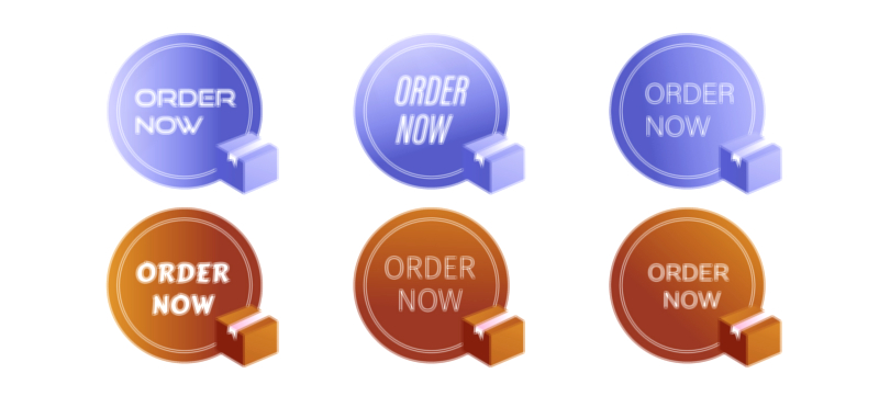
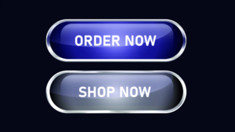
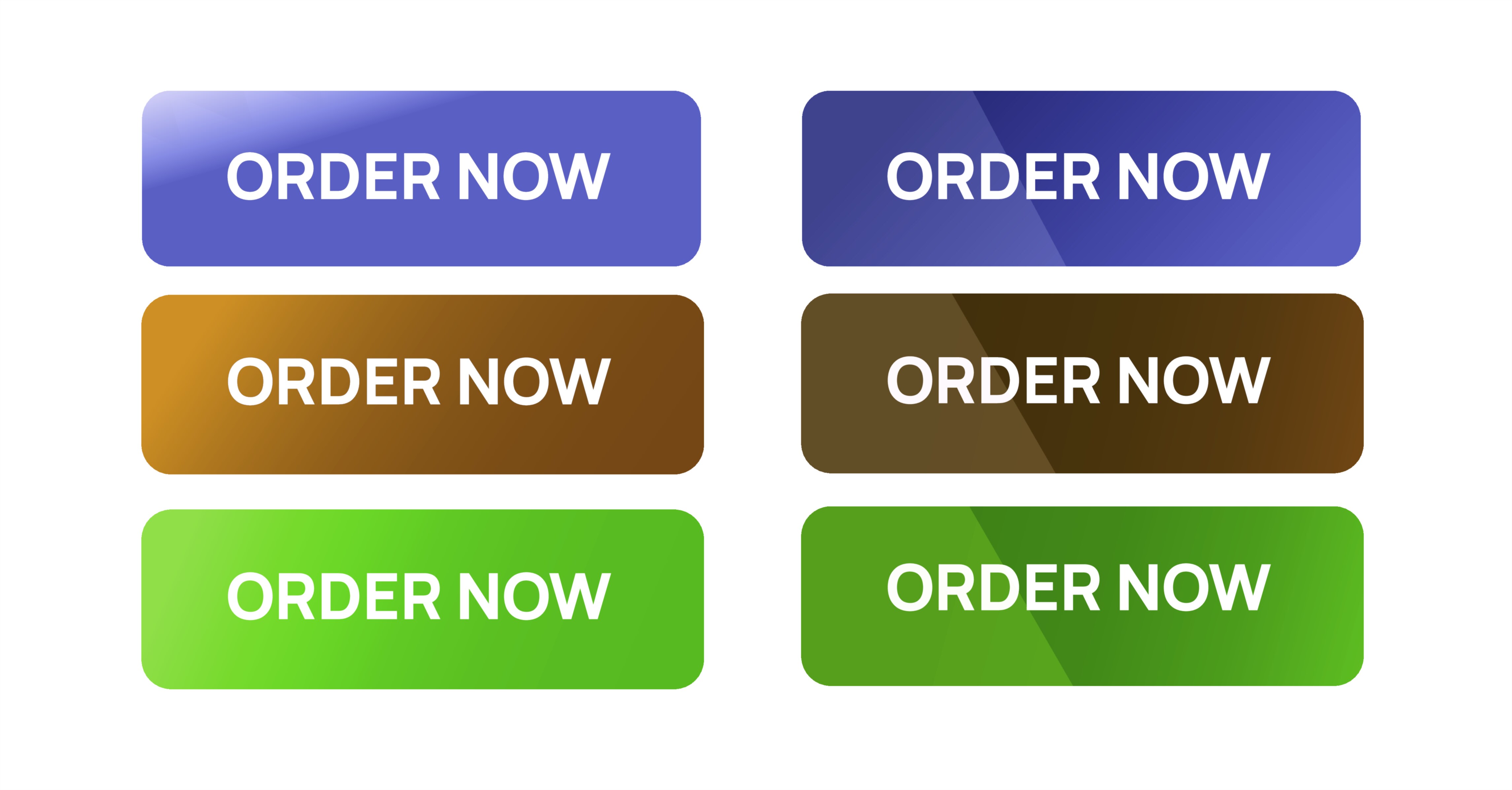
The first element of Order Now UI/UX is emotional comfort. Users will never click a call-to-action that feels confusing, intimidating, unsafe, or uncertain. The button must therefore communicate simplicity and security at just a glance. Colors, contrasts, shape, spacing, and micro-animations are carefully chosen to create certainty. Warm colors such as orange and green often trigger positive decision-making, while calm rounded corners suggest safety rather than rigid or harsh commands. Labels that are clear and direct — Order Now, Buy Now, Proceed to Checkout, Place Order — eliminate hesitation by telling the user exactly what will happen next. Subtle UI cues like padlock icons, secure payment badges, and reassurance text such as Free Returns, Secure Checkout, or No Hidden Charges help users relax emotionally and reduce fears associated with spending money online.
The UX role of the Order Now button extends beyond visual design. It must appear at the exact moment when the customer feels fully informed and ready. If it appears too early, it creates pressure; if it appears too late, it creates frustration. The path leading to the button must answer every question that could stop the user from buying — price, availability, delivery information, size or color choices, taxes, shipping timelines, and payment options. Good UX creates an effortless flow: the user explores, decides, fills necessary information, and reaches the final step without friction. Great UX removes distractions, clutter, unnecessary text boxes, or unexpected charges to prevent drop-off before the order is placed. A smooth checkout builds psychological momentum that leads naturally to the final click.
The “Order Now” moment is also a crucial inflection point where trust is activated. When users click to pay, they are sharing financial information that is deeply personal. The UI must therefore provide unmistakable signs that the environment is secure — trusted payment gateway logos, secured encryption icons, transparent billing summaries, and messages that confirm privacy. A customer clicking the button must feel that the system recognizes and protects them. This is why UX designers emphasize confirmation screens that show clear transaction summaries, digital receipts, timestamps, and order numbers before the payment finalizes. These details turn the action into reassurance rather than fear.
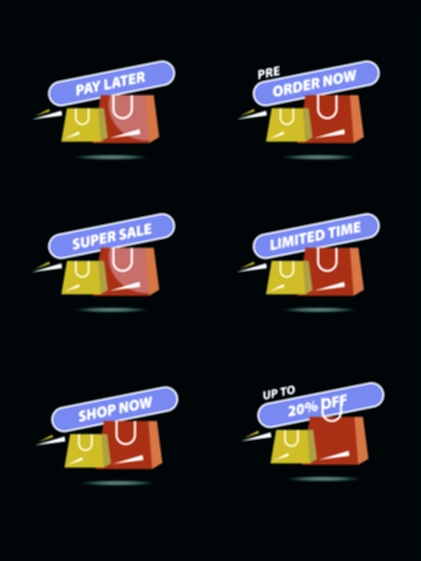
Beyond safety, the Order Now button influences urgency and motivation. Humans delay decisions when choices appear open-ended, so UI/UX design often removes the “later” option in the user’s mind by reinforcing the value of acting now. Limited-time discounts, stock indicators (Only 3 left!, Deal ends in 01:32:15), delivery timelines (Get it by Tomorrow), and reward notifications (Earn 120 loyalty points with this order) gently encourage momentum. These tactics are not meant to force decisions, but to remove indecision by proving that the click is beneficial in the present moment. UI/UX succeeds not when it pressures users, but when it makes them feel happy and confident about their choice.
After the click, the experience must remain just as comforting. The post-order screen is the emotional “landing point” of the user journey. A strong UX pattern shows a success message immediately — Order Placed Successfully, We’re Preparing Your Delivery, Your Payment Was Securely Processed, with options like Track Order, View Invoice, or Continue Shopping. This helps users feel in control after spending money and prevents the anxiety of not knowing whether the payment went through. A smooth post-order flow increases user satisfaction, strengthens loyalty, and makes the buyer more likely to return.
The Order Now button also connects deeply with brand personality. Minimalist brands may use clean and soft UI; energetic brands may choose bold colors and micro-interactions; premium platforms may use subtle animation to communicate elegance. No matter the style, the button is the moment where a brand keeps its promise: You can trust us enough to transition from exploring to buying. When executed properly, the button leaves no doubt — only clarity, comfort, and anticipation of receiving what was ordered.
In digital commerce, the process of clicking Order Now is far more than an action — it is the result of belief. It shows that the user trusts the product, the platform, the price, the payment system, the delivery process, and the brand identity. A user who clicks without tension is a user who has been guided thoughtfully through visual comfort, seamless flow, emotional reassurance, and logical understanding. When UI/UX achieves this, the button becomes effortless to click and the shopping experience becomes memorable.
This is why one small button carries the weight of the entire customer journey. Every detail in the interface — from the first product view to the moment the confirmation screen appears — works together to make the click feel natural and secure. And every time a user presses Order Now, it confirms not only a purchase but a successful UX relationship built on trust, transparency, confidence, and satisfaction.