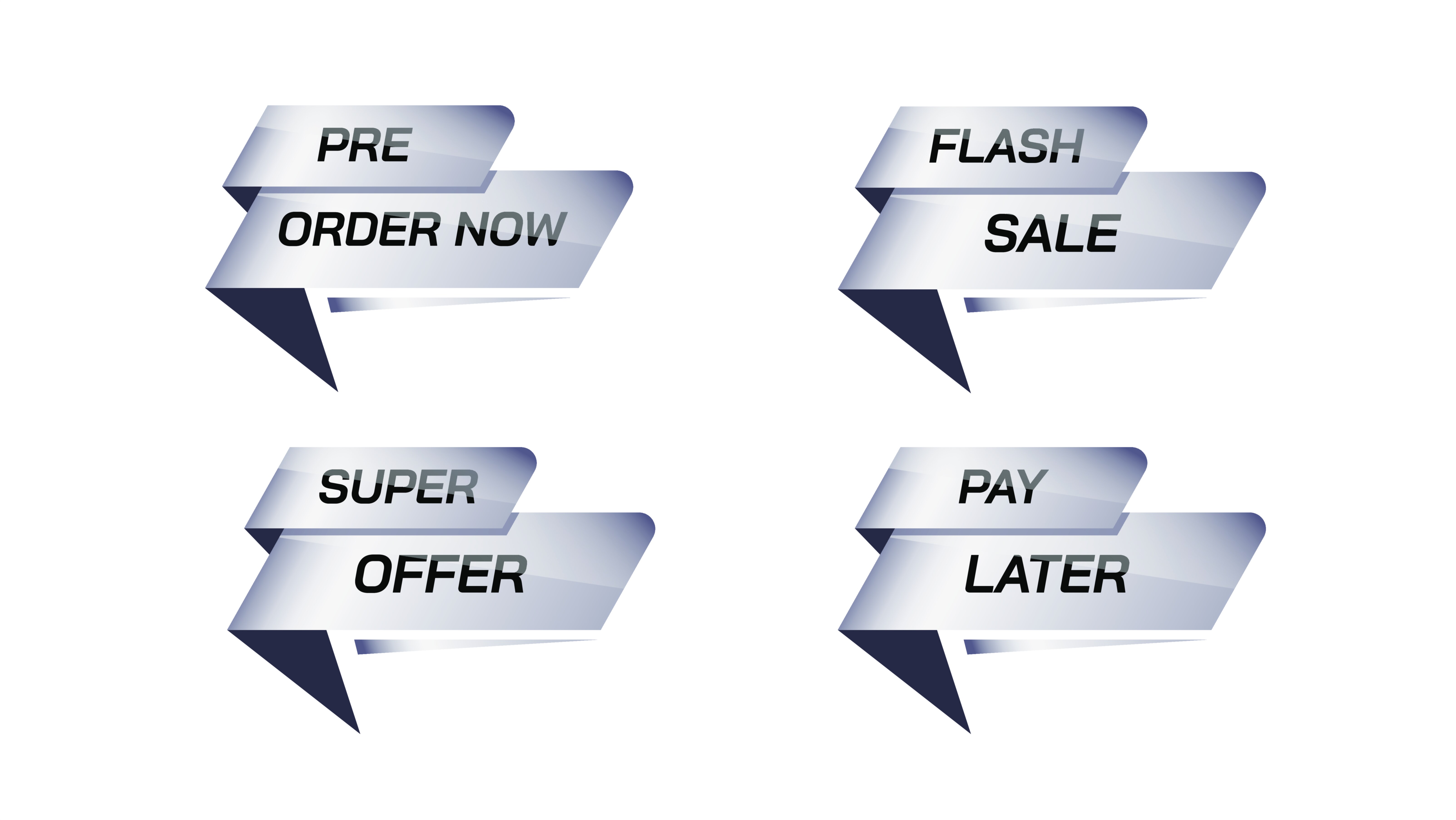
Flash Sale, Pre-Order Now, and Shop Now UI Assets – Modern Digital Commerce Design, Conversion Psychology, and the Visual Language That Drives Confident Online Purchases
Flash Sale, Pre-Order Now, and Shop Now UI assets form the core visual building blocks of modern e-commerce interaction. They are far more than decorative icons or clickable buttons; they are digital invitations that guide users through three different purchase mindsets: urgency, anticipation, and general shopping engagement. When a user visits an online store, product pages, banners, and promotional sections are filled with information and choices. Yet the decision to take action does not happen through reason alone — it happens through emotion supported by clarity. These UI assets play the most powerful role in converting browsing into buying, because they communicate the meaning of the moment in an instant. While the product page represents the what, these buttons and UI graphics represent the when and why of buying. Their design influences trust, excitement, and confidence, ultimately becoming the turning point of the digital shopping journey.
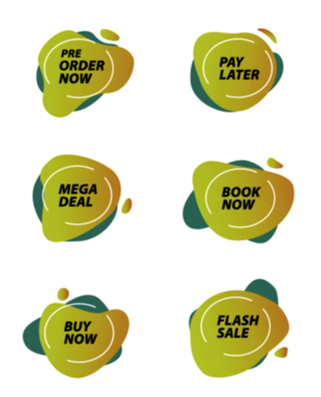
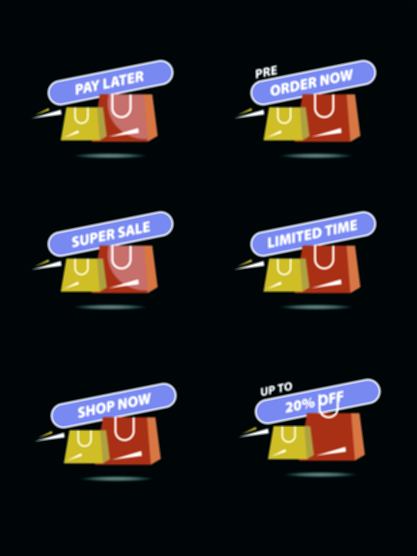
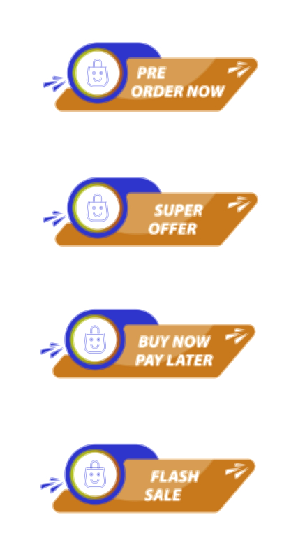
The Flash Sale UI asset is built on urgency. It communicates that the opportunity is temporary, special, and disappearing fast. In this context, emotion overtakes hesitation — users act quickly because waiting could mean loss. The vector design of a Flash Sale badge or button therefore emphasizes speed, intensity, and limited availability. High-impact colors like bright red, neon orange, and electric yellow stimulate alertness. Dynamic shapes such as bursts, lightning symbols, fire icons, countdown timers, price-drop arrows, and sharp accents signal rapid action. A Flash Sale UI element should visually interrupt the page just enough to demand attention while avoiding chaos. When shoppers see this asset, they instinctively feel that time is running out and delaying the purchase could result in missing a rare deal. The emotional message becomes: you might regret not acting now. Users click not only because they want the product, but because they fear losing the opportunity.
The Pre-Order Now UI asset operates with a very different emotional tone. Here the psychology centers on anticipation and exclusivity rather than urgency. A pre-order badge or button promises early access to a product that has not yet launched — a new smartphone release, a seasonal fashion drop, limited-edition merchandise, a gaming console, or official branded collectibles. Its design language leans toward futuristic, sleek, and premium styling. Gradients, deep contrast, metallic tones, neon blue or violet edges, and icons such as clocks, rockets, stars, or calendar badges convey the feel of something special coming soon. The emotional message is be among the first and secure your unit before availability opens to everyone. When a user interacts with this asset, they feel connected to an exclusive moment rather than a routine purchase. The asset reassures them that they do not need to wait and risk sell-outs — they can reserve their piece of the future right now. The user is not just buying; they are participating early.
The Shop Now UI asset carries the broadest appeal because it is not tied to urgency or exclusivity — it supports everyday browsing that gently transitions into shopping. Shop Now assets are often found on product collections, category pages, brand banners, promotional blocks, lifestyle imagery, and home page displays. Their job is to make the user feel comfortable and welcome, not pressured. Their typical color palette is warm, friendly, and approachable rather than intense. Rounded edges, neutral gradients, minimalist icons (such as shopping bags, carts, or arrows), and balanced typography create a sense of ease and approachability. The emotional message becomes: explore freely and enjoy discovering more. For new users, these assets reduce friction by softening the start of the journey. For returning users, they provide quick access to new arrivals, curated collections, and seasonal displays without overwhelming them.
Even though Flash Sale, Pre-Order Now, and Shop Now UI assets function differently, the success of each depends on a shared foundation: clarity, confidence, and intuitive design. A user should understand the meaning instantly without reading lengthy text. The vector form ensures scalability, crispness, and consistency across all screen sizes — smartphones, laptops, tablets, and high-resolution displays. Smooth responsiveness, hover effects, and quick micro-animations help reinforce the feeling of interactivity and readiness. Typography must be bold, legible, and free of ambiguity because cognitive hesitation translates directly to drop-offs. The call-to-action must be crisp and emotionally aligned with the specific user scenario.
Placement in the interface also determines the effectiveness of these UI assets. A Flash Sale badge must be positioned near the offer and timer so the shopper associates time pressure with value. A Pre-Order Now element works best near launch announcements, product previews, or new-release pages where anticipation is highest. A Shop Now button thrives in browsing-centric layouts — lifestyle imagery, featured category overlays, curated seasonal pages, or banner promotions. When the UI asset appears in the right emotional moment, the click feels natural, not forced.
Post-interaction experience is another critical layer of UX. After clicking a Flash Sale call-to-action, users expect confirmation that the deal has been secured and that their quick action paid off. After clicking Pre-Order Now, they need release dates and confirmation that their reservation is locked in. After clicking Shop Now, they should land on a curated discovery flow rather than a generic product listing. These follow-up experiences complete the emotional loop started by the UI asset and shape future loyalty.
Brand identity also lives inside these UI elements. A luxurious premium brand might present Flash Sale assets with understated gold and clean geometric shapes rather than loud explosion marks. A youth-focused streetwear store might use graffiti-style strokes, energetic typography, and high-contrast gradients. A minimalist digital-first brand may choose ultra-clean monochrome buttons with micro-interactions instead of bright colors. The aesthetic behind each UI asset communicates how the brand wants customers to feel — calm, excited, early, rewarded, or invited.
From a business perspective, these UI assets have direct influence on conversion rates, revenue growth, and customer loyalty. Many abandoned carts and missed purchases occur not because users reject products, but because they fail to understand the emotional meaning of the moment. A shopper who does not realize a discount is about to end won’t complete a Flash Sale. A shopper who doesn’t notice early reservations are available won’t pre-order. A shopper who isn’t guided into product discovery may leave without shopping. When UI assets communicate correctly, hesitation dissolves and action feels intuitive.
As e-commerce evolves into AI-driven personalization, AR product try-on, one-tap payments, and biometric confirmations, the emotional language of call-to-action UI will remain essential. Whether users click on a touchscreen, speak through a smart assistant, tap a smartwatch, or interact in VR, there will always be a psychological bridge between browsing and buying — a moment where the customer chooses to trust the system. Flash Sale, Pre-Order Now, and Shop Now UI assets represent that moment in three different emotional forms: the thrill of urgency, the privilege of early access, and the comfort of discovery.
In the end, these UI assets are not just buttons — they are persuasion, reassurance, anticipation, and confidence transformed into visual form. Every successful click is proof that the design understood the user’s emotion and aligned the interface with their decision-making process. When executed correctly, these assets make digital shopping feel simple, safe, exciting, and meaningful, turning ordinary browsing into a buying experience people enjoy and return to again and again.