Order Now Button Vector Illustration – Sleek E-Commerce Purchase Call-to-Action and the Design Psychology Behind Seamless Digital Buying Decisions
An Order Now Button Vector Illustration is one of the most influential visual components in modern e-commerce design. It may appear small on a page, but it carries the weight of the entire shopping experience — it is the point where browsing transforms into buying, where interest becomes decision, and where hesitation becomes action. In a physical store, customers rely on touch, conversation, body language, and immediate exchange to purchase items. Online shopping removes all of these familiar cues, which makes the digital call-to-action button the substitute for the final human interaction of the sale. A sleek Order Now vector button therefore does more than sit on a checkout screen — it reassures, invites, motivates, and protects. It communicates to the shopper that they are making the right choice in a safe environment, and that the platform will fulfil its promise once the button is pressed.
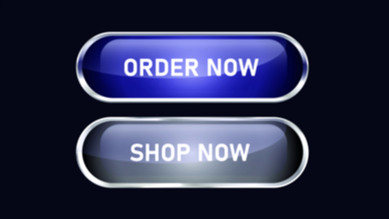
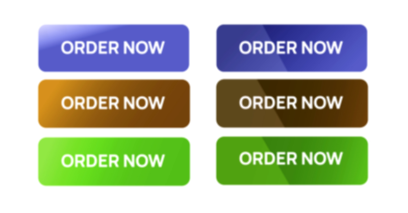
The visual style of the button determines the first emotional reaction a shopper experiences when they approach it. A sleek presentation suggests professionalism, reliability, and modern convenience. Sharp lines, smooth gradients, polished highlights, rounded edges, and balanced shadows create visual depth that tells the user the button is active and dependable rather than decorative. When designed as a vector graphic, the button remains crisp and refined on any screen size or resolution, whether viewed on a smartphone, laptop, tablet, or high-definition monitor. This consistency matters because a blurry, pixelated, or poorly scaled button signals carelessness and immediately weakens user confidence. A sleek vector design, by contrast, reflects precision and intentionality, reinforcing the impression that the entire platform is secure, trustworthy, and customer-centered.
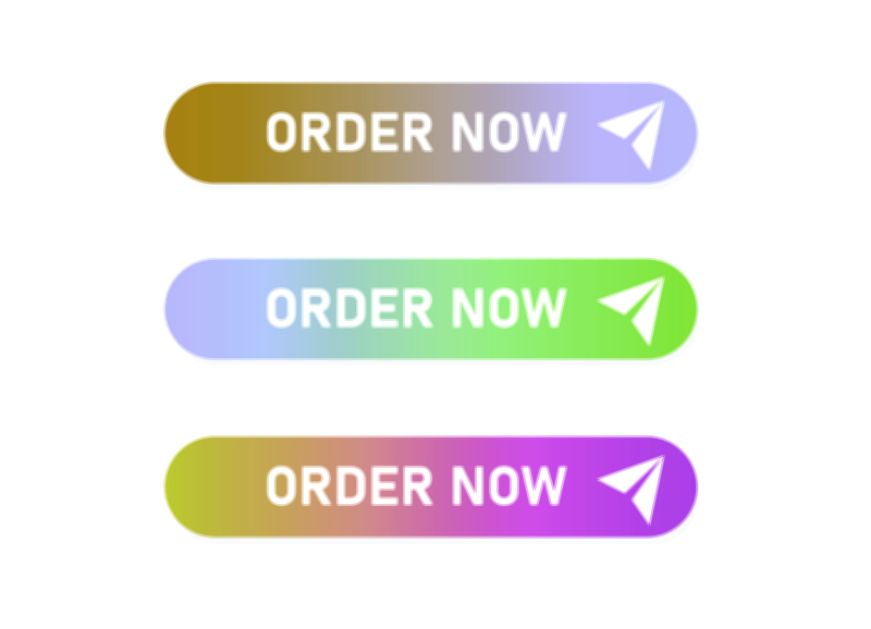
Color choice in the Order Now vector illustration plays a decisive role in user psychology. E-commerce design harnesses the emotional influence of color because different hues trigger different responses. Warm colors like red and orange stimulate action and urgency; green communicates safety and confirmation; blue gives a sense of trust and reliability; purple conveys exclusivity and premium value. The button must stand out from the surrounding interface without looking aggressive — a fine balance that reduces cognitive strain and encourages natural engagement. Shadows and subtle 3D depth make the button feel tangible, and micro-interactions such as a quick hover glow or soft ripple effect reinforce responsiveness, giving the impression that the system is ready to serve the user immediately.
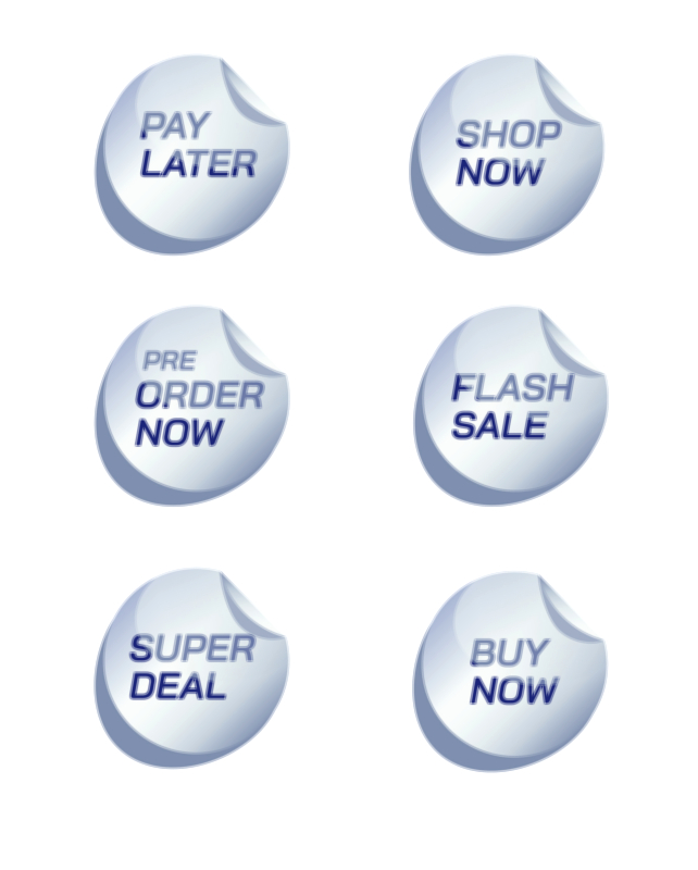
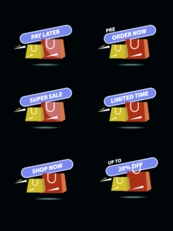
Typography and label wording are equally critical elements in the illustration. The text must tell the user exactly what is happening with zero ambiguity — short, clear, and confident. Labels such as Order Now, Place Order, Buy Now, and Proceed Securely reduce hesitation because they confirm both the action and its purpose. Bold, well-spaced, and high-contrast fonts ensure instant readability. When the shopper glances at the button, they should process meaning faster than thought. Supporting text or icons — such as a small padlock or shield — reinforce that payments will be secure, a detail proven to reduce checkout abandonment significantly because users associate these symbols with data protection and encrypted transactions.
Placement of the Order Now vector button determines whether the customer completes the purchase or abandons it. UX design ensures the button appears only when the shopper has enough information to make a confident decision — after pricing details, return policy, delivery information, available payment methods, and optional coupon entry are visible. If users feel they might be surprised by hidden charges, unclear conditions, or uncertain delivery expectations, they instinctively retreat rather than convert. A sleek button within a transparent, minimalistic layout helps shift attention away from doubts and toward completion. Clean whitespace around the button, uncluttered form fields, and predictable checkout steps reduce mental friction, allowing shoppers to reach the final click without stress.
The emotional peak of the shopping journey occurs after the click. A beautifully illustrated button is not enough if the post-click experience fails. Customers need instant reassurance because payment represents vulnerability. The interface must immediately display a confirmation — a success animation, order ID, expected delivery date, and secure payment verification. This moment protects the user from uncertainty, which could otherwise generate anxiety about double charges or failed orders. If the user feels satisfied within seconds of placing the order, their trust in the brand deepens and their likelihood of returning increases.
A sleek vector Order Now button also reflects the brand’s personality. Minimalistic brands adopt soft gradients and refined icons; energetic youthful brands choose high-motion interactions and vibrant tones; luxury brands emphasize simplicity, muted palettes, and elegant contours. Even within a simple rectangle, the button becomes a miniature brand ambassador. Its appearance communicates what the platform values — speed, elegance, modernity, trust, or exclusivity. When button design aligns with brand voice, the interaction feels cohesive rather than mechanical.
From a business perspective, the importance of this vector element cannot be overstated. Many abandoned carts do not stem from price objections but from discomfort at the moment of purchase. A confusing layout, hidden charges, or a dull button can interrupt an otherwise successful shopping journey. Conversely, an appealing and reassuring Order Now button can significantly elevate conversion rates, helping customers take the final step with confidence. It reduces hesitation, increases engagement, and reinforces the belief that the platform is professional and dependable.
As digital commerce continues to evolve, the Order Now button will adapt to new interfaces and technologies. In the coming years, biometric approval, one-tap checkout, AI-personalized pricing, and frictionless auto-fill payments will make purchasing even faster. Yet the button — in visual or conceptual form — will remain the center of action because users need a moment of acknowledgment, a moment where the system asks for consent and the customer confirms their decision. Whether displayed on mobile screens, augmented-reality shopping environments, smartwatches, or voice-driven retail platforms, the core message will endure: This is the moment you choose to trust us.
Ultimately, the Order Now Button Vector Illustration is more than a polished UI asset. It represents the point where digital convenience meets human psychology, where design meets emotion, and where e-commerce fulfills its promise of making shopping simple and satisfying. Every time a customer clicks that sleek, well-designed button, the brand earns not only a sale — but loyalty, confidence, and a memory of a purchase that felt smooth, safe, and enjoyable from beginning to end.