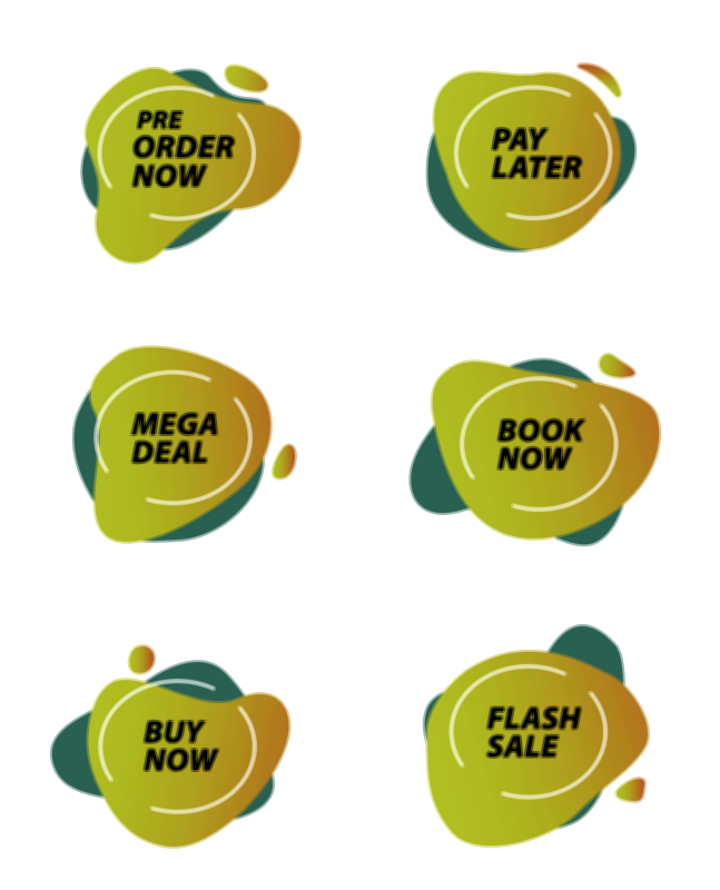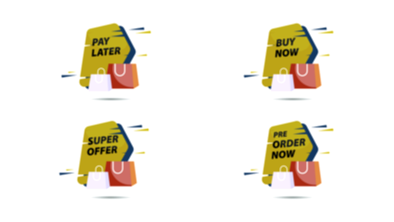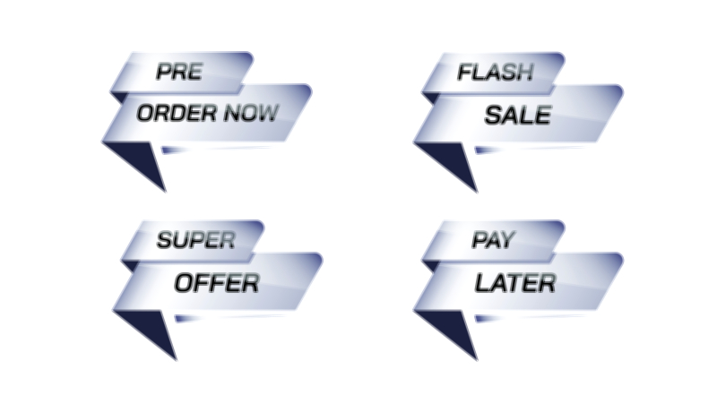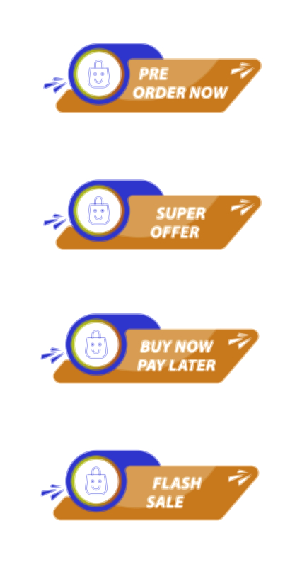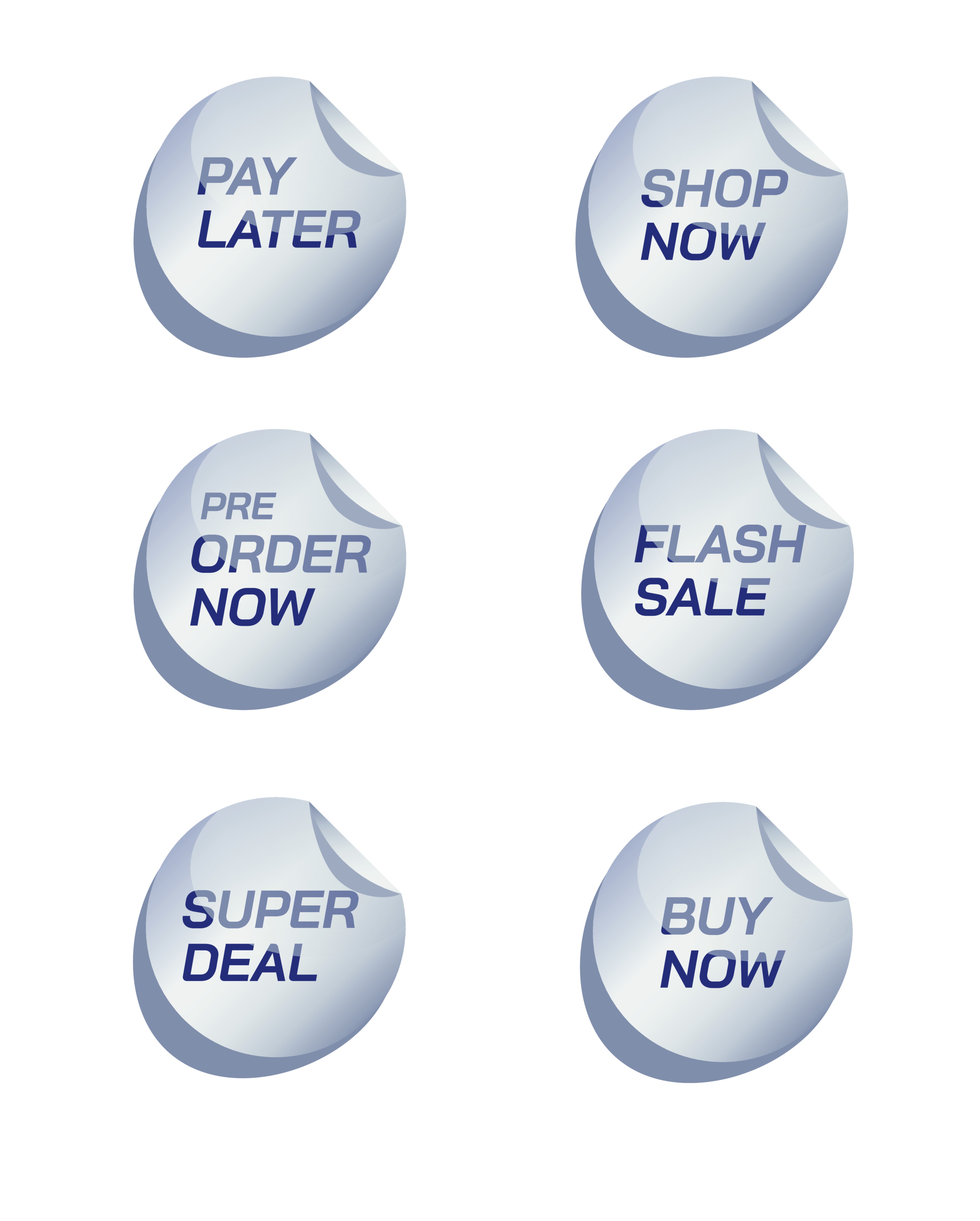
Order Now, Pay Later, Flash Sale, Super Deal, and Pre-Order Buttons Vector Illustration – Modern E-Commerce UI Design and the Visual Psychology of High-Conversion Digital Shopping Experiences
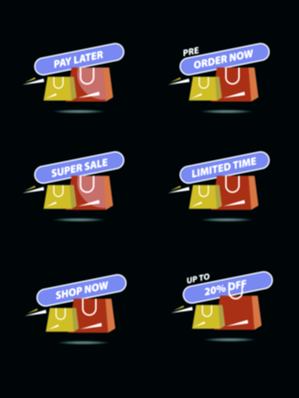
In modern e-commerce, buttons are not simply clickable shapes on a screen — they are emotional decision triggers. When a shopper browses an online marketplace, the journey is filled with information, comparisons, and small mental negotiations. Yet all of those thoughts eventually lead to one of several specific call-to-action buttons: Order Now, Pay Later, Flash Sale, Super Deal, or Pre-Order. Each of these buttons represents a different purchase scenario and carries a unique emotional message for the shopper. Designing vector illustrations for these buttons requires deep understanding of UI design, business goals, and human psychology. Their visual identity — color, shape, tone, icon style, motion, and placement — influences whether a shopper feels confident enough to act. A modern UI button must make buying feel effortless, safe, urgent, or exclusive depending on context, and it must achieve this effect within only a fraction of a second.
The Order Now button is the classic purchase command — the moment where a shopper is ready to complete the transaction. Its vector illustration must look sleek, trustworthy, and immediately recognizable. Users are vulnerable when spending money, so design must remove doubt. Calm contrast, rounded corners, refined shadows, and subtle animations create a reassuring environment. The wording must be clear and direct, while optional secure-payment icons reinforce confidence. This button represents final commitment, so the illustration must communicate absolute clarity.
The Pay Later button speaks to a different psychology — convenience and financial flexibility. Instead of pushing the shopper to make a full payment immediately, it promises the freedom to purchase now without the instant burden of expense. Its vector illustration usually incorporates calm, supportive colors such as blues or greens, symbolizing safety and non-urgency. Icons such as a calendar or an installment badge may accompany the label. The goal is to make the shopper feel financially accommodated rather than pressured, turning desire into a feasible purchase.
The Flash Sale button is built on time-sensitive urgency. In this case, adrenaline drives action. The vector illustration must instantly communicate limited duration and opportunity. Bold colors like bright red or orange, dynamic gradient strokes, sharp highlights, and energetic icons such as fire, lightning, or countdown clocks trigger fast decision-making. The design should look fast, exciting, and intense — not subtle — because shoppers must feel that hesitation equals loss. This button embodies the emotional rush of grabbing a deal before it disappears.
The Super Deal button appeals to the instinct for maximum value rather than urgency alone. It conveys the satisfaction of saving money or gaining a reward. Attractive, celebratory colors such as gold, yellow, or emerald can hint at greatness or special value. Star icons, medal badges, sparkles, or ribbon shapes reinforce the theme of winning. Unlike Flash Sale, which says buy quickly, Super Deal says this is the smartest purchase choice available. Its vector illustration must feel rewarding, special, and financially satisfying.
The Pre-Order button represents anticipation and exclusivity. It promises access to something not yet available — a new smartphone release, limited edition merchandise, newly launched fashion, or high-demand gaming gear. The illustration must visually express priority and reservation. Designers often incorporate futuristic gradients, glowing edges, and icons such as clocks, rockets, or “early access” badges. The emotional tone is secure your spot before others. Users should feel they are joining something early and are ahead of the crowd. It is less about urgency and more about exclusivity and excitement for what is coming next.
Although each button serves a different purpose, all share UI/UX foundations that determine whether a shopper proceeds or abandons the purchase. They must be crisp, scalable, and resolution-independent — which is why vector format is essential. They must stand out without disrupting the layout. They must be readable immediately, with labels free of ambiguity. And they must be placed at the exact point in the purchase flow where the shopper is prepared to act: after clarity about price, delivery, return policies, and benefits.
The emotional aftermath of a click must also be planned. The user interface should provide instant feedback — through confirmation animation, a success message, or a progress indicator — reassuring the shopper that their decision has been received and processed safely. Without this, even a beautifully illustrated button can fail, because uncertainty after payment generates anxiety. When feedback is immediate, relief and satisfaction replace worry, increasing customer trust and future loyalty.
Each of these vector button types also reflects brand personality. Premium brands may use minimalistic elegance; youth-oriented brands may embrace high-energy gradients and motion; eco-friendly brands may use soft natural palettes and warm shapes. Even though the function of buttons is consistent across platforms, the emotional tone and visual styling differentiate the identity of one e-commerce brand from another.
From a business point of view, these buttons are critical conversion points. Cart abandonment, delay in purchase decisions, or hesitation in checkout flow frequently emerge not from lack of interest but from insufficient reassurance, unclear messaging, or uninspiring visuals. Strong vector button design reduces friction, increases confidence, and aligns emotions with business goals. When the shopper sees the right button visual at the right moment with the right message, they feel that acting is a natural and beneficial choice.
As e-commerce evolves with one-tap payments, biometrics, augmented reality shopping, AI-based recommendations, and voice-controlled checkout, the visual communication of call-to-action buttons will remain central. Whether on a mobile app, a website, a smart TV, a VR headset, or a wearable device, users will always need a moment of clarity and permission — a moment where they knowingly agree to purchase. That decisive moment will always belong to the button.
In the end, Order Now, Pay Later, Flash Sale, Super Deal, and Pre-Order Buttons Vector Illustration – Modern E-Commerce UI Design represents the art of translating emotion into action. Each button tells a different psychological story — commitment, convenience, urgency, value, and anticipation — yet all of them share the same mission: convert curiosity into a confident decision. Every successful click is the result of thoughtful design that respects human behavior, protects user emotion, and makes digital commerce feel simple, secure, and rewarding.