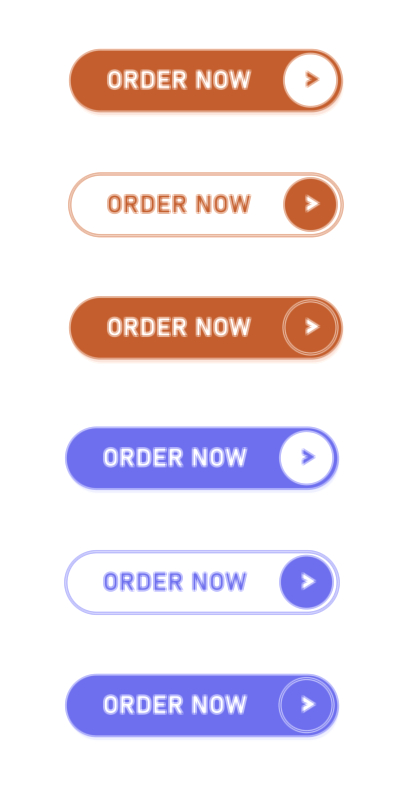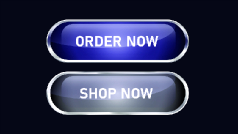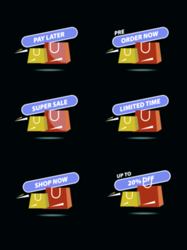
Order Now Button Vector Illustration UI/UX – The Visual Language, Emotional Psychology, and Conversion Strategy Behind a High-Impact E-Commerce Call-to-Action
An Order Now Button Vector illustration in UI/UX design is far more than a decorative graphic. It is a functional visual trigger that guides a user toward the final step of purchasing, while simultaneously conveying trust, security, clarity, and emotional comfort. In the digital shopping experience, the user cannot physically interact with a product, speak to a salesperson, or handle cash; therefore, confidence must be built through visuals, layout, and interaction design. The vector illustration of an Order Now button symbolically represents this moment of commitment, turning a simple design element into a powerful psychological anchor that transforms browsing into buying. Every pixel, curve, color, and icon in such an illustration sends a message that must feel inviting rather than risky, assuring rather than uncertain, and effortless rather than complicated.
A vector-based Order Now button holds a significant advantage because vector graphics remain sharp and scalable across all resolutions and device sizes. In UI/UX terms, this means the call-to-action maintains consistency whether the user visits from a smartphone, tablet, laptop, or desktop screen. This seamless clarity is crucial because even minor imperfections in a button’s appearance can interrupt emotional flow, weaken trust, or cause hesitation at the final step of checkout. Users approach the Order Now moment with heightened sensitivity, not because they fear clicking a button, but because they are about to spend money, and financial decisions trigger instinctive caution. The button must therefore eliminate doubt and create a feeling of certainty that everything about the purchase is correct and secure.
Color choice in the vector illustration plays a decisive role. Warm tones such as orange or red can stimulate action and urgency, while green signals safety, acceptance, and completion. A balanced combination of contrast and brightness ensures the button stands out without creating tension. Rounded edges create psychological softness, making the interaction feel less aggressive and more welcoming. Subtle gradients or shadows add depth and realism, suggesting that the button is actionable rather than static. Micro-interaction design—such as a slight scale animation on hover, a ripple effect on tap, or a gentle glow when highlighted—reinforces the message that the system is responsive to the user’s input. Together, these design elements form a visual experience that gently encourages decision-making rather than forcing it.
Text inside the vector button carries just as much weight as the graphic style. A label such as Order Now, Place Order, Buy Now, or Secure Order must offer clarity and confidence in a single glance. The font is chosen for readability, boldness, and friendliness. The spacing around the text ensures that the button breathes visually rather than appearing cramped or overwhelming. Sometimes additional elements such as a lock icon, shield symbol, or trusted checkout badge are integrated into the vector composition to show explicitly that the payment will be safe. These icons are not mere decoration; they provide emotional reassurance that the system recognizes the seriousness of sharing financial information and protects it.
Placement of the Order Now vector button within the interface is just as important as its design. It should appear at the precise moment when the user feels fully informed and ready. If it appears too early, it creates pressure and hesitation. If it appears too late or is visually buried, the user might abandon the purchase, even after adding items to the cart. The UI journey from product page to checkout exists to build momentum toward this final action, and the button functions as the climax of that journey. Proper spacing around the button, clear surrounding information (pricing, delivery timeline, return policy), and friction-free form fields ensure the user reaches the button without cognitive strain or emotional resistance.
The emotional response that follows the click is equally shaped by UI/UX design. After a user taps the Order Now vector button, the interface must immediately display validation that the click was meaningful and successful. A progress indicator, a success animation, or a confirmation screen with order number and delivery expectation transforms uncertainty into relief. This moment is vital because if a user clicks and nothing happens instantly, even a slight delay creates anxiety and suspicion. A button illustration that transitions into a secure confirmation experience helps cement satisfaction and reinforces trust for future purchases.
The vector illustration also contributes to overall brand identity. A playful brand may design a colorful, energetic Order Now button with lively shadows and motion. A luxury brand might choose a refined, minimalist button with elegant typography and understated highlights. A technology-focused brand might use futuristic icons and a sleek glow effect. Whatever the personality, the illustration acts as a micro-signature of the brand’s tone, showing the user not only what to do but how the brand wants them to feel while doing it. Consistency across product pages, banners, and checkout screens strengthens that emotional connection.
Many conversion problems in e-commerce originate not from product rejection but from hesitation during the final step. Unexpected shipping charges, unclear payment summaries, confusing forms, and poorly designed call-to-action buttons cause users to exit even when they fully intended to buy. A thoughtful vector illustration of the Order Now button reduces these drop-offs because it supports clarity: the user sees exactly where to click, understands exactly what will happen next, and experiences comfort rather than pressure. The button succeeds when it feels like a natural continuation of the user’s journey rather than a difficult decision point.
As digital shopping continues to evolve, the role of the Order Now vector button will remain fundamental. New technologies such as one-tap payments, biometric authentication, and AI-driven checkout flows may reduce manual effort, but users will still require visual reassurance that clicking means safety, accuracy, and fairness. Even as interfaces become more fluid, the central interaction remains the same — a user choosing to place trust in a brand. The Order Now button is a symbolic handshake between platform and shopper, representing mutual respect, clear communication, and a secure digital agreement.
In the end, the Order Now Button Vector illustration is not merely a graphic surface — it is the emotional and functional center of the e-commerce experience. It carries the responsibility of convincing a person to spend money confidently, safely, and happily in a digital environment. When UI/UX design supports that moment with the right visuals, the right words, the right psychology, and the right timing, the button transforms from a simple element into a pivotal experience that drives sales, builds trust, strengthens loyalty, and defines how users remember the brand. Every successful click reveals not just a completed purchase, but a connection between technology and human confidence that the digital world depends on.