Buy Now Pay Later Super Sale Big Discount – Vector Illustration for UI Ticket Buttons in Modern eCommerce Design
How a Single Graphic Element Combines Urgency, Savings, and Financial Comfort to Maximize Digital Conversions
A Buy Now Pay Later Super Sale Big Discount UI ticket button represents one of the most emotionally charged visual triggers in the entire shopping journey. It merges four psychological motivators that influence how users react to limited-time online deals: the immediate satisfaction of Buy Now, the budgeting relief of Pay Later, the excitement of Super Sale, and the irresistible reward of a Big Discount. When these four ideas are compressed into a single graphical element — especially in a ticket-style vector button format — the design becomes a digital magnet that prompts fast but confident purchasing decisions. It is not simply a decorative badge. It is a strategically engineered element that transforms ordinary browsing behavior into decisive action by offering the shopper a perfect blend of urgency, opportunity, and comfort.
The emotional journey begins with Super Sale Big Discount, since savings are the first idea the eye registers. Shoppers are naturally attracted to price advantages, and during seasonal promotions — festive sales, payday bonuses, clearance events, launch celebrations, and brand anniversaries — customers arrive with heightened expectations of special pricing. When the UI clearly communicates that a product is available at a price lower than usual, the brain shifts from evaluation to reward anticipation. But reward alone is not enough. Customers may still hesitate because of budget timing, especially when they did not plan to spend on that day. The Buy Now Pay Later component removes that hesitation ethically by letting shoppers secure the discount without needing to pay everything upfront. The message is powerful because it solves the most common emotional conflict at checkout: “I don’t want to miss the deal… but I’m not ready to spend the full amount right now.” Instead of making the user choose between desire and responsibility, the UI allows both to coexist. That emotional resolution is what makes this type of button highly persuasive without being aggressive.
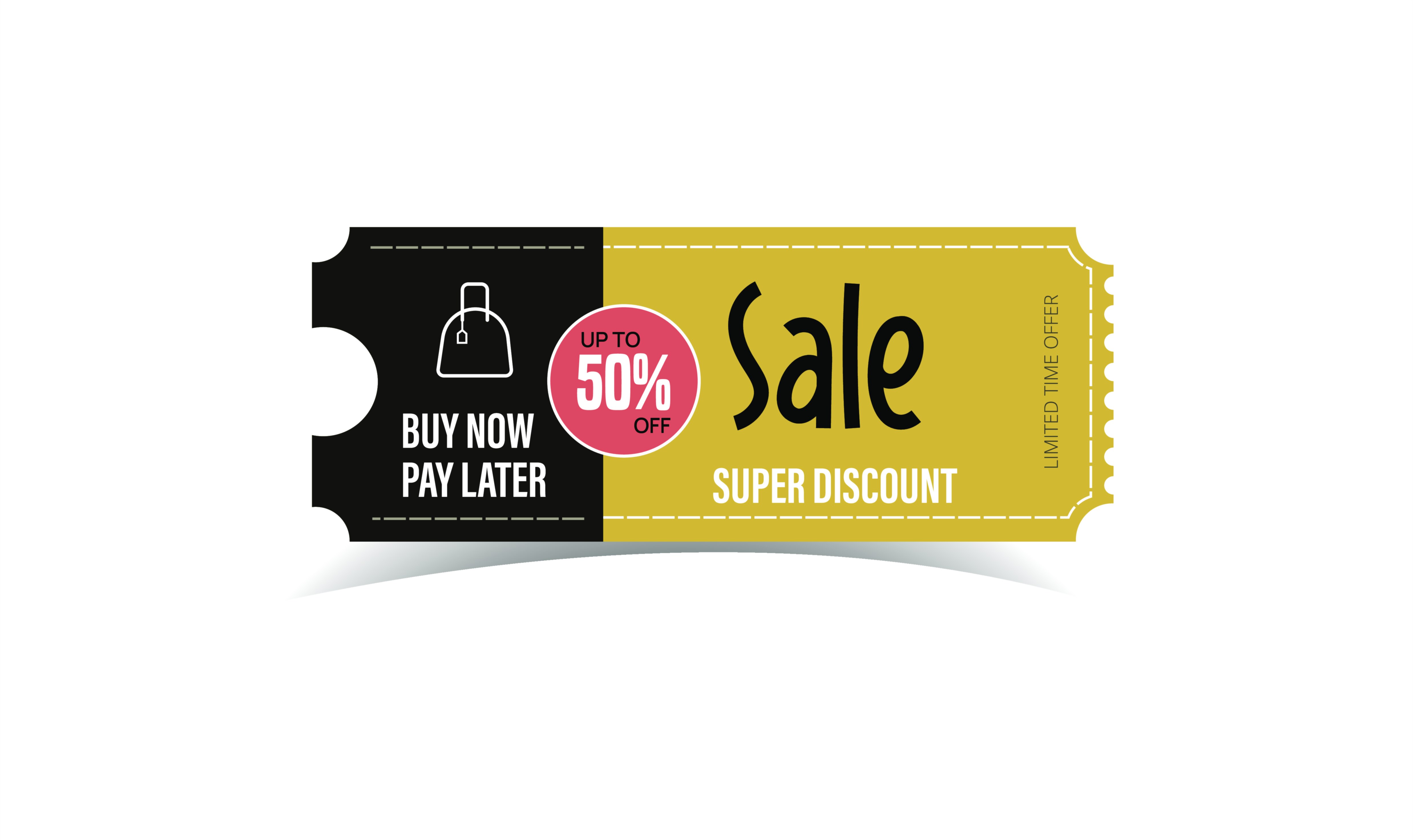
A ticket-style vector button amplifies this emotion visually. Tickets have a long cultural association with exclusivity, access, and special privileges — from concert entry passes to VIP event invitations, airline boarding passes, and limited-access coupons. In UI design, a ticket shape subconsciously suggests that the user is being offered something special and time-sensitive. The notched sides, perforation-style edges, half-rounded corners, and layered shadows make the element feel collectible, like a physical voucher one would want to keep. When this tactile visual language meets a digital interface, it turns the sale into an experience rather than a typical discount banner.
Color psychology establishes urgency and excitement. Intense saturated hues — blazing red, vibrant orange, neon coral, fluorescent magenta, golden yellow — create a sense of movement and time pressure associated with super sales. These colors activate instinctive attention and signal that the opportunity is limited. But the button must not communicate pressure alone. To support financial reassurance, the UI often incorporates softer hues — mint, pastel blue, aqua, lavender — or secondary calm overlays. When excitement and comfort coexist within the same color spectrum, the result is an emotionally stable interaction that tells shoppers they are making a smart, enjoyable decision.
Typography supports this gratification through clarity and hierarchy. On a ticket UI button, the four ideas do not compete; they reinforce each other. Large bold text — Super Sale or Big Discount — highlights the reward. The next layer of text — Buy Now Pay Later — conveys reassurance. The wording is short, sharp, and emotionally loaded without feeling aggressive. Uppercase letters, balanced spacing, and soft-rounded typefaces make the message firm but friendly. In this moment of decision, the customer must feel supported, not rushed.
Iconography deepens recognition without requiring the user to read consciously — lightning bolts, discount percentage bubbles, cashback icons, price tags, stars, shopping bags, spark flares, countdown clocks, calendars, or wallet symbols. Even if the customer scrolls quickly, the icons communicate the meaning instantly. The combination of visual clues — “big savings,” “limited time,” “buy now,” and “pay comfortably later” — reduces thinking time and increases action time. The user is not deciphering the button; the button is speaking directly to the user.
Animation and micro-interaction enhance the satisfaction further. A smooth glow, a shine wave across the ticket border, a tap ripple, a press-down bounce, or a confetti-style sparkle on activation transforms the moment into a reward. Micro movement communicates that the interface is alive, that the sale is active now, and that the button responds to human touch. Instead of wondering whether the system accepted their interaction, the shopper receives instant feedback — eliminating second thoughts.
Placement in the interface determines how powerfully the UI ticket button converts. A Super Sale Big Discount ticket works best when it appears at peak decision moments. On home screens, it magnifies promotional energy. On product pages, it prevents hesitation right before specifications overwhelm the user. Inside cart or checkout areas, it reduces the likelihood of abandonment by ensuring the shopper recognizes the ongoing savings before reconsidering. During seasonal campaigns, brands may even float this ticket button across screens as a detachable mini-badge, allowing customers to tap into a curated discount zone instantly. The idea is always the same: the button arrives right when users need reassurance that now is the right moment to purchase.
For different branding styles, the ticket adapts visually without losing meaning.
A youth-fashion marketplace might use neon gradients, sparks, and oversized bold graphics.
A luxury brand may choose matte black with gold foil–style metallic accents.
A tech or gaming platform might lean into cyber-glow lighting and geometric neon circuit motifs.
A wellness or home-comfort store might use soft warm tones with a satin shine finish.
In every case, the vector illustration remains sharp, scalable, and emotionally expressive, ensuring that the UI asset feels tailored to the brand rather than generic.
From a business perspective, this design solves three high-value challenges:
• Customers who want the product but wait for a bigger sale.
• Customers who worry about spending immediately.
• Customers who abandon carts during discount periods because they fear missing better timing later.
By offering Buy Now + Big Discount + Pay Later + Limited Sale Energy all at once, the ticket button eliminates all three barriers in a single gesture. It promises the shopper that the timing is perfect, the price is ideal, and the payment terms feel comfortable. Instead of postponing the purchase for “later,” the user secures it now, while feeling financially responsible rather than impulsive.
Even as eCommerce evolves — personalized pricing, AR showrooms, AI-timed discounts, instant biometric checkout — the emotional foundation behind this button will remain: people want to feel smart, lucky, and financially comfortable while enjoying something they love. A Buy Now Pay Later Super Sale Big Discount UI ticket button succeeds because it creates that exact emotional intersection.
It delivers a silent promise that every shopper wants to hear:
You are getting something special.
You are getting it at the right moment.
You don’t need to stretch your finances to enjoy it.
This opportunity is yours — if you claim it now.
When a single clickable UI element communicates all of that visually, confidently, and beautifully, it becomes more than a button — it becomes the most unforgettable moment of the shopping experience.