Indian Rupee Symbol Vector Illustration — ₹ Currency Design and Financial Icon Explained
The Indian Rupee symbol ₹ has become far more than a monetary mark representing the currency of India; it is a visual language of economic identity, national heritage, and modern financial standardization. Like all meaningful symbols, it carries historical depth and cultural meaning through its carefully crafted geometry. Rather than being derived from purely abstract shapes, the rupee symbol blends the Devanagari letter “र” (Ra) and the Latin capital “R” — minus the vertical stem — to create a hybrid form that resonates with both Indian tradition and global financial readability. Its design reflects the balance between heritage and modernity, signaling that the Indian economy, while rooted in long-standing civilizational memory, is fully integrated with the contemporary world of global trade, digital transactions, and financial technology. Understanding the rupee symbol therefore requires not only visual recognition, but recognition of the social, cultural, and economic story encoded into its form.
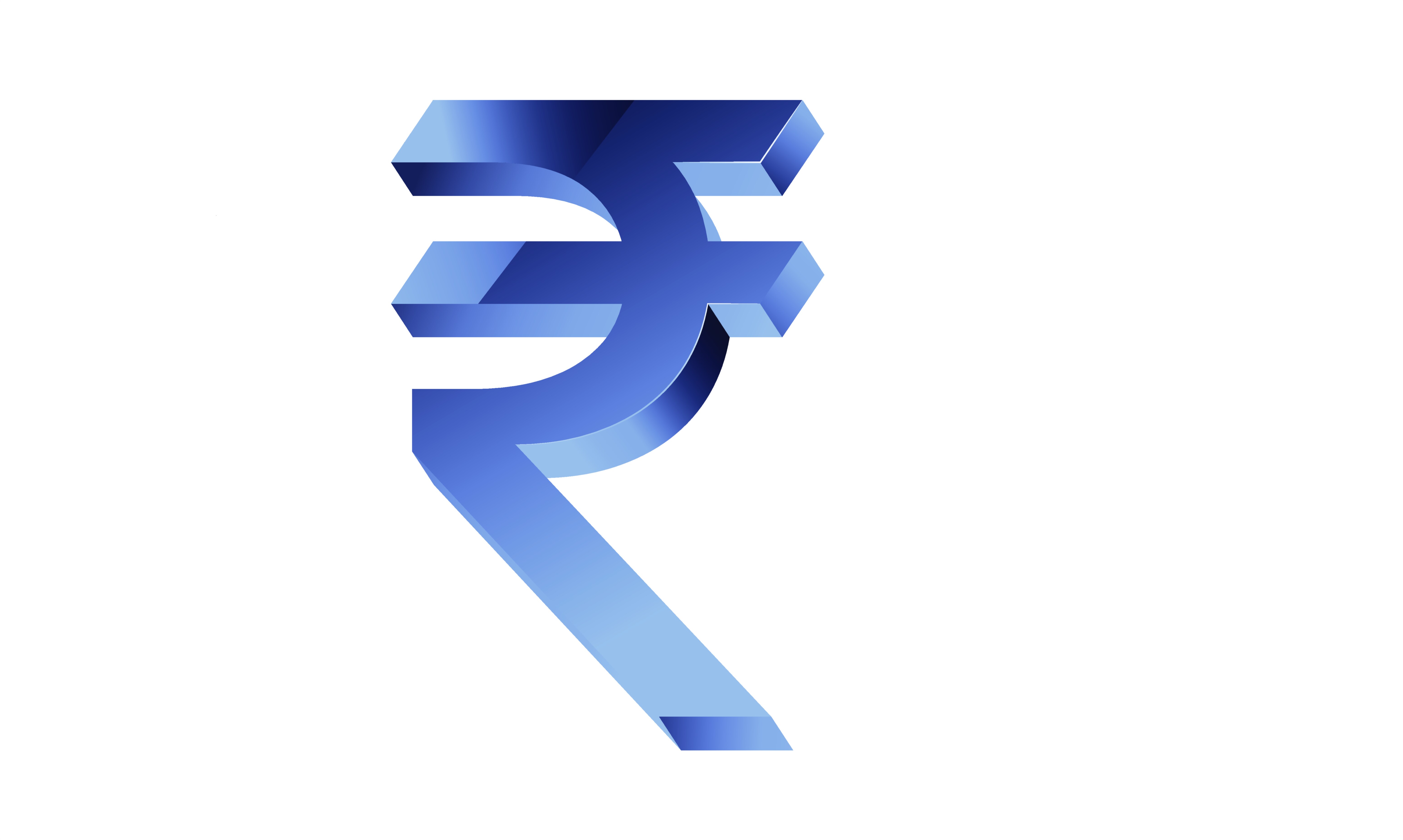
At the structural level, the ₹ symbol begins with the curve of the Devanagari “र” — yet instead of replicating the entire script form, the design incorporates a horizontal bar at the top and a parallel bar below it. These two horizontal strokes are not arbitrary styling choices; they embody the tricolor of the Indian flag while also representing the equals (=) sign, conveying the idea of economic balance, stability, and parity. This gives the symbol both cultural resonance and conceptual clarity. The vertical posture of the symbol stands firm like the Latin “R,” ensuring global recognizability in international contexts where financial symbols are expected to be typographically bold, compact, and uniform. The integration of Latin and Devanagari elements makes ₹ accessible across languages and platforms — from digital keyboards and signage to currency notes, banking interfaces, and international financial reporting.
The simplicity of the symbol’s geometry is precisely what allows it to scale flawlessly in vector graphics. In vector illustration form, the rupee symbol uses clean lines, mathematically smooth curves, and corner points that enable enlargement without pixelation — ideal for financial logos, fintech dashboards, poster layouts, educational charts, infographics, mobile app icons, and branding for businesses dealing with payments or currency exchange. Graphic designers typically create the ₹ symbol with uniform line weights, sharp edges, and a ratio that maintains vertical compactness for clarity in tight layouts. Modern typefaces often include the rupee symbol directly in their Unicode characters (U+20B9), enabling seamless insertion in digital documents, user interfaces, and typographic compositions without needing a graphic file.
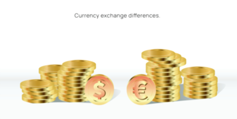
Understanding the rupee symbol also means understanding its role in financial communication. Before the symbol’s adoption, the Indian Rupee was usually abbreviated as “Rs” or “INR,” which lacked a unified visual identity and sometimes caused ambiguity in international markets. The introduction of ₹ in 2010 standardized the currency visually in the same way $, £, ¥, and € unify their respective economies. This symbol communicates India’s growing financial presence in global trade, international markets, e-commerce, and investment platforms. In the context of branding and visual communication, the rupee symbol represents trust, value, and economic activity, reinforcing confidence in Indian financial systems whether the symbol appears on currency notes, UPI transaction screens, banking advertisements, or retail pricing boards.
Beyond its functional meaning, ₹ has aesthetic implications that make it an ideal subject for vector illustration. It fits neatly into interfaces and graphic design structures because of its strong vertical axis and parallel horizontal lines that echo modern minimalism. Designers can modify the rupee symbol through gradients, neon lighting, line art, calligraphy, 3D gold effects, digital glow styles, or flat icons — while still retaining instantly recognizable form. For educational materials, a vector illustration of the rupee symbol clarifies its proportions, composition, and cultural context, helping learners understand how typography can carry significant national identity.
When used thoughtfully, the rupee symbol becomes more than a signifier of currency; it becomes a visual emblem of India’s economic strength, digital transformation, and cultural unity. It bridges the centuries-old heritage of Indian writing systems with the precision and universality of modern typography. Whether engraved on a physical coin, printed on banknotes, displayed on LED price boards, stamped on product packaging, or rendered digitally in fintech and e-commerce interfaces, ₹ conveys the same message: that the value of goods, services, or capital is connected to the identity of one of the world’s fastest-growing economies.
In its fullest interpretation, the Indian Rupee symbol embodies not only monetary value but symbolic value — representing the aspirations of a nation that is steeped in culture yet advancing confidently into the global financial future. Its strength lies not in complexity but in design discipline: a perfect balance of heritage, clarity, geometry, and economic philosophy. Through vector illustration, the precision of the rupee symbol becomes timeless, adaptable, and capable of reinforcing the visual identity of India’s financial world across every platform and format.