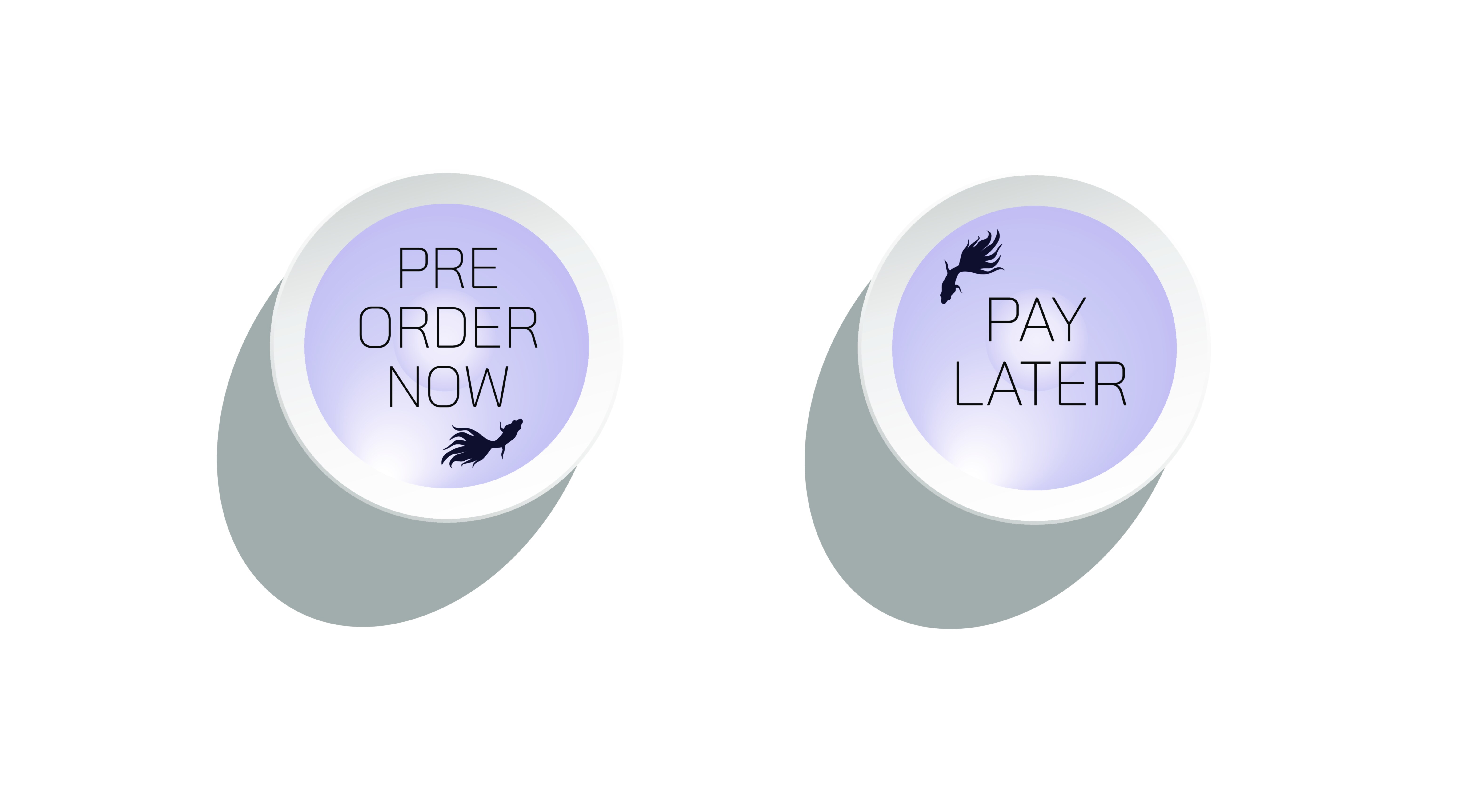
Pre Order Now Pay Later Vector Illustration for Modern eCommerce UI Design – Emotion-Driven Call-to-Action for Accessible and Exciting Digital Purchasing
A Pre Order Now Pay Later vector illustration for modern eCommerce UI design represents one of the most consumer-centric shifts in digital shopping. It merges the thrill of early access with the reassurance of financial flexibility, giving users the satisfaction of securing an upcoming product without needing to pay the full amount immediately. In a world where anticipation often clashes with budgeting concerns, this UI element removes hesitation and transforms excitement into confident action. Instead of forcing customers to choose between wanting something now and paying later, it communicates that both desires can coexist — that they can reserve the future today without financial pressure.
The emotional appeal behind this button begins with preordering. When a major tech gadget, beauty product, fashion drop, collectible item, or gaming release is about to launch, many shoppers fear missing out if they wait too long. But at the same time, they worry about committing money before the product officially ships. The Pre Order Now Pay Later UI asset solves that internal conflict instantly. It tells the customer that they can be early and smart at the same time — they can secure the product even before its release, while enjoying delayed or staggered payments. This message doesn’t sell urgency through fear; instead, it sells confidence through inclusion. The feeling shifts from “I can’t afford to preorder right now” to “I don’t need to wait — I can preorder today comfortably.”
Visually, the vector illustration must reflect both anticipation and financial ease in one design. Futuristic gradients, soft glows, and icons such as clocks, launch rockets, stars, or calendars reinforce the excitement of early access. At the same time, calm, trustworthy design cues — such as wallet icons, EMI symbols, secure-payment shields, calendar check marks, or smooth rounded edges — communicate stress-free monthly or later billing. The palette must balance excitement and comfort: bright neon accents or violet highlights awaken the preorder rush, while blues, greens, mint tones, or soft warm gradients reassure the user that finances are protected. Every line and every icon serves an emotional purpose — not decoration, but clarity: you get priority and you get payment freedom.
The typography inside the button supports this psychological message. Wording must be short, bold, and unmistakable — the user should understand the full benefit in seconds. Phrases like “Pre Order Now — Pay Later”, “Reserve Today — Payment on Release”, or “Secure Now — Pay When Available” eliminate doubt and confirm safety. Fonts should be clean, thick enough for small mobile screens, and spaced comfortably so the call-to-action remains readable even on compact UI layouts. The button should look like it belongs to a secure and skillfully engineered environment rather than a loud advertisement.
Positioning in the UI flow is equally important. The button must appear only after users are emotionally engaged with the upcoming product — typically after they have viewed its features, preview images, release date, and preorder benefits. If displayed too early, it feels confusing; if displayed too late, excitement cools. When timed correctly, the button becomes the exact point where anticipation and financial concern intersect — and resolve.
After the user clicks, instant confirmation feedback is critical. Preordering with delayed payment requires trust, so the system must immediately show an acknowledgment — order ID, expected shipping date, payment schedule or billing trigger, and tracking options. This feedback doesn’t just provide information; it completes the emotional cycle of the button by turning excitement into certainty.
Brand personality also shapes the visual tone of this UI element. A luxury tech brand may approach it with minimalist metallic accents and subtle motion; a youth-oriented marketplace may use bold neon energy; a calm home-essentials platform may style it with pastel gradients and soft, nurturing icons. Even though the wording is universal, the illustration reflects how the brand wants customers to feel: exclusive, empowered, playful, or safe.
From a business perspective, this vector UI asset is a conversion multiplier. Most shoppers who follow upcoming launches abandon the page not because they lose desire, but because they delay purchasing until finances align — and, in that delay, the emotional momentum fades. Pre Order Now Pay Later captures commitment right at the peak of desire. It drastically reduces preorder abandonment, improves launch-day revenue, and helps customers feel valued rather than pressured. It is not about pushing customers into decisions; it is about supporting people who already want the product but need transactional flexibility.
As the eCommerce world evolves — biometric one-tap checkout, auto-wallet payments, digital wallets, flexible installments, AI-driven personalization, and AR previews — emotionally sensitive call-to-action UI becomes more important, not less. Regardless of how futuristic checkout becomes, users will always want emotional reassurance before committing to a purchase. They want to feel that their excitement is respected and that their financial situation matters.
Ultimately, a Pre Order Now Pay Later vector illustration for modern eCommerce UI design is more than a button — it is a promise.
A promise that shoppers can secure what excites them without fear of overcommitment.
A promise that financial flexibility and early access no longer stand in conflict.
A promise that buying online can feel both thrilling and safe.
Every click on this button proves that the interface understood the shopper’s emotions and turned anticipation and affordability into a smooth, empowering, and memorable purchase experience.