Order Now Stylish Glass Button Vector Illustration for Modern eCommerce UI Design
A Refined, Transparent, and Emotion-Driven Checkout Trigger Built for the Future of Digital Shopping
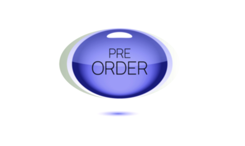
A stylish glass-effect Order Now button in vector illustration format for modern eCommerce UI design represents one of the most innovative evolutions of the digital call-to-action—where functionality, emotional design, and aesthetic pleasure intersect to elevate user experience. This button does not exist only to trigger a purchase; it exists to make the moment of purchasing feel visually rewarding, modern, and premium. Unlike traditional solid-color buttons that visually demand action, a glass-styled button invites action through beauty, sophistication, and softness. It amplifies the purchasing moment by turning it into an elegant gesture rather than a pressured decision. The design communicates that the platform values refinement in every detail, including the button that finalizes the transaction. In an age where users associate design quality with product quality, this button becomes a subtle but powerful indicator of brand excellence.
The emotional journey of a shopper leads them through attraction, evaluation, comparison, anticipation, and hesitation. The Order Now button is the moment where all those emotions converge, and therefore its design has the power to reinforce or destabilize confidence. A glass-styled version affects the emotions differently from energetic gradients or aggressive red tones because it whispers instead of shouts. Its polished transparency and soft glow tell the shopper that the purchase is safe, that the experience will be smooth, and that the product belongs in a world of high-end digital aesthetics. Transparent glass UI design taps into the psychological appeal of clarity, meaning there is nothing hidden or suspicious about the transaction. The user subconsciously experiences purity and openness, which reduces defensiveness and encourages trust.
The visual language of glass in digital interfaces is rooted in softness, sophistication, and futuristic minimalism. When applied to an eCommerce Order Now button, it creates a sensation of depth without heaviness. Color remains present, but it is softened beneath layers of semi-transparency, frosted blur, and luminous edge treatments. The edges appear like polished crystal; the interior appears weightless yet tactile. Depending on brand identity, the glass finish can lean into cold-tone clarity for tech-driven platforms, warm glossy highlights for fashion and lifestyle brands, or soft pastel reflections for beauty and wellness stores. In every case, the emotion remains consistent: the checkout action feels modern, gentle, and premium.
Typography plays one of the most important roles in the success of this glass-styled control. The words Order Now appear crisp, high-resolution, well-lit, and softly contrasted against the translucent background so that the text floats rather than sits flat. Instead of forcing urgency, the lettering communicates confidence. A font with balanced curves, clear edges, and a medium-bold weight reinforces the interface’s luxury tone without appearing stiff. When users read the text, they should feel that the final step is effortless, as though the platform is guiding them instead of commanding them.
The emotional efficiency of the glass button also depends on how lighting is illustrated. The subtle glow along the curved edges simulates physical refractive surfaces; it reminds the user of polished glass, high-end devices, modern architecture, and premium interfaces. This is not accidental. Human brains associate reflective clarity with technological advancement and quality manufacturing. Placing those associations inside a digital button transfers those impressions into the shopping moment. The checkout process begins to feel like a premium interaction rather than a chore. Even users who do not consciously analyze UI aesthetics feel this emotional shift and behave accordingly—conversion rises when design expresses high value without pressure.
In the dynamic shopping environment of smartphones and apps, responsiveness also shapes the emotional experience. A stylish glass Order Now button often uses micro-interaction to bring its visual elegance to life. A soft highlight sweep across the surface at hover or tap, a smooth depth shift when pressed, or a subtle light pulse after confirmation makes the purchase feel like a celebration rather than a routine click. These animations are not meant to distract; they are meant to acknowledge the user instantly. When people spend money—especially online—they want assurance. Responsive animation reinforces the sensation that the system is stable, attentive, and ready to fulfill their order the moment they confirm it.
Placement within the shopping interface determines how strongly the glass button influences user action. Because this design is decorative and expressive, it thrives in layouts that prioritize premium aesthetics—product hero sections, curated storefronts, high-resolution previews, luxury brand product pages, and organized, breathable UI designs. It performs exceptionally well when the product being purchased is positioned as fashionable, artistic, technology-driven, or status-oriented. Users instinctively match the quality of the button with the perceived value of the item. If a $900 smartphone is paired with a basic ugly button, the psychological harmony is disrupted; but if the button looks as refined as the product photographs, confidence strengthens.
The emotional symbolism of the glass effect also communicates transparency in pricing and delivery, because the visual metaphor of glass suggests nothing is hidden. This matters because checkout anxiety often revolves around fear of unexpected charges or unclear policies. The glass button supports subconscious feelings of honesty. The user senses clarity before rationally examining terms. A button that feels trustworthy leads to smoother mental acceptance of cost, which is one of the biggest obstacles in eCommerce purchase finalization.
Brand identity influences the styling of the button while preserving the emotional message of modern premium checkout. A clothing brand may add luminous reflections that resemble glossy acrylic. A tech brand may use cold blue neon glows and crisp shadows that feel futuristic. A health or beauty shop may add soft rose or lavender glass gradients for a soothing emotional tone. A luxury jewelry or footwear brand may combine black-crystal transparency with gold metallic lettering. Although the aesthetic shifts across sectors, every variation communicates a consistent promise: placing the order will be smooth, satisfying, and meaningful.
From a business perspective, a stylish glass Order Now button offers a powerful conversion advantage without discounting or psychological pressure. It persuades users not by urgency but by refinement. When a customer sees that the brand has invested in elegant UI design, they subconsciously perceive the product as high-quality and the shopping experience as trustworthy. Users who feel respected and visually delighted complete more purchases and return more frequently. This design also performs exceptionally well for audiences that value modern aesthetic culture—people attracted to minimalism, high-end digital styling, luxury branding, or next-generation product design.
Even as the future of digital shopping evolves toward biometrics, instant payments, voice-based checkout, AR storefronts, AI-driven personalization, and mixed-reality product previews, the emotional core of purchasing will never disappear. People will always be influenced by the quality and character of the last button they press. The Order Now Stylish Glass Button represents the next stage in design where the call-to-action does not shout for attention but earns it through modern elegance and psychological comfort.
That is why a vector illustration of an Order Now stylish glass button for modern eCommerce UI is more than a decorative asset. It is a carefully engineered emotional moment inside the shopping flow. Beneath the graceful transparency and polished highlights, the button quietly communicates something every shopper wants to feel in the final second before committing:
This purchase is safe.
This experience is premium.
You are about to complete something beautiful, and everything will go smoothly.
When a button expresses that message visually, without a single spoken word, it transforms checkout from a transaction into a deeply satisfying digital decision—and that is where modern eCommerce reaches its highest potential.