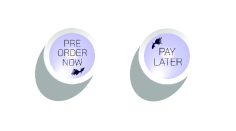
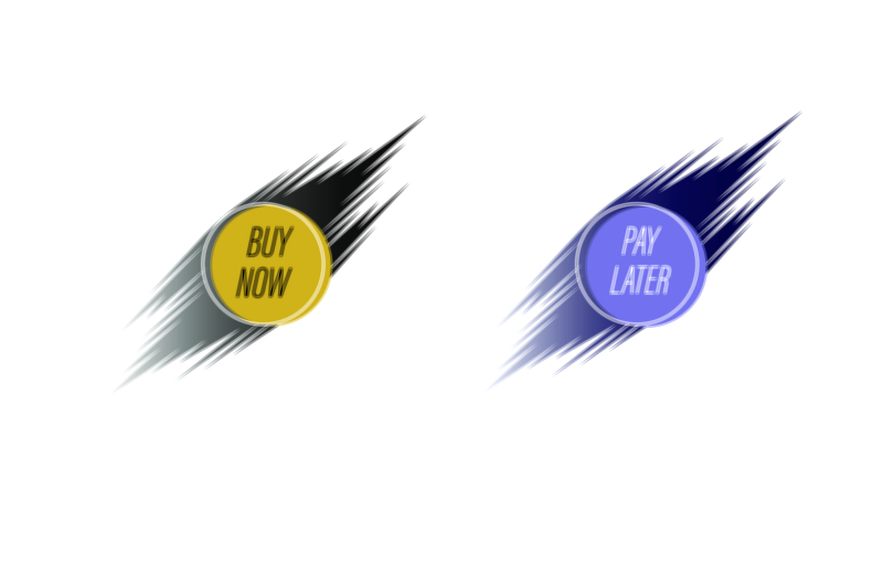
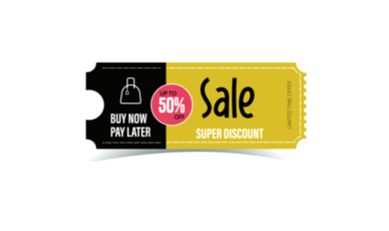
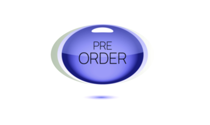
Pre Order Now Pay Later Vector Illustration UI Asset Buttons – Modern E-Commerce Design for Flexible, Exciting, and Emotion-Safe Digital Purchasing
A Pre Order Now Pay Later UI asset button represents one of the most emotionally intelligent design evolutions in today’s online shopping world. It blends two powerful motivations into a single visual trigger: the eagerness to reserve a new or upcoming product (Pre Order Now) and the relief of not having to make full payment immediately (Pay Later). As shoppers explore digital marketplaces filled with pre-launch hype and exclusive drops, many abandon purchases not because of lack of interest, but because of budget timing or price hesitation. This vector-driven button removes that conflict. It tells users that they can secure their place now while keeping financial comfort intact — an experience that transforms anticipation into excitement rather than stress.
What makes this UI asset so powerful is its ability to answer both the emotional and the financial side of the shopper’s decision. On the emotional side, it taps into the thrill of early access — the feeling of being among the first to own something new, from smartphones to gaming accessories, limited clothing releases, beauty launches, or tech gadgets. On the financial side, it reduces the internal friction that often blocks commitment — the fear of spending too much at once. The button does not push users with urgency; instead, it supports their excitement by giving them freedom over payment timing. When done right, it communicates: you don’t have to wait to experience the future — you can claim it now with no pressure.
Visually, the vector design must merge anticipation and financial ease in a single composition. For preorder identity, designers often rely on futuristic gradients, glowing strokes, metallic accents, and icons like calendars, rockets, stars, clocks, or launch-themed markers to emphasize exclusivity and early access. To express flexible payment comfort, designers integrate calm and reassuring symbols such as wallets, EMI icons, calendars with checkmarks, shield-secure badges, or hand-holding icons. The color palette plays a vital role in balancing excitement with comfort: cool greens and blues communicate payment security and calmness, while subtle neon or violet accents maintain the feeling of a premium, futuristic experience.
Typography inside the button must be bold, readable, and instantly meaningful. Labels like “Pre Order Now – Pay Later”, “Reserve Today – Pay Later”, or “Secure Now – Flexible Payments” reduce any risk of misunderstanding. Shoppers should know exactly what is happening with one glance — they are reserving now and paying later, not being locked into an unclear financial process. Fonts must communicate reliability rather than marketing hype. High contrast and comfortable spacing ensure that the call-to-action performs well even on small devices.
Placement within the interface determines conversion. If the button appears too early on a product page — before pricing or release information is understood — it may cause uncertainty. If it appears too late, the excitement window closes. The ideal moment is when the shopper has seen the launch date, the preorder benefits, the expected delivery timeline, and the cost transparency. At that moment, their emotional anticipation is highest and their financial doubt can be relieved instantly through this UI button.
Interaction feedback is a critical layer of its success. Because a preorder + delayed payment action involves both waiting and financial trust, users need assurance at the exact moment of clicking. Modern vector UI styles support smooth micro-animations — a gentle glow on hover, a press-down soft bounce, a ripple tap effect, or a transformation into a checkmark before transitioning to a confirmation screen. If the shopper clicks and nothing happens instantly, tension replaces excitement. If the button responds immediately and the confirmation screen clearly presents release timelines and payment schedule details, the user feels protected and satisfied.
Brand personality also expresses itself through this asset. A luxury technology brand may design it in a minimalist metallic style. A youth-centric gaming marketplace might use neon sci-fi accents. A home and lifestyle store may choose soft gradients with nurturing icons. Even when the wording remains the same, the vector illustration becomes a micro-signature of the brand’s emotional attitude toward its customers — playful, premium, tech-forward, or comfort-focused.
From a business and performance standpoint, Pre Order Now Pay Later is a powerful conversion booster. Without it, shoppers who love a product may delay until launch day, potentially forgetting, reconsidering, or choosing competitors. With this UX element, commitment occurs at the peak of excitement rather than the schedule of payday. It reduces preorder abandonment, boosts launch-day demand, and strengthens loyalty because users feel respected both emotionally and financially.
As commerce continues to evolve — with biometric payments, digital wallets, AI-generated shopping suggestions, and AR product try-ons — this hybrid call-to-action will grow even more valuable. No matter how futuristic the interaction becomes, users will always want confidence at the moment of commitment. They will always want to feel that their excitement is supported, not exploited.
Ultimately, a Pre Order Now Pay Later Vector Illustration UI Asset Button is not just a button. It is a promise.
A promise that shoppers can reserve what excites them without compromising financial comfort.
A promise that emotion and affordability can coexist in one satisfying choice.
Every successful click of this button becomes proof that great UI design does more than convert sales — it listens to real human feelings and makes digital purchasing feel empowering, effortless, and emotionally rewarding.