Contact Us UI Asset Vector Illustration for Modern eCommerce and App Interface – Visual Communication of Trust, Support, and Customer-Centered Guidance in the Digital Shopping Experience
A Contact Us UI asset in the form of a vector illustration for modern eCommerce and app interfaces represents one of the most quietly powerful design elements in digital customer experience. Unlike buttons that trigger instant purchases or limited-time excitement, this UI element speaks directly to the user’s need for clarity, reassurance, and human connection. In online shopping and digital service environments, every customer journeys through curiosity, evaluation, comparison, and anticipation — but at any step along the path, even a small doubt can interrupt the decision to proceed. The Contact Us button is designed to intercept that hesitation. It tells the shopper that answers are available, that support exists, and that uncertainty is not a barrier. It is not a sales trigger in the aggressive sense; it is a trust trigger, and trust often influences purchase decisions more deeply than discounts, countdown timers, or promotions ever could.
What makes the Contact Us asset so crucial in modern eCommerce is that digital interactions, no matter how intuitive, cannot predict every user’s personal doubts. A product description may be detailed, but a buyer could still wonder about suitability, compatibility, deadlines, or return guarantees. A subscription may appear clear, but a user might fear long-term commitments or hidden costs. A service booking may be easy to plan but still cause uncertainty about timing or eligibility. During all these moments, uncertainty becomes friction — friction that can either be resolved or turn into cart abandonment. The Contact Us UI button acts as a visual promise that the user will not be left alone to guess, assume, or gamble. It becomes the safe checkpoint where confusion turns into clarity.
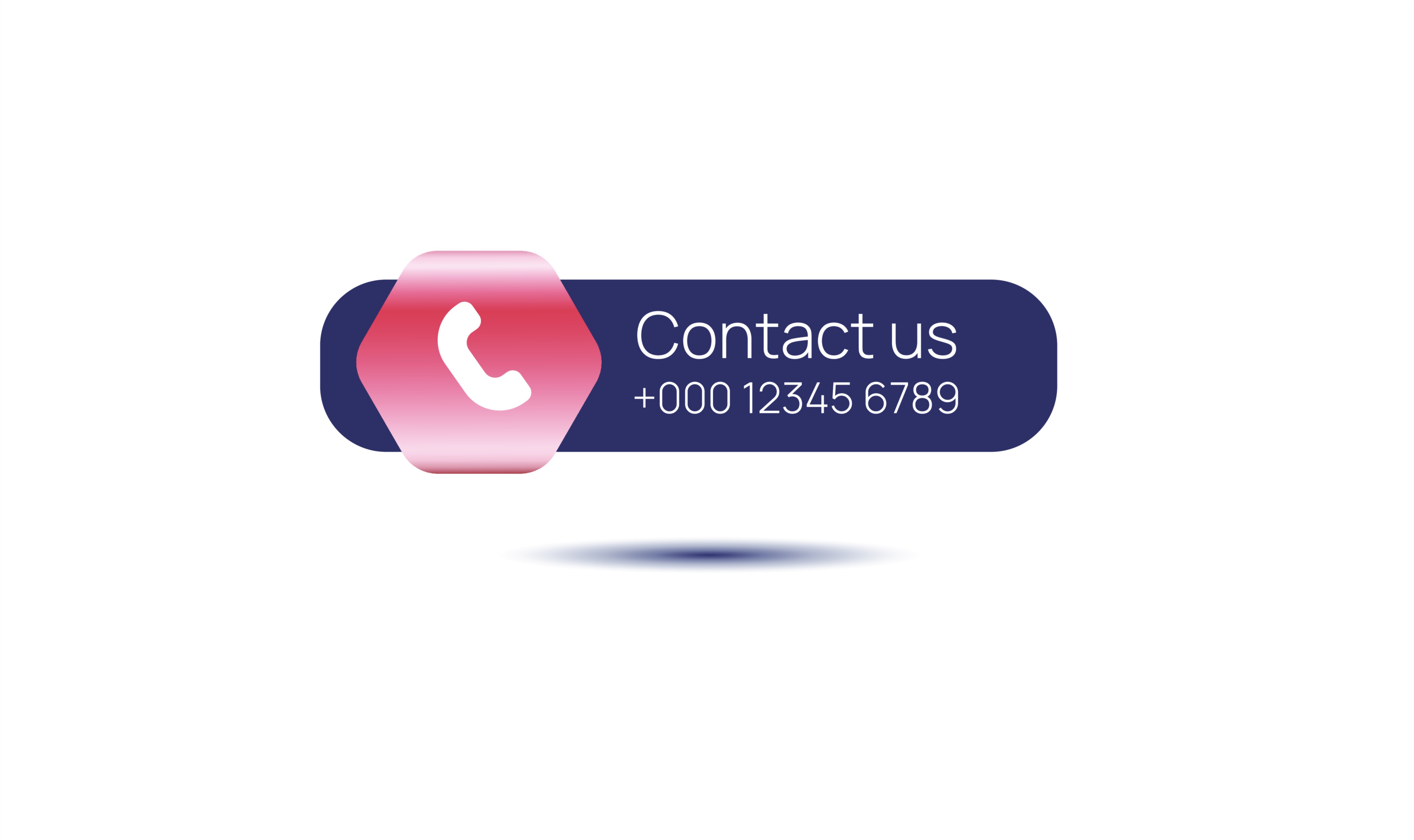
Vector illustration enhances this emotional security through visual language. Because the UI element needs to function perfectly across diverse screen sizes and devices — mobile apps, web portals, large desktop storefronts, customer dashboards, in-app billing pages, and floating support menus — vector design ensures scalability without losing sharpness or professionalism. Rounded button silhouettes convey friendliness rather than corporate distance. Moderate elevation shadowing creates a sense of tactility and approachability, suggesting that the interface is ready to interact rather than simply display information. Soft glow accents or gradient strokes give the button a contemporary feel while maintaining calm energy rather than urgency.
Color psychology plays a defining role in conveying the emotional tone of Contact Us. While promotional UI elements use high-energy palettes to trigger decisiveness, support-oriented buttons rely on calming, safe visual cues. Blues and teals evoke reliability and competence, green suggests resolution and helpfulness, violet gradients express professional care, and muted pastel hues communicate warmth and patience. The user should feel that tapping on Contact Us will lead to a respectful and simple interaction, not an obligation or high-pressure conversation. This is where modern UX diverges sharply from outdated eras — the button should not imply that the user will be persuaded; it should imply that they will be listened to.
Iconography amplifies clarity for fast interpretation. The most common symbols include headset icons, envelope icons, chat bubbles, ringing phone silhouettes, customer support avatars, and notification circles. These icons reduce the cognitive load by telling the brain instantly that help is available. In rapid scroll environments, such symbolic recognition is essential: the user may not read the text immediately, but the icon conveys that the interface offers communication, confirmation, and assistance. The speed at which the meaning is absorbed directly influences the likelihood that a user who is hesitant will reach out rather than give up.
Typography reinforces this emotional weight. The text Contact Us must appear clear, friendly, and confident without being pushy. The font should be bold enough to avoid doubt but smooth enough to feel conversational. Rounded sans-serif letterforms often succeed because they subtly express warmth and approachability. The lettering space should breathe, preventing the button from feeling crowded or tense. A shopper deciding whether to contact support must never subconsciously read urgency or pressure — the tone must always be: We’re available — whenever you’re ready.
Micro-interaction animation completes the emotional loop. A subtle hover glow, a ripple effect on tap, a soft upward bounce, or a gentle shift in icon opacity communicates responsiveness. When a shopper encounters uncertainty, even a tiny lag or lack of motion can introduce doubt. Responsive animation communicates stability and acknowledgment — it reminds the shopper that when they reach out, the system will respond. This matters deeply, because the moment a user chooses to click Contact Us is often a moment of vulnerability: they admit uncertainty and look for reassurance. A seamless tap response reinforces confidence and respect.
Placement within the interface determines how effective the button becomes. Unlike purchase buttons, support buttons must remain visible without appearing intrusive. When a user needs guidance, they should never need to hunt for it. That is why Contact Us often appears near the footer of a product page, at the edge of a checkout sequence, within floating help panels, near billing details, or in persistent navigation menus. It is not designed to distract — it is designed to be available the exact moment reassurance is needed. For high-risk decisions — premium purchases, subscriptions, travel, financial services, or healthcare — strategic placement massively improves completion rates, because users feel safe acting when an easy support pathway is visible.
Brand identity shapes the stylistic flavor while protecting emotional intent. A luxury shopping app may use black and gold tones with elegant headset icons. A tech ecommerce marketplace might lean toward futuristic gradients and neon accents. A wellness brand may favor soft peach tones and calm customer representative illustrations. A finance or service provider may use stable deep blue backgrounds with shield-integrated icons. Even as aesthetics shift, the emotional message remains identical: this button exists for you — not for the business.
From the business perspective, the value of Contact Us extends far beyond customer service. It rescues abandoned carts, clarifies misunderstandings, helps hesitant buyers, increases subscription conversion, reduces fear of hidden charges, and strengthens brand reliability. Every time a user clicks Contact Us instead of closing the app or abandoning the website, a potential lost sale transforms into a guided sale. In sectors where customers often feel nervous — electronics, insurance, education, furniture, wellness plans, hospital services, and international delivery — having an immediately visible support gateway can create measurable revenue uplift. More importantly, the emotional experience builds long-term loyalty because customers remember when a brand cared enough to help them rather than confuse or pressure them.
Even as the future of digital commerce evolves — AI answer engines, conversational checkout, self-resolving FAQs, meta-shopping ecosystems, and predictive support — the psychological need behind the Contact Us button will never disappear. Technology can automate processes, but reassurance, empathy, and human-centered assistance remain universal. People feel safer when they know help is accessible. A well-designed Contact Us UI asset becomes not a last resort, but a sign of respect.
That is why a Contact Us vector illustration for modern eCommerce and app UI is more than an interface component. It is a visual imprint of hospitality — a signal that the platform values the shopper as a person, not merely a buyer. Behind the typography, the button whispers a message that every user needs to feel when navigating unfamiliar decisions:
You are not alone here.
You matter.
If you need us, we are available — right away.
When this message is delivered visually, calmly, confidently, and beautifully, the button becomes not just a clickable object, but a reassuring moment of connection that elevates the entire shopping experience from transactional to genuinely customer-centered.