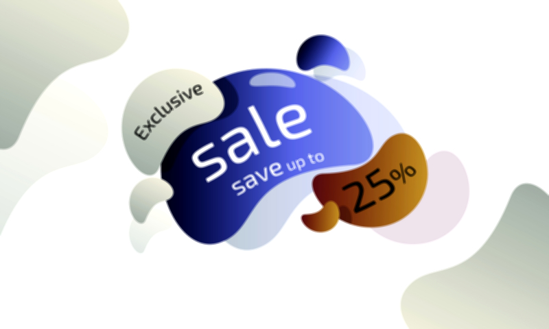
Big Sale Save Up to 30% – Vector Illustration for eCommerce UI and Promotions
A Big Sale Save Up to 30% vector illustration for eCommerce UI and promotions is a highly effective visual tool designed to communicate meaningful savings while maintaining a balanced tone that feels both exciting and trustworthy. Unlike massive clearance events that focus on extreme markdowns, a save up to 30% promotion represents a strong but reasonable deal — one that appeals to value-conscious shoppers who seek good pricing while still appreciating product quality, new arrivals, and curated collections. In a fast-moving digital store environment where users browse quickly and attention is fleeting, this vector graphic acts as a targeted signal that a worthwhile opportunity is available right now, making it easier for shoppers to shift from passive viewing to intentional purchasing.
The true power of this illustration lies in its combination of two motivating elements: Big Sale and Save Up to 30%. The phrase Big Sale immediately conveys that the event is significant and time-specific, not a routine discount quietly running in the background. It evokes the feeling of entering a dedicated promotional period that deserves extra attention. Meanwhile, Save Up to 30% provides clear numerical context, helping shoppers recognize that the savings are meaningful and that browsing the sale may lead to financially beneficial decisions. This clarity creates trust, and trust increases conversions — shoppers are more likely to engage with a sale when the discount parameters are easy to understand without exaggerated ambiguity.
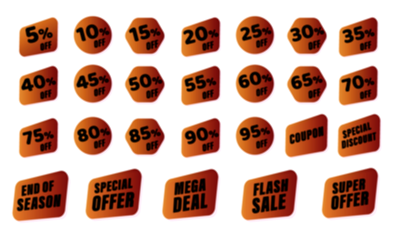
Visually, the design of this promotional vector illustration follows the energetic language of modern eCommerce. Dynamic shapes such as ribbon banners, badge seals, angle-cut tags, and highlight frames create the impact necessary to stand out against organized product grids. These shapes communicate motion even when static, encouraging the user to pause and look closer. The color palette depends on the tone of the brand, but the goal is always prominence. Retail platforms that thrive on impulse-buy behavior often use vivid shades like red, orange, and yellow to trigger urgency and draw the eye away from background elements. Premium or minimalist brands may lean toward gold-on-black, deep blue gradients, champagne accents, charcoal overlays, or glossy glass-style UI to maintain elegance while still signaling an important promotion. Whatever the palette, the badge must be unmistakable in the shopping layout.
Typography plays a carefully engineered role. The word SALE is usually the visual anchor of the composition because it is the quickest signal consumers process in promotional environments. BIG SALE introduces an energy boost — a message that the discount period is significant enough to deserve attention even from shoppers who weren’t originally planning to buy. The supporting text SAVE UP TO 30% amplifies this by delivering concrete savings, making the deal feel real rather than vague. Bold uppercase fonts ensure high readability on both desktop and mobile, and the number 30% is often emphasized through size contrast, color highlights, or glow outlines because the numerical discount is the fastest-decoded visual element in a shopping interface. Even at thumbnail scale, the badge should remain legible in a fraction of a second.
The vector format is critical to the functionality of this asset. Because the artwork consists of scalable vector paths rather than fixed pixels, the same promotional badge can easily be applied across:
• homepage hero banners and seasonal sliders
• product grid overlays and thumbnail corner stickers
• category section headers and discount strips
• mobile app highlight cards and sticky bottom banners
• cart reminders and checkout-stage motivations
• social media sale graphics and promotional reels
• email marketing and WhatsApp sale flyers
• offline print-ready posters for hybrid brands
The illustration remains crisp at every size, preserving quality whether it is displayed as a tiny product icon or a full-width banner. Layer separation also allows teams to adjust color themes, change discount values for future campaigns, or adapt the design to seasonal events without rebuilding from scratch — an essential time-saver for high-volume retail calendars.
Emotionally, the Big Sale Save Up to 30% vector illustration influences the decision-making phase rather than the browsing phase. Many shoppers hesitate not because they dislike products, but because they are unsure if it is the right moment to purchase. A sale badge that communicates a realistic and appealing discount removes that uncertainty. The customer begins to feel that purchasing now is smarter than waiting later. The psychology shifts from maybe next time to why not now? This is especially powerful for categories like fashion, footwear, beauty, home goods, electronics accessories, and fitness gear where interest already exists but motivation needs one final push.
The sophistication of this type of promotion fits perfectly into today’s UI trends. Gradient glass badges integrate smoothly into modern dark-theme apps. Soft-glow tags with neon lines reinforce the lively feel of fast-fashion and tech retail. Pastel seals introduce a friendly tone suitable for lifestyle and family brands. Subtle micro-motions — gentle pulsing edges, shimmer passes, or dynamic spark glows — can elevate the illustration without overwhelming the user interface. Such enhancements add life to the badge while making sure navigation remains effortless.
Ultimately, a Big Sale Save Up to 30% vector illustration for eCommerce UI and promotions is not just a decorative visual. It is a behavioral prompt engineered for the conversion stage of the shopping cycle. It reassures users that there is a strong value window open right now, encourages them to explore discounted items they might otherwise ignore, and increases the likelihood of cart completion by reducing uncertainty about price and timing.
It delivers one clear message to every shopper who sees it:
You can get what you want — and save while doing it.
This is the right moment, and it won’t last forever.
That single message transforms browsing into action, and action into a satisfying purchase experience that customers remember positively.